例4:绘制1000个点
import matplotlib.pyplot as plt
x_values = list(range(1, 1001))
y_values = [x**2 for x in x_values]
plt.scatter(x_values, y_values, s=40)  # s为尺寸
# 设置图表标题并给坐标轴加上标签
plt.title("Square Number", fontsize=24)
plt.xlabel("Value", fontsize=24)
plt.ylabel("Square of Value", fontsize=24)
# 设置刻度标记的大小
plt.tick_params(axis='both', which='major', labelsize=14)
# 设置每个坐标轴的取值范围
plt.axis([0, 1100, 0, 1100000])
plt.show()

例5:删除数据点的轮廓
绘制的点默认为蓝色点和黑色轮廓;但绘制多个点时,黑色轮廓可能粘连在一起,这里可以删除轮廓。
plt.scatter(x_values, y_values, edgecolor='none', s=40)
注意:2.0.2版本的matplotlib, edgecolor默认为’none’,所以这里根本不需要这句话
例6:自定义颜色
可以使用RGB颜色模式自定义颜色,要指定自定义颜色,可传递参数c,并设置为一个元组,其中包含三个0~1之间的小数值,分别为红,绿,蓝分量。
如下,显示为深蓝色。
plt.scatter(x_values, y_values, c=(0, 0, 0.8), edgecolor='none', s=40)

例:使用颜色映射,根据y值的不同,设置不同程度的颜色
import matplotlib.pyplot as plt
x_values = list(range(1, 1001))
y_values = [x**2 for x in x_values]
plt.scatter(x_values, y_values, c=y_values, cmap=plt.cm.Blues, edgecolors='none', s=40)
# 设置图表标题并给坐标轴加上标签
plt.title("Square Number", fontsize=24)
plt.xlabel("Value", fontsize=24)
plt.ylabel("Square of Value", fontsize=24)
# 设置刻度标记的大小
plt.tick_params(axis='both', which='major', labelsize=14)
# 设置每个坐标轴的取值范围
plt.axis([0, 1100, 0, 1100000])
plt.show()

17.3 保存图表
可将plt.show()的调用替换为plt.savefig()的调用
plt.savefig('squares_plot.png', bbox_inches='tight')
第一个实参指定要与什么样的文件名保存图表,存储在.py文件的当前目录中
第二个实参指定将图表多余的空白区域裁剪掉4
17.4 绘制随机漫步图
from random import choice
import matplotlib.pyplot as plt
class RandomWalk():
    """一个生成随机漫步数据的类"""
    def __init__(self, num_points=5000):                # 5000个点
        """初始化随机漫步的属性"""
        self.num_points = num_points
        # 所有随机漫步都始于(0,0)
        self.x_values = [0]
        self.y_values = [0]
    def fill_walk(self):
        """计算随机漫步包含的所有点"""
        while len(self.x_values) < self.num_points:    # 不断漫步,直到列表达到指定的长度
            # 决定前进方向以及沿这个方向前进的距离
            x_direction = choice([1, -1])              # x方向,1为右,-1为左
            x_distance = choice([0, 1, 2, 3, 4])       # 距离
            x_step = x_direction * x_distance          # 带方向的距离
            y_direction = choice([1, -1])
            y_distance = choice([0, 1, 2, 3, 4])
            y_step = y_direction * y_distance
            # 拒绝原地踏步
            if x_step == 0 and y_step == 0:
                continue
            # 计算下一个点的x和y值
            next_x = self.x_values[-1] + x_step       # 最后的一个值生成最新的值
            next_y = self.y_values[-1] + y_step
            self.x_values.append(next_x)
            self.y_values.append(next_y)
# 创建实例,并将其包含的点都绘制出来
rw = RandomWalk()
rw.fill_walk()
plt.scatter(rw.x_values, rw.y_values, s=15)
plt.show()

例2:绘制多次随机漫步
只需要修改实例化那里,RandomWalk的类不变
# 只要程序处于活动状态,并将其包含的点都绘制出来
while True:
    # 创建一个RandomWalk实例,并将其的点都绘制出来
    rw = RandomWalk()
    rw.fill_walk()
    plt.scatter(rw.x_values, rw.y_values, s=15)
    plt.show()
    keep_running = input("是否绘制下幅图(y/n):")
    if keep_running == 'n':
        break
例3:给点着色
颜色由浅入深
# 只要程序处于活动状态,并将其包含的点都绘制出来
while True:
    # 创建一个RandomWalk实例,并将其的点都绘制出来
    rw = RandomWalk()
    rw.fill_walk()
    point_numbers = list(range(rw.num_points))
    plt.scatter(rw.x_values, rw.y_values, c=point_numbers,
                cmap=plt.cm.Blues, edgecolors='none', s=15)
    plt.show()
    keep_running = input("是否绘制下幅图(y/n):")
    if keep_running == 'n':
        break

例4:绘制起点和终点
# 只要程序处于活动状态,并将其包含的点都绘制出来
while True:
    # 创建一个RandomWalk实例,并将其的点都绘制出来
    rw = RandomWalk()
    rw.fill_walk()
    point_numbers = list(range(rw.num_points))
    plt.scatter(rw.x_values, rw.y_values, c=point_numbers,
                cmap=plt.cm.Blues, edgecolors='none', s=15)
    # 突出起点和终点
    plt.scatter(0, 0, c='green', edgecolors='none', s=100)  # 起点绿色
    plt.scatter(rw.x_values[-1], rw.y_values[-1],
                c='red', edgecolors='none', s=100)          # 终点红色
    plt.show()
    keep_running = input("是否绘制下幅图(y/n):")
    if keep_running == 'n':
        break

例5:隐藏坐标轴
# 只要程序处于活动状态,并将其包含的点都绘制出来
while True:
    # 创建一个RandomWalk实例,并将其的点都绘制出来
    rw = RandomWalk()
    rw.fill_walk()
    point_numbers = list(range(rw.num_points))
    plt.scatter(rw.x_values, rw.y_values, c=point_numbers,
                cmap=plt.cm.Blues, edgecolors='none', s=15)
    # 突出起点和终点
    plt.scatter(0, 0, c='green', edgecolors='none', s=100)  # 起点绿色
    plt.scatter(rw.x_values[-1], rw.y_values[-1],
                c='red', edgecolors='none', s=100)          # 终点红色
    # 隐藏坐标轴
    plt.axes().get_xaxis().set_visible(False)
    plt.axes().get_yaxis().set_visible(False)
    plt.show()
    keep_running = input("是否绘制下幅图(y/n):")
    if keep_running == 'n':
        break

例6:增加点到50000,减小点的大小从15到1
# 只要程序处于活动状态,并将其包含的点都绘制出来
while True:
    # 创建一个RandomWalk实例,并将其的点都绘制出来
    rw = RandomWalk(50000)
    rw.fill_walk()
    point_numbers = list(range(rw.num_points))
    plt.scatter(rw.x_values, rw.y_values, c=point_numbers,
                cmap=plt.cm.Blues, edgecolors='none', s=1)
    # 突出起点和终点
    plt.scatter(0, 0, c='green', edgecolors='none', s=100)  # 起点绿色
    plt.scatter(rw.x_values[-1], rw.y_values[-1],
                c='red', edgecolors='none', s=100)          # 终点红色
    # 隐藏坐标轴
    plt.axes().get_xaxis().set_visible(False)
    plt.axes().get_yaxis().set_visible(False)
    plt.show()
    keep_running = input("是否绘制下幅图(y/n):")
    if keep_running == 'n':
        break

例7:调整尺寸以适合屏幕
最终所有代码如下:
from random import choice
import matplotlib.pyplot as plt
class RandomWalk():
    """一个生成随机漫步数据的类"""
    def __init__(self, num_points=5000):               # 5000个点
        """初始化随机漫步的属性"""
        self.num_points = num_points
        # 所有随机漫步都始于(0,0)
        self.x_values = [0]
        self.y_values = [0]
    def fill_walk(self):
        """计算随机漫步包含的所有点"""
        while len(self.x_values) < self.num_points:    # 不断漫步,直到列表达到指定的长度
            # 决定前进方向以及沿这个方向前进的距离
            x_direction = choice([1, -1])              # x方向,1为右,-1为左
            x_distance = choice([0, 1, 2, 3, 4])       # 距离
            x_step = x_direction * x_distance          # 带方向的距离
            y_direction = choice([1, -1])
            y_distance = choice([0, 1, 2, 3, 4])
            y_step = y_direction * y_distance
            # 拒绝原地踏步
            if x_step == 0 and y_step == 0:
                continue
            # 计算下一个点的x和y值
            next_x = self.x_values[-1] + x_step       # 最后的一个值生成最新的值
            next_y = self.y_values[-1] + y_step
            self.x_values.append(next_x)
            self.y_values.append(next_y)
# 只要程序处于活动状态,并将其包含的点都绘制出来
while True:
    # 创建一个RandomWalk实例,并将其的点都绘制出来
    rw = RandomWalk(50000)
    rw.fill_walk()
    # 6.设置绘图窗口的尺寸
    plt.figure(figsize=(10, 6))
    point_numbers = list(range(rw.num_points))
    plt.scatter(rw.x_values, rw.y_values, c=point_numbers,
                cmap=plt.cm.Blues, edgecolors='none', s=1)
    # 突出起点和终点
    plt.scatter(0, 0, c='green', edgecolors='none', s=100)  # 起点绿色
    plt.scatter(rw.x_values[-1], rw.y_values[-1],
                c='red', edgecolors='none', s=100)          # 终点红色
    # 隐藏坐标轴
    plt.axes().get_xaxis().set_visible(False)
    plt.axes().get_yaxis().set_visible(False)
    plt.show()
    keep_running = input("是否绘制下幅图(y/n):")
    if keep_running == 'n':
        break

如果上述代码指定的图表尺寸不合适,可根据需要调整其中的数字。如果你知道自己的系统的分辨率,可使用形参dip向figure()传递该分辨率,以有效的利用可用的屏幕空间
plt.figure(dpi=128, figsize=(10,6))
17.5 使用Pygal模拟掷骰子
pip install pygal==1.7
例1:创建一个掷骰子的类,先来100次
from random import randint
class Die():
    """表示一个骰子的类"""
    def __init__(self, num_sides=6):
        """骰子默认为6面"""
        self.num_sides = num_sides
    def roll(self):
        """返回一个位于1和骰子面数之间的随机值"""
        return randint(1, self.num_sides)
# 创建一个D6
die = Die()
# 掷几次骰子,并将结果存储在一个列表中
results = []
for roll_num in range(10):    # 掷骰子10次
    result = die.roll()
    results.append(result)
print(results)
结果随机:
[4, 5, 2, 1, 2, 3, 6, 3, 6, 3]
例2:统计结果
# 创建一个D6
die = Die()
# 掷几次骰子,并将结果存储在一个列表中
results = []
for roll_num in range(1000):    # 掷骰子1000次
    result = die.roll()
    results.append(result)
# 分析结果
frequencies = []
for value in range(1, die.num_sides+1):  # 遍历1到6
    frequency = results.count(value)     # 计算出现每个点的次数
    frequencies.append(frequency)        # 添加到列表中
print(frequencies)
[163, 157, 161, 182, 178, 159]
例3:将结果绘制成直方图
from random import randint
import pygal
class Die():
    """表示一个骰子的类"""
    def __init__(self, num_sides=6):
        """骰子默认为6面"""
        self.num_sides = num_sides
    def roll(self):
        """返回一个位于1和骰子面数之间的随机值"""
        return randint(1, self.num_sides)
# 创建一个D6
die = Die()
# 掷几次骰子,并将结果存储在一个列表中
results = []
for roll_num in range(1000):             # 掷骰子1000次
    result = die.roll()
    results.append(result)
# 分析结果
frequencies = []
for value in range(1, die.num_sides+1):  # 遍历1到6
    frequency = results.count(value)     # 计算次数
    frequencies.append(frequency)        # 添加到列表中
print(frequencies)
# 对结果进行可视化
hist = pygal.Bar()                                   # 创建实例,存储在hist中
hist.title = "一个骰子掷1000次的结果"  # 标题
hist.x_labels = ['1', '2', '3', '4', '5', '6']       # x轴标签
hist.x_title = "结果"
hist.y_title = "统计的次数"
hist.add('D6', frequencies)                          # 传递要添加的值指定的标签
hist.render_to_file('die_visual.svg')                # 将图表渲染成.svg文件

要查看生成的直方图,需要用Web浏览器打开,生成的.svg文件在代码所在文件夹下
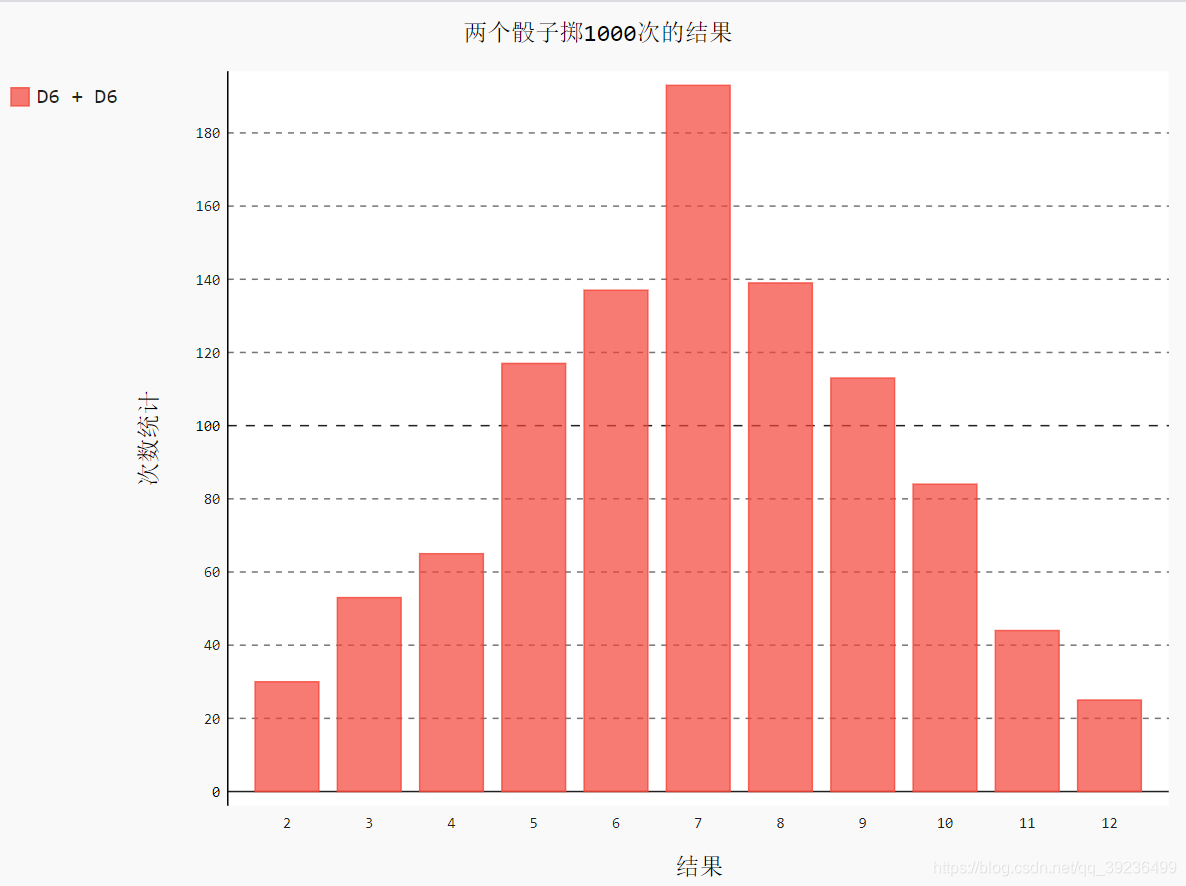
例4:同时掷两个骰子
from random import randint
import pygal
class Die():
    """表示一个骰子的类"""
    def __init__(self, num_sides=6):
        """骰子默认为6面"""
        self.num_sides = num_sides
    def roll(self):
        """返回一个位于1和骰子面数之间的随机值"""
        return randint(1, self.num_sides)
# 创建两个D6骰子
die_1 = Die()
die_2 = Die()
# 掷几次骰子,并将结果存储在一个列表中
results = []
for roll_num in range(1000):              # 掷骰子1000次
    result = die_1.roll() + die_2.roll()  # 两个骰子结果相加
    results.append(result)
# 分析结果
frequencies = []
sum_result = die_1.num_sides + die_2.num_sides
for value in range(2, sum_result+1):     # 遍历2到12
    frequency = results.count(value)     # 计算每个点出现的次数
    frequencies.append(frequency)        # 添加到列表中
print(frequencies)
# 对结果进行可视化
hist = pygal.Bar()                                   # 创建实例,存储在hist中
hist.title = "两个骰子掷1000次的结果"  # 标题
hist.x_labels = ['2', '3', '4', '5', '6', '7', '8', '9', '10', '11', '12']       # x轴标签
hist.x_title = "结果"
hist.y_title = "次数统计"
hist.add('D6 + D6', frequencies)                   # 传递要添加的值指定的标签
hist.render_to_file('die_visual.svg')                # 将图表渲染成.svg文件
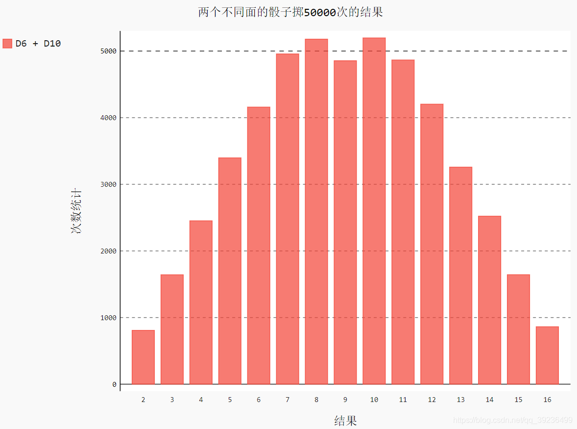
例5:同时掷两个面数不同的骰子
from random import randint
import pygal
class Die():
    """表示一个骰子的类"""
    def __init__(self, num_sides=6):
        """骰子默认为6面"""
        self.num_sides = num_sides
    def roll(self):
        """返回一个位于1和骰子面数之间的随机值"""
        return randint(1, self.num_sides)
# 创建两个骰子
die_1 = Die()    # 6面的骰子
die_2 = Die(10)  # 10面的骰子
# 掷几次骰子,并将结果存储在一个列表中
results = []
for roll_num in range(50000):
    result = die_1.roll() + die_2.roll()  # 两个骰子结果相加
    results.append(result)
# 分析结果
frequencies = []
sum_result = die_1.num_sides + die_2.num_sides
for value in range(2, sum_result+1):     # 遍历每个可能出现的点数
    frequency = results.count(value)     # 计算该点数出现的次数
    frequencies.append(frequency)        # 添加到列表中
print(frequencies)
# 对结果进行可视化
hist = pygal.Bar()                                   # 创建实例,存储在hist中
hist.title = "两个不同面的骰子掷50000次的结果"  # 标题
hist.x_labels = ['2', '3', '4', '5', '6', '7', '8', '9', '10',
                 '11', '12', '13', '14', '15', '16']       # x轴标签
hist.x_title = "结果"
hist.y_title = "次数统计"
hist.add('D6 + D10', frequencies)                   # 传递要添加的值指定的标签
hist.render_to_file('die_visual.svg')               # 将图表渲染成.svg文件
十八. 下载数据
18.1 csv文件
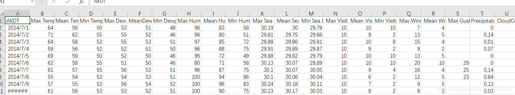
例1:分析CSV文件头
CSV文件其文件以纯文本的形式存储表格数据(数字和文本)。纯文本意味着该文件是一个字符序列,不含必须像二进制数字那样被解读的数据。
next()返回文件的下一行
import csv                              # 用于分析CSV文件中的数据行
filename = 'sitka_weather_07-2014.csv'
with open(filename) as f:               # 打开文件,并将结果文件对象存储在f中
    reader = csv.reader(f)              # 创建与该文件相关联的阅读器对象,并存储在reader中
    header_row = next(reader)           # 第一行
    print(header_row)                   # 输出显示第一行
数据太多这里剪切一部分

reader处理文件以逗号分隔第一行数据,并存储在列表中。
例2:打印文件头及其位置
为让文件头数据更容易理解,将列表中的每个文件头及其位置打印出来。
调用enumerate()来获取每个元素的索引及其值
import csv                              # 用于分析CSV文件中的数据行
filename = 'sitka_weather_07-2014.csv'
with open(filename) as f:               # 打开文件,并将结果文件对象存储在f中
    reader = csv.reader(f)              # 创建与该文件相关联的阅读器对象,并存储在reader中
    header_row = next(reader)           # 第一行
    for index, column_header in enumerate(header_row):  # 调用enumerate()来获取每个元素的索引及其值
        print(index, column_header)
这里截取一部分图

例3:提取并读取数据
阅读器对象从其停留的地方继续往下读取CSV文件,每次都自动返回当前所处位置的下一行,由于我们已经读取了文件头行,这个循环将从第二行开始,这行便是数据。
import csv                              # 用于分析CSV文件中的数据行
filename = 'sitka_weather_07-2014.csv'
with open(filename) as f:               # 打开文件,并将结果文件对象存储在f中
    reader = csv.reader(f)              # 创建与该文件相关联的阅读器对象,并存储在reader中
    header_row = next(reader)           # 第一行
    highs = []                          # 空列表
    for row in reader:                  # 遍历每行
        high = int(row[1])              # str转int
        highs.append(high)              # 每行的第1个元素,从第0个开始
    print(highs)


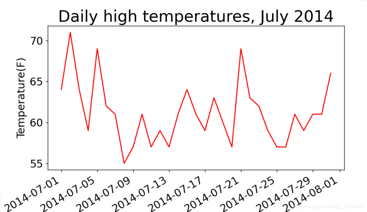
例:绘制气温图表
import csv                              # 用于分析CSV文件中的数据行
from matplotlib import pyplot as plt    # 画图需要
# 从文件中获取最高气温
filename = 'sitka_weather_07-2014.csv'
with open(filename) as f:               # 打开文件,并将结果文件对象存储在f中
    reader = csv.reader(f)              # 创建与该文件相关联的阅读器对象,并存储在reader中
    header_row = next(reader)           # 第一行
    highs = []                          # 空列表
    for row in reader:                  # 遍历每行
        high = int(row[1])
        highs.append(high)              # 每行的第1个元素,从第0个开始
    print(highs)
# 根据数据绘制图像
fig = plt.figure(dpi=128, figsize=(10, 6))  #设置图像大小尺寸
plt.plot(highs, c='red')
# 设置图形的格式
plt.title("Daily high temperatures, July 2014", fontsize=24)  # 标题
plt.xlabel('', fontsize=16)                                   # x轴
plt.ylabel("Temperature(F)", fontsize=16)                     # y轴
plt.tick_params(axis='both', which='major', labelsize=16)     # 刻度标记大小
plt.show()

datetime模块
from datetime import datetime
first_date = datetime.strptime('2014-7-1', '%Y-%m-%d')  # 第一个参数传入实参,第二个给设置的格式
print(first_date)
2014-07-01 00:00:00
‘%Y-’ 让python将字符串中第一个连字符前面的部分视为四位的年份;
‘%m-’ 让python将第二个连字符前面的部分视为表示月份的数字;
‘%d’ 让python将字符串的最后一部分视为月份中的一天
方法strptime()可接受各种实参,并根据它们来决定如何解读时期,下表列出这些实参:
| 实参 | 含义 |
| %A | 星期的名称,如Monday |
| %B | 月份名,如January |
| %m | 用数字表示的月份(01~12) |
| %d | 用数字表示的月份的一天(01~31) |
| %Y | 四位的年份,如2020 |
| %y | 两位的年份,如20 |
| %H | 24小时制的小时数(00~23) |
| %I | 12小时制的小时数(01~12) |
| %p | am或pm |
| %M | 分钟数(00~59) |
| %S | 秒数(00~61) |
例2:在图表中添加日期
import csv                              # 用于分析CSV文件中的数据行
from matplotlib import pyplot as plt    # 画图需要
from datetime import datetime           # 将字符串转换为对应日期需要
# 从文件中获取最高气温和日期
filename = 'sitka_weather_07-2014.csv'
with open(filename) as f:               # 打开文件,并将结果文件对象存储在f中
    reader = csv.reader(f)              # 创建与该文件相关联的阅读器对象,并存储在reader中
    header_row = next(reader)
    dates, highs = [], []               # 日期,最高温度初始化为空列表
    for row in reader:                  # 遍历每行
        current_date = datetime.strptime(row[0], "%Y-%m-%d")  # 每行第零个元素
        dates.append(current_date)      # 添加日期
        high = int(row[1])              # 最高温度转化为整型
        highs.append(high)              # 添加温度
# 根据数据绘制图像
fig = plt.figure(dpi=128, figsize=(10, 6))
plt.plot(dates, highs, c='red')
# 设置图形的格式
plt.title("Daily high temperatures, July 2014", fontsize=24)  # 标题
plt.xlabel('', fontsize=16)                                   # x轴
fig.autofmt_xdate()                                           # 绘制斜的x轴标签
plt.ylabel("Temperature(F)", fontsize=16)                     # y轴
plt.tick_params(axis='both', which='major', labelsize=16)     # 刻度标记大小
plt.show()
例3:添加更多数据,涵盖更长的时间
这里只是换了一个数据更多的文件,改了一个标题
import csv                              # 用于分析CSV文件中的数据行
from matplotlib import pyplot as plt    # 画图需要
from datetime import datetime           # 将字符串转换为对应日期需要
# 从文件中获取最高气温和日期
filename = 'sitka_weather_2014.csv'
with open(filename) as f:               # 打开文件,并将结果文件对象存储在f中
    reader = csv.reader(f)              # 创建与该文件相关联的阅读器对象,并存储在reader中
    header_row = next(reader)           # 第一行
    dates, highs = [], []               # 日期,最高温度初始化为空列表
    for row in reader:                  # 遍历每行
        current_date = datetime.strptime(row[0], "%Y-%m-%d")  # 每行第零个元素
        dates.append(current_date)      # 添加日期
        high = int(row[1])              # 最高温度转化为整型
        highs.append(high)              # 添加温度
# 根据数据绘制图像
fig = plt.figure(dpi=128, figsize=(10, 6))
plt.plot(dates, highs, c='red')
# 设置图形的格式
plt.title("Daily high temperatures - 2014", fontsize=24)      # 标题
plt.xlabel('', fontsize=16)                                   # x轴
fig.autofmt_xdate()                                           # 绘制斜的x轴标签
plt.ylabel("Temperature(F)", fontsize=16)                     # y轴
plt.tick_params(axis='both', which='major', labelsize=16)     # 刻度标记大小
plt.show()

例4:再绘制一个数据系列
这里多绘制了一个最低温度
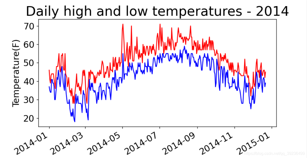
import csv                              # 用于分析CSV文件中的数据行
from matplotlib import pyplot as plt    # 画图需要
from datetime import datetime           # 将字符串转换为对应日期需要
# 从文件中获取最高气温,最低温度和日期
filename = 'sitka_weather_2014.csv'
with open(filename) as f:               # 打开文件,并将结果文件对象存储在f中
    reader = csv.reader(f)              # 创建与该文件相关联的阅读器对象,并存储在reader中
    header_row = next(reader)           # 第一行
    dates, highs, lows = [], [], []     # 日期,最高温度初始化为空列表
    for row in reader:                  # 遍历每行
        current_date = datetime.strptime(row[0], "%Y-%m-%d")  # 每行第零个元素
        dates.append(current_date)      # 添加日期
        high = int(row[1])              # 最高温度转化为整型
        highs.append(high)              # 添加温度
        low = int(row[3])
        lows.append(low)
# 根据数据绘制图像
fig = plt.figure(dpi=128, figsize=(10, 6))
plt.plot(dates, highs, c='red')
plt.plot(dates, lows, c='blue')
# 设置图形的格式
plt.title("Daily high and low temperatures - 2014", fontsize=24)  # 标题
plt.xlabel('', fontsize=16)                                       # x轴
fig.autofmt_xdate()                                               # 绘制斜的x轴标签
plt.ylabel("Temperature(F)", fontsize=16)                         # y轴
plt.tick_params(axis='both', which='major', labelsize=16)         # 刻度标记大小
plt.show()
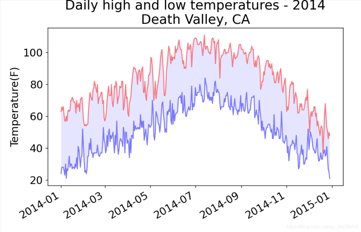
例5:给图表区域着色
import csv                              # 用于分析CSV文件中的数据行
from matplotlib import pyplot as plt    # 画图需要
from datetime import datetime           # 将字符串转换为对应日期需要
# 从文件中获取最高气温,最低温度和日期
filename = 'sitka_weather_2014.csv'
with open(filename) as f:               # 打开文件,并将结果文件对象存储在f中
    reader = csv.reader(f)              # 创建与该文件相关联的阅读器对象,并存储在reader中
    header_row = next(reader)           # 第一行
    dates, highs, lows = [], [], []     # 日期,最高温度初始化为空列表
    for row in reader:                  # 遍历每行
        current_date = datetime.strptime(row[0], "%Y-%m-%d")  # 每行第零个元素
        dates.append(current_date)      # 添加日期
        high = int(row[1])              # 最高温度转化为整型
        highs.append(high)              # 添加温度
        low = int(row[3])
        lows.append(low)
# 根据数据绘制图像
fig = plt.figure(dpi=128, figsize=(10, 6))
plt.plot(dates, highs, c='red', alpha=0.5)   # alpha指定颜色的透明度,使得红色和蓝色折线看起来更浅
plt.plot(dates, lows, c='blue', alpha=0.5)
plt.fill_between(dates, highs, lows, facecolor='blue', alpha=0.1)  # 两条线之间填充蓝色,透明度0.1
# 设置图形的格式
plt.title("Daily high and low temperatures - 2014", fontsize=24)  # 标题
plt.xlabel('', fontsize=16)                                       # x轴
fig.autofmt_xdate()                                               # 绘制斜的x轴标签
plt.ylabel("Temperature(F)", fontsize=16)                         # y轴
plt.tick_params(axis='both', which='major', labelsize=16)         # 刻度标记大小
plt.show()

例6:错误检查
有些文档可能数据不全,缺失数据可能引起异常
例如换这个文档

这个文档数据不全

这里就需要修改代码,如下:
import csv                              # 用于分析CSV文件中的数据行
from matplotlib import pyplot as plt    # 画图需要
from datetime import datetime           # 将字符串转换为对应日期需要
# 从文件中获取最高气温,最低温度和日期
filename = 'death_valley_2014.csv'
with open(filename) as f:               # 打开文件,并将结果文件对象存储在f中
    reader = csv.reader(f)              # 创建与该文件相关联的阅读器对象,并存储在reader中
    header_row = next(reader)           # 第一行
    dates, highs, lows = [], [], []     # 日期,最高温度初始化为空列表
    for row in reader:                  # 遍历每行
        try:
            current_date = datetime.strptime(row[0], "%Y-%m-%d")  # 每行第零个元素
            high = int(row[1])  # 最高温度转化为整型
            low = int(row[3])
        except ValueError:
            print(current_date, 'missing data')
        else:
            dates.append(current_date)      # 添加日期
            highs.append(high)              # 添加温度
            lows.append(low)
# 根据数据绘制图像
fig = plt.figure(dpi=128, figsize=(10, 6))
plt.plot(dates, highs, c='red', alpha=0.5)   # alpha指定颜色的透明度,使得红色和蓝色折线看起来更浅
plt.plot(dates, lows, c='blue', alpha=0.5)
plt.fill_between(dates, highs, lows, facecolor='blue', alpha=0.1)  # 两条线之间填充蓝色,透明度0.1
# 设置图形的格式
title = 'Daily high and low temperatures - 2014\nDeath Valley, CA'
plt.title(title, fontsize=20)  # 标题
plt.xlabel('', fontsize=16)                                       # x轴
fig.autofmt_xdate()                                               # 绘制斜的x轴标签
plt.ylabel("Temperature(F)", fontsize=16)                         # y轴
plt.tick_params(axis='both', which='major', labelsize=16)         # 刻度标记大小
plt.show()

18.2 json文件
例:存
import json
numbers = [1, 3, 5, 7, 9]
filename = "numbers.json"
with open(filename, 'w') as f_obj:
    json.dump(numbers, f_obj)
例:取
import json
filename = "numbers.json"
with open(filename) as f_obj:
    numbers = json.load(f_obj)
print(numbers)
[1, 3, 5, 7, 9]
例1:从数据地址下载json文件,这里从GitHub上下载
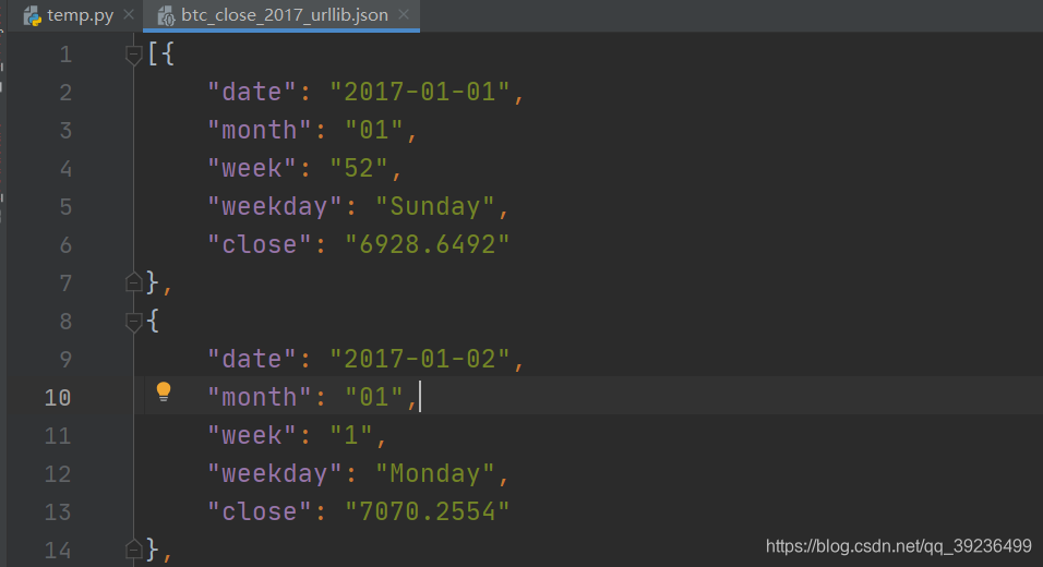
from __future__ import (absolute_import, division, print_function, unicode_literals)
from urllib.request import urlopen
import json
# 网址:the url
json_url = 'https://raw.githubusercontent.com/muxuezi/btc/master/btc_close_2017.json'
response = urlopen(json_url)
req = response.read()                                # 读取数据
with open('btc_close_2017_urllib.json', 'wb') as f:  # 将数据写入文件
    f.write(req)
file_urllib = json.loads(req)                        # 加载json格式
print(file_urllib)
下载得到的数据:
例2:第二种下载方法requests
import requests
# 网址:the url
json_url = 'https://raw.githubusercontent.com/muxuezi/btc/master/btc_close_2017.json'
req = requests.get(json_url)                           # 读取数据
with open('btc_close_2017_urllib.json', 'w') as f:     # 将数据写入文件
    f.write(req.text)
file_requests = req.json()
例3:从下载得到的文件中提取数据
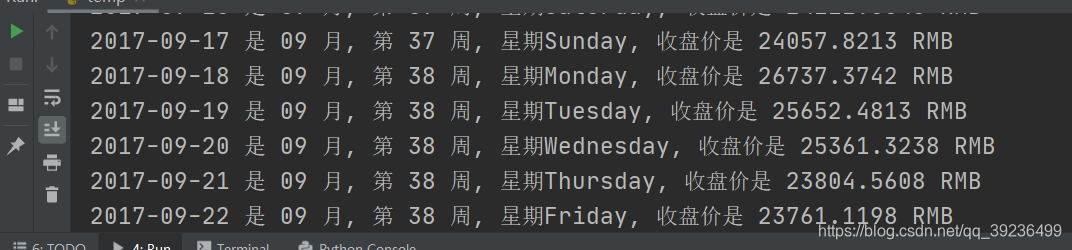
import json
"""文件中的数据是多个字典,字典都包含相同的键,对应不同的值,这里遍历所有字典,输出每个字典里键对应的值"""
# 将数据加载到一个列表中
filename = 'btc_close_2017_urllib.json'  # 文件
with open(filename) as f:                # 打开文件
    btc_data = json.load(f)              # 加载文件
# 打印每一天的信息
for btc_dict in btc_data:                # 遍历字典
    date = btc_dict['date']              # 每个字典中都有,日期
    month = btc_dict['month']            # 月份
    week = btc_dict['week']              # 周
    weekday = btc_dict['weekday']        # 周末
    close = btc_dict['close']            # 收盘价
    print("{} 是 {} 月, 第 {} 周, 星期{}, 收盘价是 {} RMB".format(date, month, week, weekday, close))
数据太多,部分如下
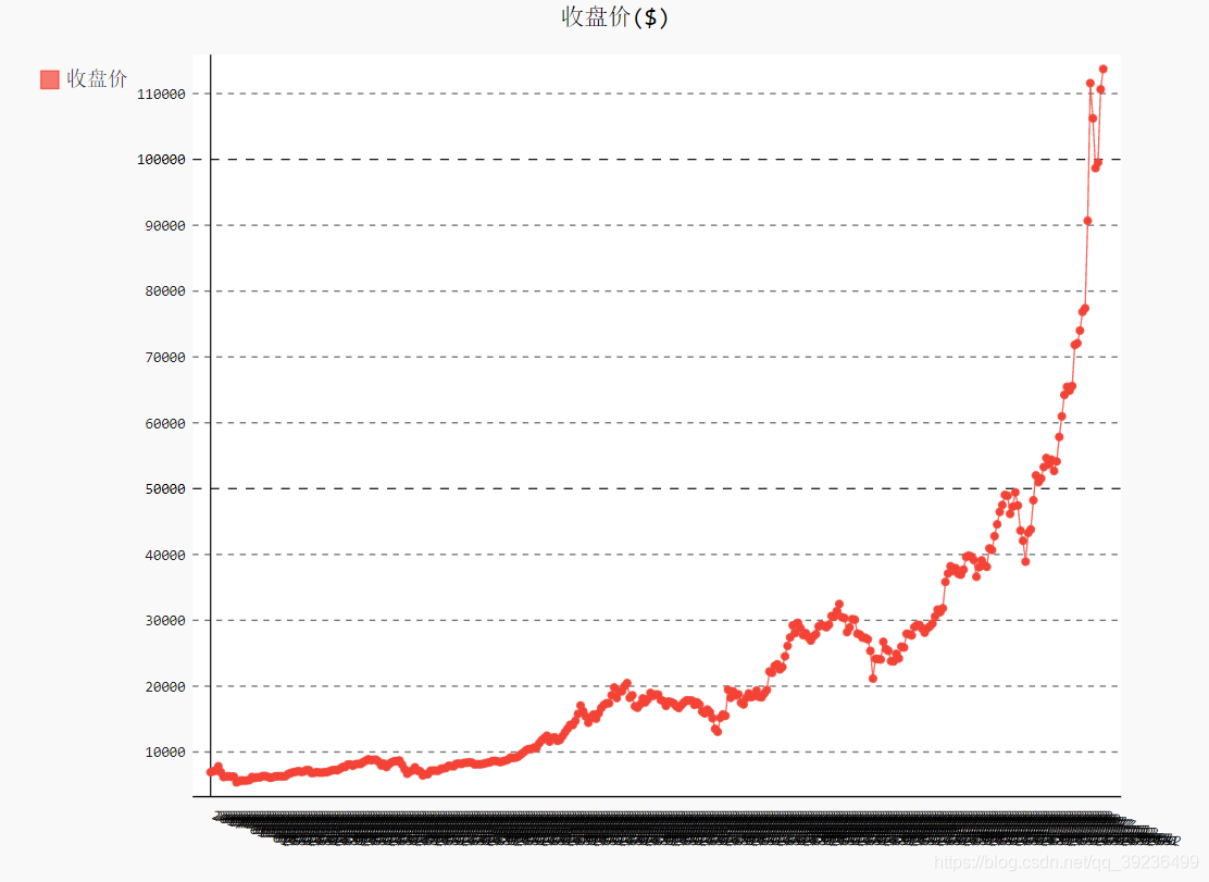
例4:收盘价
import json
import pygal
"""文件中的数据是多个字典,字典都包含相同的键,对应不同的值,这里遍历所有字典,输出每个字典里键对应的值"""
# 将数据加载到一个列表中
filename = 'btc_close_2017_urllib.json'  # 文件
with open(filename) as f:                # 打开文件
    btc_data = json.load(f)              # 加载文件
# 打印每一天的信息
for btc_dict in btc_data:                # 遍历字典
    date = btc_dict['date']              # 每个字典中都有,日期
    month = int(btc_dict['month'])            # 月份
    week = int(btc_dict['week'])              # 周
    weekday = btc_dict['weekday']             # 周末
    close = int(float(btc_dict['close']))     # 收盘价
    print("{} 是 {} 月, 第 {} 周, 星期{}, 收盘价是 {} RMB".format(date, month, week, weekday, close))
# 创建5个列表,分别存储日期和收盘价
dates = []
months = []
weeks = []
weekdays = []
close = []
# 每一天的信息
for btc_dict in btc_data:
    dates.append(btc_dict['date'])
    months.append(int(btc_dict['month']))
    weeks.append(int(btc_dict['week']))
    weekdays.append(btc_dict['weekday'])
    close.append(int(float(btc_dict['close'])))
line_chart = pygal.Line(x_label_rotation=20, show_minoe_x_labels=False)
line_chart.title = '收盘价($)'
line_chart.x_labels = dates
N = 20   # x轴坐标每隔20天显示一次
line_chart.x_labels_major = dates[::N]
line_chart.add('收盘价', close)
line_chart.render_to_file('收盘价折线图($).svg')
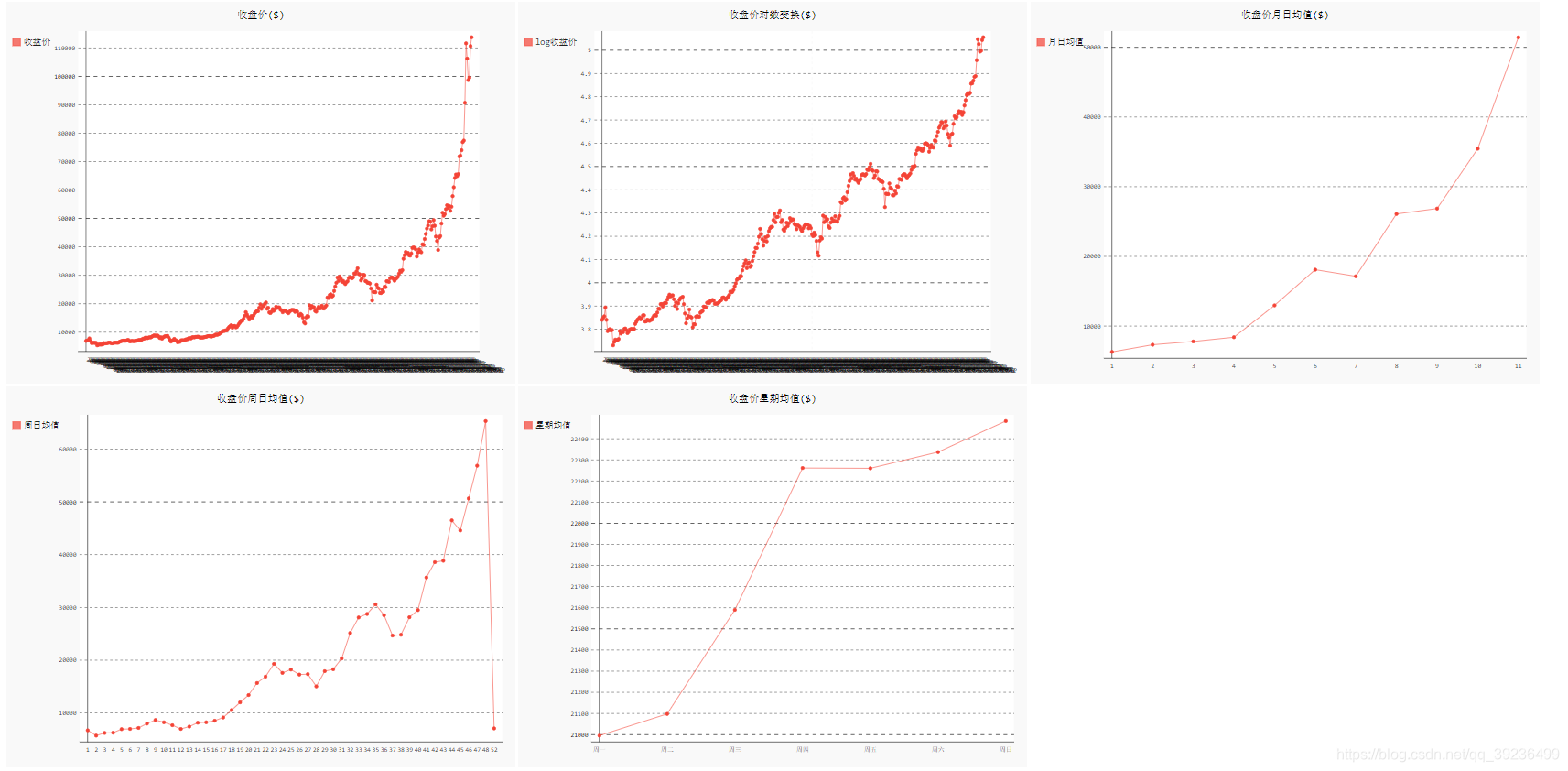
例5:收盘价对数变换折线图
import json
import pygal
import math
from itertools import groupby
"""文件中的数据是多个字典,字典都包含相同的键,对应不同的值,这里遍历所有字典,输出每个字典里键对应的值"""
# 将数据加载到一个列表中
filename = 'btc_close_2017_urllib.json'  # 文件
with open(filename) as f:                # 打开文件
    btc_data = json.load(f)              # 加载文件
# 打印每一天的信息
for btc_dict in btc_data:                # 遍历字典
    date = btc_dict['date']              # 每个字典中都有,日期
    month = int(btc_dict['month'])            # 月份
    week = int(btc_dict['week'])              # 周
    weekday = btc_dict['weekday']             # 周末
    close = int(float(btc_dict['close']))     # 收盘价
    print("{} 是 {} 月, 第 {} 周, 星期{}, 收盘价是 {} RMB".format(date, month, week, weekday, close))
# 创建5个列表,分别存储日期和收盘价
dates = []
months = []
weeks = []
weekdays = []
close = []
# 每一天的信息
for btc_dict in btc_data:
    dates.append(btc_dict['date'])
    months.append(int(btc_dict['month']))
    weeks.append(int(btc_dict['week']))
    weekdays.append(btc_dict['weekday'])
    close.append(int(float(btc_dict['close'])))
"""收盘价折线图"""
line_chart = pygal.Line(x_label_rotation=20, show_minoe_x_labels=False)
line_chart.title = '收盘价($)'
line_chart.x_labels = dates
N = 20   # x轴坐标每隔20天显示一次
line_chart.x_labels_major = dates[::N]
line_chart.add('收盘价', close)
line_chart.render_to_file('收盘价折线图($).svg')
"""收盘价对数变换折线图"""
line_chart = pygal.Line(x_label_rotation=20, show_minoe_x_labels=False)
line_chart.title = '收盘价对数变换($)'
line_chart.x_labels = dates
N = 20   # x轴坐标每隔20天显示一次
line_chart.x_labels_major = dates[::N]
close_log = [math.log10(_) for _ in close]    # 这里不一样
line_chart.add('log收盘价', close_log)
line_chart.render_to_file('收盘价对数变换折线图($).svg')

例6:收盘价周日均值和收盘价星期均值
import json
import pygal
import math
from itertools import groupby
"""文件中的数据是多个字典,字典都包含相同的键,对应不同的值,这里遍历所有字典,输出每个字典里键对应的值"""
# 将数据加载到一个列表中
filename = 'btc_close_2017_urllib.json'  # 文件
with open(filename) as f:                # 打开文件
    btc_data = json.load(f)              # 加载文件
# 打印每一天的信息
for btc_dict in btc_data:                # 遍历字典
    date = btc_dict['date']              # 每个字典中都有,日期
    month = int(btc_dict['month'])            # 月份
    week = int(btc_dict['week'])              # 周
    weekday = btc_dict['weekday']             # 周末
    close = int(float(btc_dict['close']))     # 收盘价
    print("{} 是 {} 月, 第 {} 周, 星期{}, 收盘价是 {} RMB".format(date, month, week, weekday, close))
# 创建5个列表,分别存储日期和收盘价
dates = []
months = []
weeks = []
weekdays = []
close = []
# 每一天的信息
for btc_dict in btc_data:
    dates.append(btc_dict['date'])
    months.append(int(btc_dict['month']))
    weeks.append(int(btc_dict['week']))
    weekdays.append(btc_dict['weekday'])
    close.append(int(float(btc_dict['close'])))
"""收盘价折线图"""
line_chart = pygal.Line(x_label_rotation=20, show_minoe_x_labels=False)
line_chart.title = '收盘价($)'
line_chart.x_labels = dates
N = 20   # x轴坐标每隔20天显示一次
line_chart.x_labels_major = dates[::N]
line_chart.add('收盘价', close)
line_chart.render_to_file('收盘价折线图($).svg')
"""收盘价对数变换折线图"""
line_chart = pygal.Line(x_label_rotation=20, show_minoe_x_labels=False)
line_chart.title = '收盘价对数变换($)'
line_chart.x_labels = dates
N = 20   # x轴坐标每隔20天显示一次
line_chart.x_labels_major = dates[::N]
close_log = [math.log10(_) for _ in close]
line_chart.add('log收盘价', close_log)
line_chart.render_to_file('收盘价对数变换折线图($).svg')
def draw_line(x_data, y_data, title, y_legend):
    xy_map = []
    for x, y in groupby(sorted(zip(x_data, y_data)), key=lambda _: _[0]):
        y_list = [v for _, v in y]
        xy_map.append([x, sum(y_list) / len(y_list)])
    x_unique, y_mean = [*zip(*xy_map)]
    line_chart = pygal.Line()           # 画图
    line_chart.title = title            # 设置标题
    line_chart.x_labels = x_unique
    line_chart.add(y_legend, y_mean)    # 添加了Y轴标签
    line_chart.render_to_file(title+'.svg')  # 保存为.svg文件
    return line_chart
idx_month = dates.index('2017-12-01')
line_chart_month = draw_line(months[:idx_month], close[:idx_month],
                             '收盘价月日均值($)', '月日均值')
line_chart_month
inx_week = dates.index('2017-12-01')
line_chart_week = draw_line(weeks[:idx_month], close[1:idx_month],
                            '收盘价周日均值($)', '周日均值')
line_chart_week
idx_week = dates.index('2017-12-11')
wd = ['Monday', 'Tuesday', 'Wednesday',
      'Thursday', 'Friday', 'Saturday', 'Sunday']
weekdays_int = [wd.index(w) + 1 for w in weekdays[1:idx_week]]
line_chart_weekday = draw_line(
    weekdays_int, close[1:idx_week], '收盘价星期均值($)', '星期均值')
line_chart_weekday.x_labels = ['周一', '周二', '周三', '周四', '周五', '周六', '周日']
line_chart_weekday.render_to_file('收盘价星期均值($).svg')
line_chart_weekday
这里图就不贴了
最后:收盘价数据仪表盘
import json
import pygal
import math
from itertools import groupby
"""文件中的数据是多个字典,字典都包含相同的键,对应不同的值,这里遍历所有字典,输出每个字典里键对应的值"""
# 将数据加载到一个列表中
filename = 'btc_close_2017_urllib.json'  # 文件
with open(filename) as f:                # 打开文件
    btc_data = json.load(f)              # 加载文件
# 打印每一天的信息
for btc_dict in btc_data:                # 遍历字典
    date = btc_dict['date']              # 每个字典中都有,日期
    month = int(btc_dict['month'])            # 月份
    week = int(btc_dict['week'])              # 周
    weekday = btc_dict['weekday']             # 周末
    close = int(float(btc_dict['close']))     # 收盘价
    print("{} 是 {} 月, 第 {} 周, 星期{}, 收盘价是 {} RMB".format(date, month, week, weekday, close))
# 创建5个列表,分别存储日期和收盘价
dates = []
months = []
weeks = []
weekdays = []
close = []
# 每一天的信息
for btc_dict in btc_data:
    dates.append(btc_dict['date'])
    months.append(int(btc_dict['month']))
    weeks.append(int(btc_dict['week']))
    weekdays.append(btc_dict['weekday'])
    close.append(int(float(btc_dict['close'])))
"""收盘价折线图"""
line_chart = pygal.Line(x_label_rotation=20, show_minoe_x_labels=False)
line_chart.title = '收盘价($)'
line_chart.x_labels = dates
N = 20   # x轴坐标每隔20天显示一次
line_chart.x_labels_major = dates[::N]
line_chart.add('收盘价', close)
line_chart.render_to_file('收盘价折线图($).svg')
"""收盘价对数变换折线图"""
line_chart = pygal.Line(x_label_rotation=20, show_minoe_x_labels=False)
line_chart.title = '收盘价对数变换($)'
line_chart.x_labels = dates
N = 20   # x轴坐标每隔20天显示一次
line_chart.x_labels_major = dates[::N]
close_log = [math.log10(_) for _ in close]
line_chart.add('log收盘价', close_log)
line_chart.render_to_file('收盘价对数变换折线图($).svg')
def draw_line(x_data, y_data, title, y_legend):
    xy_map = []
    for x, y in groupby(sorted(zip(x_data, y_data)), key=lambda _: _[0]):
        y_list = [v for _, v in y]
        xy_map.append([x, sum(y_list) / len(y_list)])
    x_unique, y_mean = [*zip(*xy_map)]
    line_chart = pygal.Line()           # 画图
    line_chart.title = title            # 设置标题
    line_chart.x_labels = x_unique
    line_chart.add(y_legend, y_mean)    # 添加了Y轴标签
    line_chart.render_to_file(title+'.svg')  # 保存为.svg文件
    return line_chart
idx_month = dates.index('2017-12-01')
line_chart_month = draw_line(months[:idx_month], close[:idx_month],
                             '收盘价月日均值($)', '月日均值')
line_chart_month
inx_week = dates.index('2017-12-01')
line_chart_week = draw_line(weeks[:idx_month], close[1:idx_month],
                            '收盘价周日均值($)', '周日均值')
line_chart_week
idx_week = dates.index('2017-12-11')
wd = ['Monday', 'Tuesday', 'Wednesday',
      'Thursday', 'Friday', 'Saturday', 'Sunday']
weekdays_int = [wd.index(w) + 1 for w in weekdays[1:idx_week]]
line_chart_weekday = draw_line(
    weekdays_int, close[1:idx_week], '收盘价星期均值($)', '星期均值')
line_chart_weekday.x_labels = ['周一', '周二', '周三', '周四', '周五', '周六', '周日']
line_chart_weekday.render_to_file('收盘价星期均值($).svg')
line_chart_weekday
with open('收盘价Dashboard.html', 'w', encoding='utf8') as html_file:
    html_file.write(
        '<html><head><title>收盘价Dashboard</title><meta charset="utf-8"></head><body>\n')
    for svg in [
            '收盘价折线图($).svg', '收盘价对数变换折线图($).svg', '收盘价月日均值($).svg',
            '收盘价周日均值($).svg', '收盘价星期均值($).svg'
    ]:
        html_file.write(
            '    <object type="image/svg+xml" data="{0}" height=500></object>\n'.format(svg))  # 1
    html_file.write('</body></html>')
相当于把上面得到的五张图放在一个HTML文件中
十九. 使用API
19.1 requests
例:找出GitHub中星级最高的python项目
1、先查看能否成功响应
import requests
# 执行API调用并存储响应
url = "https://api.github.com/search/repositories?q=language:python&sort=stars"
r = requests.get(url)
print("Status code:", r.status_code)  # 状态码
# 将API响应存储在一个变量中
response_dict = r.json()
# 处理结果
print(response_dict.keys())
Status code: 200
dict_keys(['total_count', 'incomplete_results', 'items'])
2、处理响应字典
import requests
# 执行API调用并存储响应
url = "https://api.github.com/search/repositories?q=language:python&sort=stars"
r = requests.get(url)
print("Status code:", r.status_code)  # 状态码
# 将API响应存储在一个变量中
response_dict = r.json()
print("Total repositories:", response_dict['total_count'])
# 探索有关仓库的信息
repo_dicts = response_dict['items']
print("Repositories returned:", len(repo_dicts))  # 打印有多少个仓库数,也就是python项目数
# 研究第一个仓库
repo_dict = repo_dicts[0]
print("\nKeys:", len(repo_dict))
for key in sorted(repo_dict.keys()):  # 排序打印
    print(key)

3、继续研究第一个项目
# 研究第一个仓库
repo_dict = repo_dicts[0]
print("\nSelected information about first repository:")
print("Name:", repo_dict['name'])                # 项目名字
print("Owner:", repo_dict['owner']['login'])     # 所有者
print("Stars:", repo_dict['stargazers_count'])   # 星数
print("Repository:", repo_dict['html_url'])      # 地址
print("Created:", repo_dict['created_at'])       # 创建时间
print("Updated:", repo_dict['updated_at'])       # 修改时间
print("Description:", repo_dict['description'])  # 项目描述
Status code: 200
Total repositories: 8901091
Repositories returned: 30
Selected information about first repository:
Name: public-apis
Owner: public-apis
Stars: 213233
Repository: https://github.com/public-apis/public-apis
Created: 2016-03-20T23:49:42Z
Updated: 2022-10-28T02:38:42Z
Description: A collective list of free APIs
4、使用Pygal可视化仓库
import requests
import pygal
from pygal.style import LightColorizedStyle as LCS, LightenStyle as LS
# 执行API调用并存储响应
url = "https://api.github.com/search/repositories?q=language:python&sort=stars"
r = requests.get(url)
print("Status code:", r.status_code)  # 状态码
# 将API响应存储在一个变量中
response_dict = r.json()
print("Total repositories:", response_dict['total_count'])
# 探索有关仓库的信息
repo_dicts = response_dict['items']
names, stars = [], []
for repo_dict in repo_dicts:
    names.append(repo_dict['name'])
    stars.append(repo_dict['stargazers_count'])
# 可视化
my_style = LS('#333366', base_style=LCS)
chart = pygal.Bar(style=my_style, x_label_rotation=45, show_legend=False) # 第二参数标签旋转,第三参数隐藏图例
chart.title = "Most-Starred Python Projects on GitHub"
chart.x_labels = names
chart.add('', stars)
chart.render_to_file('python_repos.svg')

5、调整图像
# 可视化
my_style = LS('#333366', base_style=LCS)
my_config = pygal.Config()
my_config.x_label_rotation = 45
my_config.show_legend = False
my_config.title_font_size = 24
my_config.label_font_size = 14
my_config.major_label_font_size = 18
my_config.truncate_label = 15
my_config.show_y_guides = False
my_config.width = 1000
chart = pygal.Bar(my_config, style=my_style)
chart.title = "Most-Starred Python Projects on GitHub"
chart.x_labels = names
chart.add('', stars)
chart.render_to_file('python_repos.svg')