三、核心组件深度剖析
3.1 表单组件 Form
Form是shadcn/ui最强大的组件之一,它与React Hook Form和Zod深度集成,提供了类型安全、声明式的表单验证体验。
完整代码示例:
import { useForm } from 'react-hook-form';
import { zodResolver } from '@hookform/resolvers/zod';
import { z } from 'zod';
import { Form, FormControl, FormDescription, FormField, FormItem, FormLabel, FormMessage } from '@/components/ui/form';
import { Input } from '@/components/ui/input';
import { Button } from '@/components/ui/button';
import { Checkbox } from '@/components/ui/checkbox';
import { Select, SelectContent, SelectItem, SelectTrigger, SelectValue } from '@/components/ui/select';

// 1. 定义Zod验证schema
const profileFormSchema = z.object({
  name: z.string()
    .min(2, '姓名至少需要2个字符')
    .max(50, '姓名不能超过50个字符'),
  email: z.string()
    .email('请输入有效的邮箱地址'),
  role: z.enum(['admin', 'user', 'guest'], {
    required_error: '请选择用户角色',
  }),
  terms: z.boolean()
    .refine(val => val === true, '请同意服务条款'),
});

type ProfileFormValues = z.infer<typeof profileFormSchema>;

// 2. 默认值
const defaultValues: Partial<ProfileFormValues> = {
  name: '',
  email: '',
  role: 'user',
  terms: false,
};

export function ProfileForm() {
  const form = useForm<ProfileFormValues>({
    resolver: zodResolver(profileFormSchema),
    defaultValues,
  });

  function onSubmit(data: ProfileFormValues) {
    // data是类型安全、已验证的数据
    console.log('提交的数据:', data);
  }

  return (
    <Form {...form}>
      <form onSubmit={form.handleSubmit(onSubmit)} className="space-y-6">
        {/* 文本输入框 */}
        <FormField
          control={form.control}
          name="name"
          render={({ field }) => (
            <FormItem>
              <FormLabel>姓名</FormLabel>
              <FormControl>
                <Input placeholder="张三" {...field} />
              </FormControl>
              <FormDescription>
                请输入您的真实姓名,这将用于身份验证。
              </FormDescription>
              <FormMessage />
            </FormItem>
          )}
        />

        {/* 邮箱输入框 */}
        <FormField
          control={form.control}
          name="email"
          render={({ field }) => (
            <FormItem>
              <FormLabel>邮箱</FormLabel>
              <FormControl>
                <Input type="email" placeholder="zhang@example.com" {...field} />
              </FormControl>
              <FormMessage />
            </FormItem>
          )}
        />

        {/* 下拉选择框 */}
        <FormField
          control={form.control}
          name="role"
          render={({ field }) => (
            <FormItem>
              <FormLabel>角色</FormLabel>
              <Select onValueChange={field.onChange} defaultValue={field.value}>
                <FormControl>
                  <SelectTrigger>
                    <SelectValue placeholder="请选择用户角色" />
                  </SelectTrigger>
                </FormControl>
                <SelectContent>
                  <SelectItem value="admin">管理员</SelectItem>
                  <SelectItem value="user">普通用户</SelectItem>
                  <SelectItem value="guest">访客</SelectItem>
                </SelectContent>
              </Select>
              <FormMessage />
            </FormItem>
          )}
        />

        {/* 复选框 */}
        <FormField
          control={form.control}
          name="terms"
          render={({ field }) => (
            <FormItem className="flex flex-row items-start space-x-3 space-y-0">
              <FormControl>
                <Checkbox
                  checked={field.value}
                  onCheckedChange={field.onChange}
                />
              </FormControl>
              <div className="space-y-1 leading-none">
                <FormLabel>同意服务条款</FormLabel>
                <FormDescription>
                  我已阅读并同意用户服务协议和隐私政策。
                </FormDescription>
              </div>
              <FormMessage />
            </FormItem>
          )}
        />

        <Button type="submit">更新资料</Button>
      </form>
    </Form>
  );
}
Form组件的核心价值: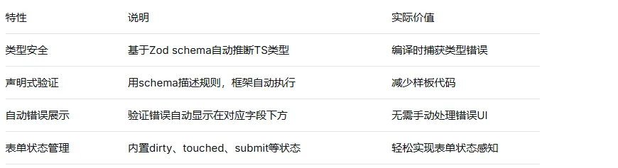
3.2 数据表格组件 DataTable
DataTable基于TanStack Table构建,提供了开箱即用的排序、过滤、分页功能。
完整代码示例:
import * as React from 'react';
import {
  ColumnDef,
  ColumnFiltersState,
  SortingState,
  VisibilityState,
  flexRender,
  getCoreRowModel,
  getFilteredRowModel,
  getPaginationRowModel,
  getSortedRowModel,
  useReactTable,
} from '@tanstack/react-table';
import { ArrowUpDown, ChevronDown, MoreHorizontal } from 'lucide-react';

import { Button } from '@/components/ui/button';
import { Checkbox } from '@/components/ui/checkbox';
import {
  DropdownMenu,
  DropdownMenuContent,
  DropdownMenuItem,
  DropdownMenuLabel,
  DropdownMenuSeparator,
  DropdownMenuTrigger,
} from '@/components/ui/dropdown-menu';
import { Input } from '@/components/ui/input';
import {
  Table,
  TableBody,
  TableCell,
  TableHead,
  TableHeader,
  TableRow,
} from '@/components/ui/table';
import { Badge } from '@/components/ui/badge';

// 数据类型定义
type Payment = {
  id: string;
  amount: number;
  status: 'pending' | 'processing' | 'success' | 'failed';
  email: string;
};

// 模拟数据
const data: Payment[] = [
  { id: 'INV001', amount: 250, status: 'pending', email: 'user1@example.com' },
  { id: 'INV002', amount: 350, status: 'processing', email: 'user2@example.com' },
  { id: 'INV003', amount: 450, status: 'success', email: 'user3@example.com' },
  { id: 'INV004', amount: 550, status: 'failed', email: 'user4@example.com' },
  // ... 更多数据
];

// 列定义(核心)
const columns: ColumnDef<Payment>[] = [
  {
    id: 'select',
    header: ({ table }) => (
      <Checkbox
        checked={table.getIsAllPageRowsSelected()}
        onCheckedChange={(value) => table.toggleAllPageRowsSelected(!!value)}
        aria-label="全选"
      />
    ),
    cell: ({ row }) => (
      <Checkbox
        checked={row.getIsSelected()}
        onCheckedChange={(value) => row.toggleSelected(!!value)}
        aria-label="选择"
      />
    ),
    enableSorting: false,
    enableHiding: false,
  },
  {
    accessorKey: 'id',
    header: '订单号',
    cell: ({ row }) => <div className="font-medium">{row.getValue('id')}</div>,
  },
  {
    accessorKey: 'amount',
    header: ({ column }) => (
      <Button
        variant="ghost"
        onClick={() => column.toggleSorting(column.getIsSorted() === 'asc')}
      >
        金额
        <ArrowUpDown className="ml-2 h-4 w-4" />
      </Button>
    ),
    cell: ({ row }) => {
      const amount = parseFloat(row.getValue('amount'));
      const formatted = new Intl.NumberFormat('zh-CN', {
        style: 'currency',
        currency: 'CNY',
      }).format(amount);
      return <div className="text-right">{formatted}</div>;
    },
  },
  {
    accessorKey: 'status',
    header: '状态',
    cell: ({ row }) => {
      const status = row.getValue('status') as string;
      const statusMap = {
        pending: { label: '待处理', variant: 'secondary' },
        processing: { label: '处理中', variant: 'default' },
        success: { label: '成功', variant: 'success' },
        failed: { label: '失败', variant: 'destructive' },
      };
      const { label, variant } = statusMap[status as keyof typeof statusMap];
      return <Badge variant={variant as any}>{label}</Badge>;
    },
  },
  {
    accessorKey: 'email',
    header: ({ column }) => (
      <Button
        variant="ghost"
        onClick={() => column.toggleSorting(column.getIsSorted() === 'asc')}
      >
        邮箱
        <ArrowUpDown className="ml-2 h-4 w-4" />
      </Button>
    ),
  },
  {
    id: 'actions',
    cell: ({ row }) => {
      const payment = row.original;

      return (
        <DropdownMenu>
          <DropdownMenuTrigger asChild>
            <Button variant="ghost" className="h-8 w-8 p-0">
              <span className="sr-only">打开菜单</span>
              <MoreHorizontal className="h-4 w-4" />
            </Button>
          </DropdownMenuTrigger>
          <DropdownMenuContent align="end">
            <DropdownMenuLabel>操作</DropdownMenuLabel>
            <DropdownMenuItem onClick={() => navigator.clipboard.writeText(payment.id)}>
              复制订单号
            </DropdownMenuItem>
            <DropdownMenuSeparator />
            <DropdownMenuItem>查看详情</DropdownMenuItem>
            <DropdownMenuItem>修改状态</DropdownMenuItem>
          </DropdownMenuContent>
        </DropdownMenu>
      );
    },
  },
];

export function PaymentsTable() {
  const [sorting, setSorting] = React.useState<SortingState>([]);
  const [columnFilters, setColumnFilters] = React.useState<ColumnFiltersState>([]);
  const [columnVisibility, setColumnVisibility] = React.useState<VisibilityState>({});
  const [rowSelection, setRowSelection] = React.useState({});

  const table = useReactTable({
    data,
    columns,
    onSortingChange: setSorting,
    onColumnFiltersChange: setColumnFilters,
    getCoreRowModel: getCoreRowModel(),
    getPaginationRowModel: getPaginationRowModel(),
    getSortedRowModel: getSortedRowModel(),
    getFilteredRowModel: getFilteredRowModel(),
    onColumnVisibilityChange: setColumnVisibility,
    onRowSelectionChange: setRowSelection,
    state: {
      sorting,
      columnFilters,
      columnVisibility,
      rowSelection,
    },
  });

  return (
    <div className="w-full">
      {/* 搜索过滤 */}
      <div className="flex items-center py-4">
        <Input
          placeholder="按邮箱筛选..."
          value={(table.getColumn('email')?.getFilterValue() as string) ?? ''}
          onChange={(event) =>
            table.getColumn('email')?.setFilterValue(event.target.value)
          }
          className="max-w-sm"
        />
        <DropdownMenu>
          <DropdownMenuTrigger asChild>
            <Button variant="outline" className="ml-auto">
              显示列 <ChevronDown className="ml-2 h-4 w-4" />
            </Button>
          </DropdownMenuTrigger>
          <DropdownMenuContent align="end">
            {table
              .getAllColumns()
              .filter((column) => column.getCanHide())
              .map((column) => (
                <DropdownMenuItem
                  key={column.id}
                  className="capitalize"
                  onSelect={() => column.toggleVisibility(!column.getIsVisible())}
                >
                  {column.id === 'select' ? '选择' : column.id}
                </DropdownMenuItem>
              ))}
          </DropdownMenuContent>
        </DropdownMenu>
      </div>

      {/* 表格主体 */}
      <div className="rounded-md border">
        <Table>
          <TableHeader>
            {table.getHeaderGroups().map((headerGroup) => (
              <TableRow key={headerGroup.id}>
                {headerGroup.headers.map((header) => (
                  <TableHead key={header.id}>
                    {header.isPlaceholder
                      ? null
                      : flexRender(header.column.columnDef.header, header.getContext())}
                  </TableHead>
                ))}
              </TableRow>
            ))}
          </TableHeader>
          <TableBody>
            {table.getRowModel().rows?.length ? (
              table.getRowModel().rows.map((row) => (
                <TableRow
                  key={row.id}
                  data-state={row.getIsSelected() && 'selected'}
                >
                  {row.getVisibleCells().map((cell) => (
                    <TableCell key={cell.id}>
                      {flexRender(cell.column.columnDef.cell, cell.getContext())}
                    </TableCell>
                  ))}
                </TableRow>
              ))
            ) : (
              <TableRow>
                <TableCell colSpan={columns.length} className="h-24 text-center">
                  暂无数据
                </TableCell>
              </TableRow>
            )}
          </TableBody>
        </Table>
      </div>

      {/* 分页和统计 */}
      <div className="flex items-center justify-between space-x-2 py-4">
        <div className="flex-1 text-sm text-muted-foreground">
          已选择 {table.getFilteredSelectedRowModel().rows.length} 行
        </div>
        <div className="space-x-2">
          <Button
            variant="outline"
            size="sm"
            onClick={() => table.previousPage()}
            disabled={!table.getCanPreviousPage()}
          >
            上一页
          </Button>
          <Button
            variant="outline"
            size="sm"
            onClick={() => table.nextPage()}
            disabled={!table.getCanNextPage()}
          >
            下一页
          </Button>
        </div>
      </div>
    </div>
  );
}
3.3 其他核心组件用法速览
Button组件:
import { Button } from '@/components/ui/button';
import { Loader2 } from 'lucide-react';

// 基础用法
<Button>默认按钮</Button>
<Button variant="destructive">删除</Button>
<Button variant="outline">边框按钮</Button>
<Button variant="secondary">次要按钮</Button>
<Button variant="ghost">幽灵按钮</Button>
<Button variant="link">链接按钮</Button>

// 尺寸
<Button size="sm">小按钮</Button>
<Button size="lg">大按钮</Button>
<Button size="icon"><SearchIcon /></Button>

// 加载状态
<Button disabled>
  <Loader2 className="mr-2 h-4 w-4 animate-spin" />
  请稍候
</Button>

// 作为子组件(asChild)
<Button asChild>
  <Link href="/dashboard">控制面板</Link>
</Button>
Dialog组件:
import { Button } from '@/components/ui/button';
import {
  Dialog,
  DialogContent,
  DialogDescription,
  DialogFooter,
  DialogHeader,
  DialogTitle,
  DialogTrigger,
} from '@/components/ui/dialog';
import { Input } from '@/components/ui/input';
import { Label } from '@/components/ui/label';

export function DialogDemo() {
  return (
    <Dialog>
      <DialogTrigger asChild>
        <Button variant="outline">编辑资料</Button>
      </DialogTrigger>
      <DialogContent className="sm:max-w-[425px]">
        <DialogHeader>
          <DialogTitle>编辑资料</DialogTitle>
          <DialogDescription>
            在这里修改你的个人信息。完成后点击保存。
          </DialogDescription>
        </DialogHeader>
        <div className="grid gap-4 py-4">
          <div className="grid grid-cols-4 items-center gap-4">
            <Label htmlFor="name" className="text-right">
              姓名
            </Label>
            <Input id="name" value="张三" className="col-span-3" />
          </div>
          <div className="grid grid-cols-4 items-center gap-4">
            <Label htmlFor="username" className="text-right">
              用户名
            </Label>
            <Input id="username" value="@zhangsan" className="col-span-3" />
          </div>
        </div>
        <DialogFooter>
          <Button type="submit">保存</Button>
        </DialogFooter>
      </DialogContent>
    </Dialog>
  );
}
四、主题定制详解
4.1 CSS变量系统的工作原理
shadcn/ui使用CSS自定义属性进行主题定制,而不是JavaScript主题对象。这种方式的核心优势是:
运行时切换:CSS变量可以在运行时修改,无需重新编译
继承性:子元素自动继承父元素定义的主题变量
浏览器原生支持:无需任何JavaScript运行时开销
跨组件一致性:所有组件共享同一套变量
/* globals.css - 完整的主题变量定义 */
@tailwind base;
@tailwind components;
@tailwind utilities;

@layer base {
  :root {
    /* 背景和前景色 */
    --background: 0 0% 100%;
    --foreground: 222.2 84% 4.9%;

    /* 卡片颜色 */
    --card: 0 0% 100%;
    --card-foreground: 222.2 84% 4.9%;

    /* 弹出层颜色 */
    --popover: 0 0% 100%;
    --popover-foreground: 222.2 84% 4.9%;

    /* 主色调 */
    --primary: 222.2 47.4% 11.2%;
    --primary-foreground: 210 40% 98%;

    /* 次要色调 */
    --secondary: 210 40% 96.1%;
    --secondary-foreground: 222.2 47.4% 11.2%;

    /* 弱化色 */
    --muted: 210 40% 96.1%;
    --muted-foreground: 215.4 16.3% 46.9%;

    /* 强调色 */
    --accent: 210 40% 96.1%;
    --accent-foreground: 222.2 47.4% 11.2%;

    /* 危险色(错误、删除) */
    --destructive: 0 84.2% 60.2%;
    --destructive-foreground: 210 40% 98%;

    /* 边框和输入框 */
    --border: 214.3 31.8% 91.4%;
    --input: 214.3 31.8% 91.4%;
    --ring: 222.2 84% 4.9%;

    /* 圆角 */
    --radius: 0.5rem;
  }

  .dark {
    --background: 222.2 84% 4.9%;
    --foreground: 210 40% 98%;
    --card: 222.2 84% 4.9%;
    --card-foreground: 210 40% 98%;
    --popover: 222.2 84% 4.9%;
    --popover-foreground: 210 40% 98%;
    --primary: 210 40% 98%;
    --primary-foreground: 222.2 47.4% 11.2%;
    --secondary: 217.2 32.6% 17.5%;
    --secondary-foreground: 210 40% 98%;
    --muted: 217.2 32.6% 17.5%;
    --muted-foreground: 215 20.2% 65.1%;
    --accent: 217.2 32.6% 17.5%;
    --accent-foreground: 210 40% 98%;
    --destructive: 0 62.8% 30.6%;
    --destructive-foreground: 210 40% 98%;
    --border: 217.2 32.6% 17.5%;
    --input: 217.2 32.6% 17.5%;
    --ring: 212.7 26.8% 83.9%;
  }
}

@layer base {
  * {
    @apply border-border;
  }
  body {
    @apply bg-background text-foreground;
  }
}
重要格式说明:颜色使用HSL格式,但不包含hsl()包装器——只写221.2 83.2% 53.3%而不是hsl(221.2, 83.2%, 53.3%)。Tailwind会在使用时自动添加。
4.2 如何创建自定义主题
步骤1:选择基础颜色
shadcn/ui提供了多种预设基础色: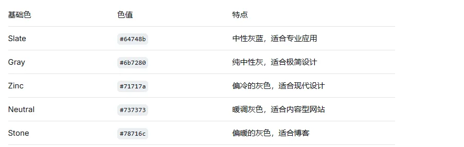
步骤2:修改CSS变量
/* custom.css - 自定义主题 */
@layer base {
  :root {
    --primary: 267 100% 64%;      /* 紫色主题 */
    --primary-foreground: 0 0% 100%;
    --radius: 0.75rem;             /* 更大的圆角 */
    --background: 0 0% 98%;        /* 浅灰背景 */
  }
}
步骤3:应用自定义主题
将自定义CSS文件导入到globals.css中,确保在shadcn/ui变量之后。
4.3 暗色模式实现
shadcn/ui开箱即用支持暗色模式。使用next-themes实现主题切换:
npm install next-themes
// components/theme-provider.tsx
'use client';

import * as React from 'react';
import { ThemeProvider as NextThemesProvider } from 'next-themes';
import { type ThemeProviderProps } from 'next-themes/dist/types';

export function ThemeProvider({ children, ...props }: ThemeProviderProps) {
  return <NextThemesProvider {...props}>{children}</NextThemesProvider>;
}
// app/layout.tsx
import { ThemeProvider } from '@/components/theme-provider';

export default function RootLayout({ children }: { children: React.ReactNode }) {
  return (
    <html lang="zh-CN" suppressHydrationWarning>
      <body>
        <ThemeProvider
          attribute="class"
          defaultTheme="system"
          enableSystem
          disableTransitionOnChange
        >
          {children}
        </ThemeProvider>
      </body>
    </html>
  );
}
// components/mode-toggle.tsx
'use client';

import * as React from 'react';
import { Moon, Sun } from 'lucide-react';
import { useTheme } from 'next-themes';
import { Button } from '@/components/ui/button';

export function ModeToggle() {
  const { theme, setTheme } = useTheme();

  return (
    <Button
      variant="outline"
      size="icon"
      onClick={() => setTheme(theme === 'light' ? 'dark' : 'light')}
    >
      <Sun className="h-[1.2rem] w-[1.2rem] rotate-0 scale-100 transition-all dark:-rotate-90 dark:scale-0" />
      <Moon className="absolute h-[1.2rem] w-[1.2rem] rotate-90 scale-0 transition-all dark:rotate-0 dark:scale-100" />
      <span className="sr-only">切换主题</span>
    </Button>
  );
}
4.4 可视化主题编辑(tweakcn)
对于需要深度主题定制的场景,tweakcn是专为shadcn/ui打造的可视化主题编辑器。
核心能力对比: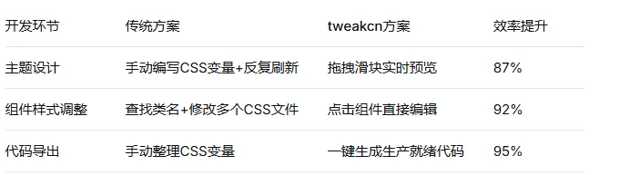
主要功能:
颜色系统定制:拖动HSL滑块调整主色调,使用对比度检查器确保WCAG标准(AA或AAA级)
排版系统调整:选择字体组合,设置标题与正文的比例关系
组件样式微调:点击预览区组件直接编辑圆角、内边距、阴影等
AI主题生成:通过自然语言描述生成主题(如"为金融科技应用创建专业的深蓝色主题")
代码导出:生成可直接粘贴到项目的CSS变量
4.5 高级主题定制:组件级样式覆盖
由于组件代码就在你的项目中,你可以直接修改组件文件来调整样式:
// components/ui/button.tsx - 修改前
const buttonVariants = cva(
  "inline-flex items-center justify-center rounded-md text-sm font-medium ...",
  {
    variants: {
      variant: {
        default: "bg-primary text-primary-foreground hover:bg-primary/90",
        destructive: "bg-destructive text-destructive-foreground hover:bg-destructive/90",
        // ...
      },
    },
  }
)

// components/ui/button.tsx - 修改后(添加自定义variant)
const buttonVariants = cva(
  "inline-flex items-center justify-center rounded-lg text-sm font-medium ...", // 圆角从md改为lg
  {
    variants: {
      variant: {
        default: "bg-primary text-primary-foreground hover:bg-primary/90",
        destructive: "bg-destructive text-destructive-foreground hover:bg-destructive/90",
        brand: "bg-cyan-500 text-white hover:bg-cyan-600 shadow-lg shadow-cyan-500/25", // 新增
        // ...
      },
    },
  }
)