效果演示
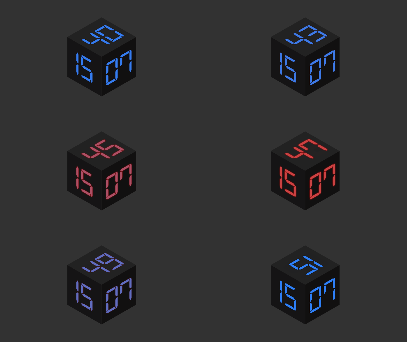
文末可一键复制完整代码
Code
HTML
<html lang="en"> <head> <meta charset="UTF-8"> <meta name="viewport" content="width=device-width, initial-scale=1.0"> <title>霓虹灯数字时钟</title> <link rel="stylesheet" href="./127-霓虹灯数字时钟.css"> </head> <body> <figure> <div class="face top"> <p id="s"></p> </div> <div class="face front"> <p id="m"></p> </div> <div class="face left"> <p id="h"></p> </div> </figure> </body> <script src="./127-霓虹灯数字时钟.js"></script> </html>
CSS
@font-face { font-family: 'Digital-7'; src: url('https://s3-us-west-2.amazonaws.com/s.cdpn.io/184191/Digital-7.eot?#iefix') format('embedded-opentype'), url('https://s3-us-west-2.amazonaws.com/s.cdpn.io/184191/Digital-7.woff') format('woff'), url('https://s3-us-west-2.amazonaws.com/s.cdpn.io/184191/Digital-7.ttf') format('truetype'), url('https://s3-us-west-2.amazonaws.com/s.cdpn.io/184191/Digital-7.svg#Digital-7') format('svg'); font-weight: normal; font-style: normal; } ::selection { background: #333; } ::selection { background: #111; } *, html { margin: 0; } body { background: #333 } figure { width: 210px; height: 210px; position: absolute; top: 50%; left: 50%; margin-top: -105px; margin-left: -105px; transform-style: preserve-3d; transform-style: preserve-3d; transform: rotateX(-35deg) rotateY(45deg); transform: rotateX(-35deg) rotateY(45deg); transition: 2s; } figure:hover { transform: rotateX(-50deg) rotateY(45deg); transform: rotateX(-50deg) rotateY(45deg); } .face { width: 100%; height: 100%; position: absolute; transform-origin: center; transform-origin: center; background: #000; text-align: center; } p { font-size: 180px; font-family: 'Digital-7'; margin-top: 20px; color: #2982FF; text-shadow: 0px 0px 5px #000; animation: color 10s infinite; animation: color 10s infinite; line-height: 180px; } .front { transform: translate3d(0, 0, 105px); transform: translate3d(0, 0, 105px); background: #111; } .left { transform: rotateY(-90deg) translate3d(0, 0, 105px); transform: rotateY(-90deg) translate3d(0, 0, 105px); background: #151515; } .top { transform: rotateX(90deg) translate3d(0, 0, 105px); transform: rotateX(90deg) translate3d(0, 0, 105px); background: #222; } @keyframes color { 0% { color: #2982ff; text-shadow: 0px 0px 5px #000; } 50% { color: #cc4343; text-shadow: 0px 0px 5px #ff0000; } } @-webkit-keyframes color { 0% { color: #2982ff; text-shadow: 0px 0px 5px #000; } 50% { color: #cc4343; text-shadow: 0px 0px 5px #ff0000; } }
JavaScript
function date_time(id) {
        date = new Date;
        h = date.getHours();
        if (h < 10) {
                h = "0" + h;
        }
        m = date.getMinutes();
        if (m < 10) {
                m = "0" + m;
        }
        s = date.getSeconds();
        if (s < 10) {
                s = "0" + s;
        }
        document.getElementById("s").innerHTML = '' + s;
        document.getElementById("m").innerHTML = '' + m;
        document.getElementById("h").innerHTML = '' + h;
        setTimeout('date_time("' + "s" + '");', '1000');
        return true;
}
window.onload = date_time('s');
实现思路拆分
CSS 部分
@font-face {
    font-family: 'Digital-7';
    src: url('https://s3-us-west-2.amazonaws.com/s.cdpn.io/184191/Digital-7.eot?#iefix') format('embedded-opentype'), url('https://s3-us-west-2.amazonaws.com/s.cdpn.io/184191/Digital-7.woff') format('woff'), url('https://s3-us-west-2.amazonaws.com/s.cdpn.io/184191/Digital-7.ttf') format('truetype'), url('https://s3-us-west-2.amazonaws.com/s.cdpn.io/184191/Digital-7.svg#Digital-7') format('svg');
    font-weight: normal;
    font-style: normal;
}
定义数字时钟使用的字体。
::selection {
    background: #333;
}
设置文本选中时的背景颜色。
::selection { background: #111; }
设置Mozilla浏览器中文本选中时的背景颜色。
*,
html {
    margin: 0;
}
重置默认的外边距。
body {
    background: #333;
}
设置页面背景颜色。
figure { width: 210px; height: 210px; position: absolute; top: 50%; left: 50%; margin-top: -105px; margin-left: -105px; transform-style: preserve-3d; transform-style: preserve-3d; transform: rotateX(-35deg) rotateY(45deg); transform: rotateX(-35deg) rotateY(45deg); transition: 2s; }
定义时钟容器的样式,包括尺寸、位置、3D转换和过渡效果。
figure:hover { transform: rotateX(-50deg) rotateY(45deg); transform: rotateX(-50deg) rotateY(45deg); }
定义时钟容器悬停时的样式。
.face { width: 100%; height: 100%; position: absolute; transform-origin: center; transform-origin: center; background: #000; text-align: center; }
定义时钟各个面的样式。
p { font-size: 180px; font-family: 'Digital-7'; margin-top: 20px; color: #2982FF; text-shadow: 0px 0px 5px #000; animation: color 10s infinite; animation: color 10s infinite; line-height: 180px; }
定义时钟数字的样式,包括字体、颜色、阴影和动画。
.front { transform: translate3d(0, 0, 105px); transform: translate3d(0, 0, 105px); background: #111; } .left { transform: rotateY(-90deg) translate3d(0, 0, 105px); transform: rotateY(-90deg) translate3d(0, 0, 105px); background: #151515; } .top { transform: rotateX(90deg) translate3d(0, 0, 105px); transform: rotateX(90deg) translate3d(0, 0, 105px); background: #222; }
定义时钟各个面的具体样式,包括背景颜色和3D转换。
@keyframes color {
    0% {
        color: #2982ff;
        text-shadow: 0px 0px 5px #000;
    }
    50% {
        color: #cc4343;
        text-shadow: 0px 0px 5px #ff0000;
    }
}
@-webkit-keyframes color {
    0% {
        color: #2982ff;
        text-shadow: 0px 0px 5px #000;
    }
    50% {
        color: #cc4343;
        text-shadow: 0px 0px 5px #ff0000;
    }
}
定义霓虹灯颜色变化动画的关键帧。
JavaScript 部分
function date_time(id) {
        date = new Date;
        h = date.getHours();
        if (h < 10) {
                h = "0" + h;
        }
        m = date.getMinutes();
        if (m < 10) {
                m = "0" + m;
        }
        s = date.getSeconds();
        if (s < 10) {
                s = "0" + s;
        }
        document.getElementById("s").innerHTML = '' + s;
        document.getElementById("m").innerHTML = '' + m;
        document.getElementById("h").innerHTML = '' + h;
        setTimeout('date_time("' + "s" + '");', '1000');
        return true;
}
window.onload = date_time('s');
定义一个函数来获取当前时间并更新时钟的显示,设置页面加载完成时执行该函数。
<html lang="en"> <head> <meta charset="UTF-8"> <meta name="viewport" content="width=device-width, initial-scale=1.0"> <title>霓虹灯数字时钟</title> <style> @font-face { font-family: 'Digital-7'; src: url('https://s3-us-west-2.amazonaws.com/s.cdpn.io/184191/Digital-7.eot?#iefix') format('embedded-opentype'), url('https://s3-us-west-2.amazonaws.com/s.cdpn.io/184191/Digital-7.woff') format('woff'), url('https://s3-us-west-2.amazonaws.com/s.cdpn.io/184191/Digital-7.ttf') format('truetype'), url('https://s3-us-west-2.amazonaws.com/s.cdpn.io/184191/Digital-7.svg#Digital-7') format('svg'); font-weight: normal; font-style: normal } ::selection { background: #333 } ::selection { background: #111 } *, html { margin: 0 } body { background: #333 } figure { width: 210px; height: 210px; position: absolute; top: 50%; left: 50%; margin-top: -105px; margin-left: -105px; transform-style: preserve-3d; transform-style: preserve-3d; transform: rotateX(-35deg) rotateY(45deg); transform: rotateX(-35deg) rotateY(45deg); transition: 2s } figure:hover { transform: rotateX(-50deg) rotateY(45deg); transform: rotateX(-50deg) rotateY(45deg) } .face { width: 100%; height: 100%; position: absolute; transform-origin: center; transform-origin: center; background: #000; text-align: center } p { font-size: 180px; font-family: 'Digital-7'; margin-top: 20px; color: #2982FF; text-shadow: 0px 0px 5px #000; animation: color 10s infinite; animation: color 10s infinite; line-height: 180px } .front { transform: translate3d(0, 0, 105px); transform: translate3d(0, 0, 105px); background: #111 } .left { transform: rotateY(-90deg) translate3d(0, 0, 105px); transform: rotateY(-90deg) translate3d(0, 0, 105px); background: #151515 } .top { transform: rotateX(90deg) translate3d(0, 0, 105px); transform: rotateX(90deg) translate3d(0, 0, 105px); background: #222 } @keyframes color { 0% { color: #2982ff; text-shadow: 0px 0px 5px #000 } 50% { color: #cc4343; text-shadow: 0px 0px 5px #ff0000 } } @-webkit-keyframes color { 0% { color: #2982ff; text-shadow: 0px 0px 5px #000 } 50% { color: #cc4343; text-shadow: 0px 0px 5px #ff0000 } } </style> </head> <body> <figure> <div class="face top"> <p id="s"></p> </div> <div class="face front"> <p id="m"></p> </div> <div class="face left"> <p id="h"></p> </div> </figure> </body> <script> function date_time(id) { date = new Date; h = date.getHours(); if (h < 10) { h = "0" + h } m = date.getMinutes(); if (m < 10) { m = "0" + m } s = date.getSeconds(); if (s < 10) { s = "0" + s } document.getElementById("s").innerHTML = '' + s; document.getElementById("m").innerHTML = '' + m; document.getElementById("h").innerHTML = '' + h; setTimeout('date_time("' + "s" + '");', '1000'); return true } window.onload = date_time('s'); </script> </html>