项目已开源,开源地址: https://gitcode.com/nutpi/HarmonyosNextCaseStudyTutorial , 欢迎fork & star
效果演示
1. 引言
在上一篇教程中,我们介绍了如何使用Row组件创建水平排列的功能按钮组,并讲解了基础间距与对齐的设置方法。本篇教程将深入探讨Row组件的高级特性、布局技巧以及在实际应用中的最佳实践,帮助开发者更好地掌握HarmonyOS NEXT的水平布局能力。
2. Row组件的高级属性
除了基础的space和对齐属性外,Row组件还提供了一些高级属性,用于更精细地控制布局行为。
2.1 布局权重(layoutWeight)
在Row容器中,可以通过为子组件设置layoutWeight属性来控制子组件占用剩余空间的比例。这在创建自适应布局时非常有用。
Row() {
    Button('左侧').layoutWeight(1)
    Button('中间').layoutWeight(2)
    Button('右侧').layoutWeight(1)
}
在上面的例子中,三个按钮按照1:2:1的比例分配Row容器的宽度。
2.2 布局约束(constraintSize)
constraintSize属性允许设置子组件的最小和最大尺寸约束,确保组件在不同屏幕尺寸下保持合理的大小。
Button('按钮')
    .constraintSize({
        minWidth: 60,
        maxWidth: 120,
        minHeight: 30,
        maxHeight: 50
    })
2.3 可见性与显示(visibility & display)
可以通过visibility和display属性控制子组件的可见性和显示方式,这在需要动态显示/隐藏按钮时非常有用。
Button('可选功能')
    .visibility(this.showOptionalButton ? Visibility.Visible : Visibility.None)
3. 案例深入分析
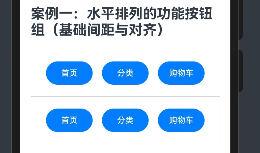
让我们回顾并深入分析本案例中的按钮组实现:
Row({ space: 16 }) // 间距16vp,居中对齐
    {
    Button('首页')
        .width(80)
        .height(40)
        .fontSize(14)
        .fontColor(0xFFFFFF)
        .backgroundColor(0x007DFF)
        .borderRadius(24)
    Button('分类')
        .width(80)
        .height(40)
        .fontSize(14)
        .fontColor(0xFFFFFF)
        .backgroundColor(0x007DFF)
        .borderRadius(24)
    Button('购物车')
        .width(80)
        .height(40)
        .fontSize(14)
        .backgroundColor(0x007DFF)
        .fontColor(0xFFFFFF)
        .borderRadius(24)
}.width('100%')
.height(80)
.backgroundColor(0xFFFFFF)
.justifyContent(FlexAlign.Center)
.shadow({ radius: 4, color: 0x05000000 })
3.1 布局结构分析
这个按钮组的布局结构可以分为两层:
- 外层容器:Row组件作为容器,设置了宽度、高度、背景色、阴影和对齐方式。
- 内层按钮:三个Button组件作为子元素,每个按钮都设置了相同的样式。
3.2 间距与对齐分析
属性 |
值 |
效果 |
space |
16 |
三个按钮之间保持16vp的等间距 |
justifyContent |
FlexAlign.Center |
按钮组在水平方向居中对齐 |
width |
'100%' |
Row容器宽度占满父容器 |
height |
80 |
Row容器高度固定为80vp |
这种设置使得按钮组在不同屏幕宽度下都能保持居中对齐,按钮之间的间距保持一致,视觉效果协调统一。
3.3 样式一致性分析
三个按钮的样式几乎完全相同,只有文本内容不同。这种一致性的设计有助于用户识别这是一组相关的功能按钮。样式特点包括:
- 相同的尺寸:宽80vp,高40vp,确保视觉上的统一
- 相同的颜色:蓝色背景(0x007DFF),白色文字(0xFFFFFF)
- 相同的圆角:24vp的圆角,创造出胶囊形状的按钮
- 相同的字体大小:14fp,保持文本视觉上的一致性
4. 常见按钮组布局模式
基于Row组件,我们可以实现多种常见的按钮组布局模式。
4.1 均匀分布模式
当需要按钮均匀分布在整个容器中时,可以使用justifyContent(FlexAlign.SpaceEvenly):
Row() {
    Button('选项一')
    Button('选项二')
    Button('选项三')
}.width('100%')
.justifyContent(FlexAlign.SpaceEvenly)
4.2 两端对齐模式
当需要将按钮分布在容器的两端时,可以使用justifyContent(FlexAlign.SpaceBetween):
Row() {
    Button('返回')
    Button('确认')
}.width('100%')
.justifyContent(FlexAlign.SpaceBetween)
4.3 左对齐/右对齐模式
当需要将按钮组对齐到容器的左侧或右侧时:
// 左对齐
Row() {
    Button('选项一')
    Button('选项二')
    Button('选项三')
}.width('100%')
.justifyContent(FlexAlign.Start)
// 右对齐
Row() {
    Button('选项一')
    Button('选项二')
    Button('选项三')
}.width('100%')
.justifyContent(FlexAlign.End)
4.4 混合对齐模式
有时需要一部分按钮左对齐,一部分按钮右对齐,可以使用嵌套的Row实现:
Row() {
    Row() {
        Button('返回')
        Button('刷新')
    }.layoutWeight(1)
    .justifyContent(FlexAlign.Start)

    Row() {
        Button('保存')
        Button('提交')
    }.layoutWeight(1)
    .justifyContent(FlexAlign.End)
}.width('100%')
5. 响应式布局技巧
在实际应用中,按钮组需要适应不同屏幕尺寸。以下是一些响应式布局技巧:
5.1 使用百分比宽度
Row({ space: 16 }) {
    Button('选项一').width('30%')
    Button('选项二').width('30%')
    Button('选项三').width('30%')
}.width('100%')
.justifyContent(FlexAlign.Center)
5.2 使用layoutWeight自适应
Row() {
    Button('选项一').layoutWeight(1)
    Button('选项二').layoutWeight(1)
    Button('选项三').layoutWeight(1)
}.width('100%')
5.3 结合媒体查询
Row() {
    Button('选项一')
        .width(this.isWideScreen ? 120 : 80)
    Button('选项二')
        .width(this.isWideScreen ? 120 : 80)
    Button('选项三')
        .width(this.isWideScreen ? 120 : 80)
}.width('100%')
.justifyContent(FlexAlign.Center)
其中isWideScreen可以通过媒体查询获取:
@State isWideScreen: boolean = false
aboutToAppear() {
    mediaQuery.matchMediaSync('(min-width: 600vp)')
        .on('change', (mediaQueryResult) => {
            this.isWideScreen = mediaQueryResult.matches
        })
}
6. 按钮组交互优化
6.1 点击状态
为按钮添加点击状态反馈,提升用户体验:
Button('首页')
    .width(80)
    .height(40)
    .fontSize(14)
    .fontColor(0xFFFFFF)
    .backgroundColor(0x007DFF)
    .borderRadius(24)
    .stateStyles({
        pressed: {
            backgroundColor: 0x0065CC,
            scale: 0.95
        }
    })
6.2 选中状态
实现类似标签页的选中效果:
@State selectedIndex: number = 0
build() {
    Row({ space: 16 }) {
        Button('首页')
            .width(80)
            .height(40)
            .fontSize(14)
            .fontColor(this.selectedIndex === 0 ? 0xFFFFFF : 0x007DFF)
            .backgroundColor(this.selectedIndex === 0 ? 0x007DFF : 0xF0F0F0)
            .borderRadius(24)
            .onClick(() => this.selectedIndex = 0)

        // 其他按钮类似...
    }
}
7. 与其他布局组件的结合
7.1 与Stack结合
可以将Row与Stack结合,在按钮上添加角标或提示:
Row({ space: 16 }) {
    Stack() {
        Button('购物车')
            .width(80)
            .height(40)

        Text('5')
            .width(16)
            .height(16)
            .fontSize(10)
            .textAlign(TextAlign.Center)
            .borderRadius(8)
            .backgroundColor(0xFF0000)
            .fontColor(0xFFFFFF)
            .position({ top: 0, right: 0 })
    }
    // 其他按钮...
}
7.2 与Column结合
可以将Row与Column结合,创建更复杂的布局:
Column() {
    Text('功能区').fontSize(16).margin({ bottom: 8 })

    Row({ space: 16 }) {
        // 按钮组
        Button('首页')
        Button('分类')
        Button('购物车')
    }.width('100%')
    .justifyContent(FlexAlign.Center)
}
8. 案例代码优化
回顾本案例代码,我们可以进行以下优化:
8.1 提取公共样式
@Component
export struct ButtonGroupExample {
    private buttonStyle(text: string) {
        return Button(text)
            .width(80)
            .height(40)
            .fontSize(14)
            .fontColor(0xFFFFFF)
            .backgroundColor(0x007DFF)
            .borderRadius(24)
    }

    build() {
        Row({ space: 16 }) {
            this.buttonStyle('首页')
            this.buttonStyle('分类')
            this.buttonStyle('购物车')
        }.width('100%')
        .height(80)
        .backgroundColor(0xFFFFFF)
        .justifyContent(FlexAlign.Center)
        .shadow({ radius: 4, color: 0x05000000 })
    }
}
8.2 使用数组动态生成按钮
@Component
export struct ButtonGroupExample {
    private buttons: string[] = ['首页', '分类', '购物车']

    private buttonStyle(text: string) {
        return Button(text)
            .width(80)
            .height(40)
            .fontSize(14)
            .fontColor(0xFFFFFF)
            .backgroundColor(0x007DFF)
            .borderRadius(24)
    }

    build() {
        Row({ space: 16 }) {
            ForEach(this.buttons, (item) => {
                this.buttonStyle(item)
            })
        }.width('100%')
        .height(80)
        .backgroundColor(0xFFFFFF)
        .justifyContent(FlexAlign.Center)
        .shadow({ radius: 4, color: 0x05000000 })
    }
}
9. 总结
本教程深入探讨了HarmonyOS NEXT中Row组件的高级特性和按钮组布局技巧。