夏日回忆
萤火虫的灵感来源于我玩的一个小游戏。小游戏里面有个活动叫“萤星漫舞”,使用道具的时候,会有萤火虫闪光的特效,特别好看。
萤火虫的记忆还停留在我的童年,乡间田野之间,夏日到来的夜晚,偶尔会和玩伴们一起去冒险,经常能遇到星星点点的萤火虫。长大后,繁华都市的华灯,虽然璀璨夺目,但是让我感觉遥远且冰冷。萤火微小,却照亮了我探索自然的路。
再次遇到萤火虫相关的场景,勾起我对童年的美好回忆,于是我决定复刻这个场景,来迎接夏日的到来。萤星漫舞的效果使用CSS3便能实现。
“望孟夏之短夜兮,何晦明之若岁?” --屈原《九章》
“孟夏之夜虽然短暂,但如遇萤星之光,可照前进之路。”--叶一一
在线预览
代码放到在线预览平台,可以查看完整代码,并体验效果,
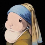
背景图
截取了一张游戏里的图做背景

图截好像有点长,^_^
最终呈现

按钮霓虹灯效果
为了增加趣味性,有些按钮激活状态下,会有光束游走效果,像老牌店铺的霓虹灯。
- 其实是四条边上移动的四条线,除了第一条线以外,移动的线设置延时时间,便可实现循环移动的效果。
- 延迟时间和上一条线的完成时间有关系,如果设置1s的完成时间,因为对面的线是不能同时出现的,所以之后每条线延迟时间是0.25s*(n-1),n为当前线出现的顺序;
- 每次点击,萤星效果会持续3秒钟就会消失,再次点击按钮可重现;
css
#button {position: absolute;
left: 50%;
bottom: 15%;
width: 150px;
height: 40px;
line-height: 40px;
background: transparent;
margin-left: -75px;
text-align: center;
color: #fc91ab;border: 2pxsolid#fc91ab;cursor: pointer;
overflow: hidden;
display: block;
z-index: 99;
}
#button:hover {background-color: #fc91ab;color: #fff;box-shadow: 0025px#fc91ab;border: none;
}
#button:hover i {position: absolute;
}
#button:hover i:nth-child(odd) {width: 100%;
height: 2px;
}
#button:hover i:nth-child(even) {width: 2px;
height: 100%;
}
#button:hover i:nth-child(1) {top: 0;
left: -100%;
background: linear-gradient(toright, transparent, #fff);animation: moveligth11slinearinfinite;
}
#button:hover i:nth-child(2) {top: -100%;
right: 0;
background: linear-gradient(tobottom, transparent, #fff);animation: moveligth21slinearinfinite;
animation-delay: 0.25s;
}
#button:hover i:nth-child(3) {bottom: 0;
right: -100%;
background: linear-gradient(toleft, transparent, #fff);animation: moveligth31slinearinfinite;
animation-delay: 0.5s;
}
#button:hover i:nth-child(4) {bottom: -100%;
left: 0;
background: linear-gradient(totop, transparent, #fff);animation: moveligth41slinearinfinite;
animation-delay: 0.75s;
}
@keyframesmoveligth1 {
0% {
left: -100%;
  }
50%,
100% {
left: 100%;
  }
}
@keyframesmoveligth2 {
0% {
top: -100%;
  }
50%,
100% {
top: 100%;
  }
}
@keyframesmoveligth3 {
0% {
right: -100%;
  }
50%,
100% {
right: 100%;
  }
}
@keyframesmoveligth4 {
0% {
bottom: -100%;
  }
50%,
100% {
bottom: 100%;
  }
}
html
<divid="button"><i></i><i></i><i></i><i></i>萤星漫舞</div>
js
varlight=document.getElementById('light');
varsearchlight=document.getElementById('searchlight');
varaperture=document.getElementById('aperture');
varbutton=document.getElementById('button');
// 设置样式functionsetStyle(str, flag) {
light.style.display=str;
searchlight.style.display=str;
aperture.style.display=str;
button.disabled=flag;
}
// 点击事件 开启动画效果functionlightShow() {
setStyle('block', true);
setTimeout(function () {
setStyle('none', false);
  }, 3000);
}
button.onclick=lightShow;
竹筒手电筒效果
手电筒效果包括屏幕和光束两部分
- 屏幕由椭圆实现,椭圆背景设置为白色再加上外阴影,便跟实物很像了;
- 光束的形状是一个梯形,但是梯形的边不够圆滑,不够美观,所以再光束尾端我又加了一个椭圆,这样边缘就有了弧度;
css
#searchlight {position: absolute;
top: 407px;
left: 85px;
height: 45px;
border-radius: 5px;
border-bottom: 40pxsolidtransparent;
border-left: 100pxsolid#d1da8b;border-top: 40pxsolidtransparent;
border-radius: 5px;
animation: searchlightchange3slinearalternateinfinite;
transform-origin: 100%;
transform: rotate(51deg);
z-index: 108;
display: none;
}
#searchlight::before {content: '';
position: absolute;
border-radius: 50%;
width: 37px;
height: 125px;
background: #d1da8b;left: -119px;
top: -40px;
transform: rotate3d(1, 0, 1, 0deg);
}
@keyframessearchlightchange {
0% {
opacity: 0.1;
  }
50% {
opacity: 0.3;
  }
100% {
opacity: 0.1;
  }
}
#aperture {position: absolute;
top: 461px;
left: 158px;
width: 54px;
height: 15px;
border-radius: 100%;
background: #fff;transform: rotate3d(1, 0, 1, -57deg);
box-shadow: 1px1px20px#fff;z-index: 109;
display: none;
}
html
<divid="searchlight"></div><divid="aperture"></div>
萤火虫发光效果
萤火虫发光效果仿照的星星闪烁效果,即明暗交替。将每个萤火虫容器的背景设置透明度从1到0.5即可。
css
#light {position: absolute;
top: 376px;
left: 94px;
width: 125px;
height: 100px;
z-index: 119;
background: none;
display: none;
}
#light .spot {border-radius: 50%;
background: #c3cb78;position: absolute;
box-shadow: 1px1px20px#c3cb78;animation: spotchange1.5slinearalternateinfinite;
}
@keyframesspotchange {
0% {
opacity: 1;
  }
50% {
opacity: 0.5;
  }
100% {
opacity: 1;
  }
}
#light .spot::before {content: '';
position: absolute;
border-radius: 50%;
background: rgba(195, 203, 120, 0.7);
box-shadow: 1px1px10px#c3cb78;left: -1px;
top: -1px;
}
#light .spot-1 {top: 10px;
left: 10px;
width: 5px;
height: 5px;
}
#light .spot-1::before {width: 7px;
height: 7px;
}
#light .spot-2 {top: 35px;
left: -5px;
width: 3px;
height: 3px;
}
#light .spot-2::before {width: 5px;
height: 5px;
}
#light .spot-3 {top: 35px;
left: 30px;
width: 3px;
height: 3px;
}
#light .spot-3::before {width: 5px;
height: 5px;
}
#light .spot-4 {top: 22px;
left: 57px;
width: 5px;
height: 5px;
}
#light .spot-4::before {width: 7px;
height: 7px;
}
#light .spot-5 {top: 15px;
left: 90px;
width: 3px;
height: 3px;
}
#light .spot-5::before {width: 5px;
height: 5px;
}
#light .spot-6 {top: 75px;
left: 50px;
width: 5px;
height: 5px;
}
#light .spot-6::before {width: 7px;
height: 7px;
}
#light .spot-7 {top: 54px;
left: 74px;
width: 3px;
height: 3px;
}
#light .spot-7::before {width: 5px;
height: 5px;
}
#light .spot-8 {top: -5px;
left: 44px;
width: 3px;
height: 3px;
}
#light .spot-8::before {width: 5px;
height: 5px;
}
#light .spot-9 {top: 80px;
left: 75px;
width: 3px;
height: 3px;
}
#light .spot-9::before {width: 5px;
height: 5px;
}
#light .spot-10 {top: 60px;
left: 35px;
width: 3px;
height: 3px;
}
#light .spot-10::before {width: 5px;
height: 5px;
}
html
<ulid="light"><liclass="spot spot-1"></li><liclass="spot spot-2"></li><liclass="spot spot-3"></li><liclass="spot spot-4"></li><liclass="spot spot-5"></li><liclass="spot spot-6"></li><liclass="spot spot-7"></li><liclass="spot spot-8"></li><liclass="spot spot-9"></li><liclass="spot spot-10"></li></ul>
总结
关于萤火虫的回忆就告一段落了。其实「童年」和「夏天」这两个标签,能碰撞出很多美好回忆。莲蓬、溪流、捉虾、西瓜、知了、蛙叫、萤火虫等等,离自然越近的时候,夏天越发有趣。
所以,我比较喜欢偏生活类的游戏,算是与生俱来的种田情怀吧。