vue2、vue3分别配置echarts多图表的同步缩放(一)

简介: vue2、vue3分别配置echarts多图表的同步缩放

⭐前言

大家好!我是yma16,本文分享在vue2和vue3中配置echarts的多图表同步缩放

背景:

解决echarts的多图表x轴同步联动的问题

⭐使用dataZoom api实现echart的同步缩放

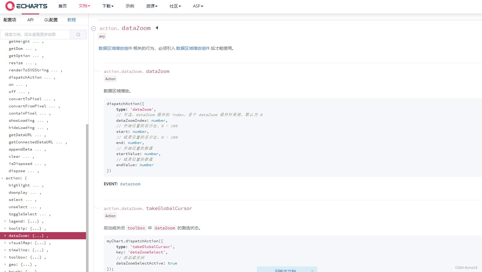
echarts的datazoom api对外暴露

原理:

echarts的实例存在datazoom缩放的方法,

所以只需要在datazoom事件触发其他图表的datazoom即可实现同步缩放

dispatchAction({
    type: 'dataZoom',
    // 可选,dataZoom 组件的 index,多个 dataZoom 组件时有用,默认为 0
    dataZoomIndex: number,
    // 开始位置的百分比,0 - 100
    start: number,
    // 结束位置的百分比,0 - 100
    end: number,
    // 开始位置的数值
    startValue: number,
    // 结束位置的数值
    endValue: number
})

注意:

x轴的范围要一致,不然可能会出现偏移

💖 vue2实现echarts多图表同步缩放

用变量记录echarts的实例,渲染完毕再触发datazoom

<!DOCTYPE html>
<html>
  <head>
    <meta charset="utf-8">
    <title>echarts 滚动事件</title>
    <!-- vue2 生产环境版本,优化了尺寸和速度 -->
    <script src="https://cdn.jsdelivr.net/npm/vue@2"></script>
    <script src="./echarts.js"></script>
  </head>
  <style>
    #app {
      position: absolute;
      height: 100vh;
      width: 100vw;
    }
  </style>
  <body>
    <div id="app">
      <div>
        first
        <div id="first" style="width: 900px;height:400px;"></div>
        second
        <div id="second" style="width: 900px;height:400px;"></div>
        third
        <div id="third" style="width: 900px;height:400px;"></div>
      </div>
    </div>
    <script type="text/javascript">
      const instanceVue = {
        el: '#app',
        name: 'ecahrts',
        data() {
          return {
            firstChart: null,
            secondChart: null,
            thirdChart: null,
            maxNum:1000,
          };
        },
        mounted() {
          
          this.initSecondData()
          this.initThirdData()
          this.initFirstData()
        },
        methods: {
          initFirstData() {
            // 基于准备好的dom,初始化echarts实例
            var myChart = echarts.init(document.getElementById('first'));
            // 指定图表的配置项和数据
            let base = +new Date(1968, 9, 3);
            let oneDay = 24 * 3600 * 500;
            let date = [];
            let data = [Math.random() * 300];
            for (let i = 1; i < this.maxNum; i++) {
              var now = new Date((base += oneDay));
              date.push([now.getFullYear(), now.getMonth() + 1, now.getDate()].join('/'));
              data.push(Math.round((Math.random() - 0.5) * 20 + data[i - 1]));
            }
            const option = {
              tooltip: {
                trigger: 'axis',
                position: function(pt) {
                  return [pt[0], '10%'];
                }
              },
              title: {
                left: 'center',
                text: 'Large Area Chart'
              },
              toolbox: {
                feature: {
                  dataZoom: {
                    yAxisIndex: 'none'
                  },
                  restore: {},
                  saveAsImage: {}
                }
              },
              xAxis: {
                type: 'category',
                boundaryGap: false,
                data: date
              },
              yAxis: {
                type: 'value',
                boundaryGap: [0, '100%']
              },
              dataZoom: [{
                  type: 'inside',
                  start: 0,
                  end: 10
                },
                {
                  start: 0,
                  end: 10
                }
              ],
              series: [{
                name: 'Fake Data',
                type: 'bar',
                symbol: 'none',
                sampling: 'lttb',
                itemStyle: {
                  color: 'rgb(255, 70, 131)'
                },
                areaStyle: {
                  color: new echarts.graphic.LinearGradient(0, 0, 0, 1, [{
                      offset: 0,
                      color: 'rgb(255, 158, 68)'
                    },
                    {
                      offset: 1,
                      color: 'rgb(255, 70, 131)'
                    }
                  ])
                },
                data: data
              }]
            };
            // 使用刚指定的配置项和数据显示图表。
            myChart.setOption(option);
            // 监听
            this.firstChart = myChart;
            this.asyncZoom()
          },
          asyncZoom() {
            const that = this
            this.firstChart.on('datazoom', function(params) {
              [that.secondChart, that.thirdChart].forEach(item => {
                console.log('item',item)
                item && item.dispatchAction({ // 触发 dataZoom 事件
                  type: 'dataZoom',
                  zoomLock: true, // 锁定整个图表的缩放功能
                  xAxisIndex: params
                    .xAxisIndex, // xAxisIndex 为当前操作的 xAxisIndex,用于确定对应的 xAxis 对象
                  yAxisIndex: params
                    .yAxisIndex, // yAxisIndex 为当前操作的 yAxisIndex,用于确定对应的 yAxis 对象
                  start: params.start, // start 为当前操作的时间范围起始值
                  end: params.end // end 为当前操作的时间范围结束值
                });
              })
            })
          },
          initSecondData() {
            // 基于准备好的dom,初始化echarts实例
            const myChart = echarts.init(document.getElementById('second'));
            // 指定图表的配置项和数据
            let base = +new Date(1968, 9, 3);
            let oneDay = 24 * 3600 * 500;
            const date = []
            const yData1 = [Math.random() * 300]
            const yData2 = [Math.random() * 100]
            for (let i = 1; i < this.maxNum; i++) {
              var now = new Date((base += oneDay));
              date.push([now.getFullYear(), now.getMonth() + 1, now.getDate()].join('/'))
              yData1.push(Math.round((Math.random() - 0.5) * 20 + yData1[i - 1]));
              yData2.push(Math.round((Math.random() - 0.5) * 20 + yData2[i - 1]));
            }
            const option = {
              title: {
                text: 'line'
              },
              tooltip: {
                trigger: 'axis'
              },
              legend: {},
              toolbox: {
                show: true,
                feature: {
                  dataZoom: {
                    yAxisIndex: 'none'
                  },
                  dataView: {
                    readOnly: false
                  },
                  magicType: {
                    type: ['line', 'bar']
                  },
                  restore: {},
                  saveAsImage: {}
                }
              },
              xAxis: {
                type: 'category',
                boundaryGap: false,
                data: date
              },
              yAxis: {
                type: 'value',
                axisLabel: {
                  formatter: '{value} °C'
                }
              },
              series: [{
                  name: 'Highest',
                  type: 'line',
                  data: yData1,
                  markPoint: {
                    data: [{
                        type: 'max',
                        name: 'Max'
                      },
                      {
                        type: 'min',
                        name: 'Min'
                      }
                    ]
                  },
                  markLine: {
                    data: [{
                      type: 'average',
                      name: 'Avg'
                    }]
                  }
                },
                {
                  name: 'Lowest',
                  type: 'line',
                  data: yData2,
                  markPoint: {
                    data: [{
                      name: '周最低',
                      value: -2,
                      xAxis: 1,
                      yAxis: -1.5
                    }]
                  },
                  markLine: {
                    data: [{
                        type: 'average',
                        name: 'Avg'
                      },
                      [{
                          symbol: 'none',
                          x: '90%',
                          yAxis: 'max'
                        },
                        {
                          symbol: 'circle',
                          label: {
                            position: 'start',
                            formatter: 'Max'
                          },
                          type: 'max',
                          name: '最高点'
                        }
                      ]
                    ]
                  }
                }
              ]
            };
            myChart.setOption(option);
            this.secondChart = myChart;
          },
          initThirdData() {
            // 基于准备好的dom,初始化echarts实例
            const myChart = echarts.init(document.getElementById('third'));
            // 指定图表的配置项和数据
            let base = +new Date(1968, 9, 3);
            let oneDay = 24 * 3600 * 500;
            const date = []
            const yData1 = [Math.random() * 300]
            for (let i = 1; i < this.maxNum; i++) {
              var now = new Date((base += oneDay));
              date.push([now.getFullYear(), now.getMonth() + 1, now.getDate()].join('/'))
              yData1.push(Math.round((Math.random() - 0.5) * 20 + yData1[i - 1]));
            }
            option = {
              toolbox: {
                show: true,
                feature: {
                  dataZoom: {
                    yAxisIndex: 'none'
                  },
                  dataView: {
                    readOnly: false
                  },
                  magicType: {
                    type: ['line', 'bar']
                  },
                  restore: {},
                  saveAsImage: {}
                }
              },
              tooltip:{
                trigger:'axis'
              },
              legend: {},
              grid: {
                left: '3%',
                right: '4%',
                bottom: '3%',
                containLabel: true
              },
              xAxis: [{
                type: 'category',
                boundaryGap: false,
                data: date
              }],
              yAxis: [{
                type: 'value',
              }],
              series: [{
                  name: 'Direct',
                  type: 'bar',
                  data: yData1
                }
              ]
            };
            myChart.setOption(option);
            this.thirdChart = myChart;
          }
        }
      }
      // 实例化
      new Vue(instanceVue);
    </script>
  </body>
</html>

代码在insidecode,如下运行即可
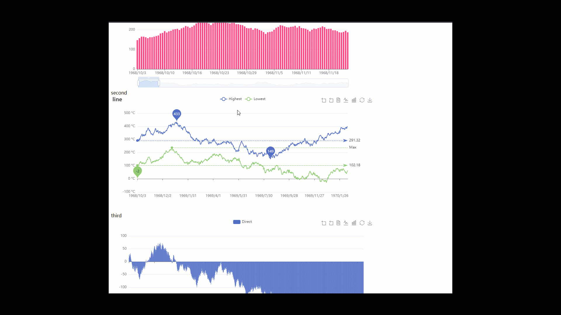

效果:

vue2、vue3分别配置echarts多图表的同步缩放(二)https://developer.aliyun.com/article/1492610

目录
相关文章
|
4天前
|
存储 JavaScript 数据可视化
vue3+echarts应用——深度遍历html的dom结构并用树图进行可视化
44 1
|
4天前
|
数据可视化 JavaScript 前端开发
Echarts是一个开源的JavaScript可视化库,用于创建各种类型的图表
Echarts是JavaScript的开源可视化库,Python通过Pyecharts库可调用它来绘制图表。示例展示了如何用Pyecharts创建柱状图:定义图表对象,设置标题和坐标轴,添加X轴、Y轴数据,最后渲染展示。Pyecharts还支持折线图、散点图、饼图等多种图表类型,更多详情可查阅官方文档。
33 0
|
4天前
|
前端开发 JavaScript 定位技术
Docusaurus框架——react+antd+echarts自定义mdx生成图表代码解释文档
28 0
|
4天前
|
数据采集 数据可视化 小程序
vue3+echarts可视化——记录我的2023编程之旅
29 1
|
4天前
|
存储
vue2、vue3分别配置echarts多图表的同步缩放(二)
vue2、vue3分别配置echarts多图表的同步缩放
20 0
|
4天前
|
数据可视化
echarts图表坐标轴数据标签添加下划线
63 0
|
4天前
|
前端开发 JavaScript BI
Django教程第5章 | Web开发实战-数据统计图表(echarts、highchart)
使用echarts和highcharts图表库实现折线图、柱状图、饼图和数据集图
71 2
|
4天前
|
容器
echarts图表怎样实现刷新功能?
echarts图表怎样实现刷新功能?
|
4天前
|
JavaScript
如何在vue添加echarts图表
如何在vue添加echarts图表
18 0