前言
大家好,我是yma16,本文分享echarts中自定义graph关系图
ehcarts引入
在 Vue 3 中引入 echarts 有多种方式,以下是其中一种基本的方式:
- 安装 echarts 和 vue-echarts:
npm install echarts vue-echarts@5.0.0-beta.5
- 在 main.js 文件中引入 echarts 和 vue-echarts:
import { createApp } from 'vue'
import App from './App.vue'
import * as echarts from 'echarts'
import ECharts from 'vue-echarts'
createApp(App)
  .component('v-chart', ECharts)
  .mount('#app')
- 在需要使用 echarts 的组件中引入 v-chart 并设置数据和配置项:
<template>
  <div class="echarts">
    <v-chart :options="options" :data="data"></v-chart>
  </div>
</template>
<script>
export default {
  data() {
    return {
      data: [20, 30, 40, 10, 25],
      options: {
        xAxis: {
          type: 'category',
          data: ['Mon', 'Tue', 'Wed', 'Thu', 'Fri'],
        },
        yAxis: {
          type: 'value',
        },
        series: [{
          data: this.data,
          type: 'bar',
        }],
      },
    }
  },
}
</script>
<style scoped>
.echarts {
  height: 400px;
}
</style>
其中,v-chart 是通过 vue-echarts 引入的 ECharts 组件,通过 options 和 data 可以设置图表的数据和配置项。这里是一个简单的柱状图例子,更多高级用法可以参考 echarts 官方文档。
关系图配置
关系图是ECharts中的一种特殊图表类型,用于展示节点与节点之间的关系。以下是关系图的配置示例:
option = {
    series: [{
        type: 'graph', // 指定图表类型为关系图
        layout: 'force', // 指定布局方式为力导向布局
        symbolSize: 50, // 指定节点大小
        roam: true, // 开启缩放和拖拽
        label: { // 指定节点标签的样式
            show: true,
            position: 'inside',
            color: '#fff',
            fontSize: 16
        },
        edgeSymbol: ['circle', 'arrow'], // 指定边的箭头图标
        edgeSymbolSize: [4, 10], // 指定边的箭头大小
        edgeLabel: { // 指定边的标签样式
            fontSize: 14,
            fontWeight: 'bold',
            color: 'auto',
            formatter: '{c}'
        },
        data: [ // 指定节点数据
            { name: '节点1' },
            { name: '节点2' },
            { name: '节点3' },
            { name: '节点4' }
        ],
        links: [ // 指定边的数据
            { source: '节点1', target: '节点2', value: 5 },
            { source: '节点2', target: '节点3', value: 10 },
            { source: '节点3', target: '节点4', value: 15 },
            { source: '节点4', target: '节点1', value: 20 }
        ],
        force: { // 指定力导向布局的参数
            repulsion: 100,
            edgeLength: 50
        }
    }]
};
上述代码中,我们通过type: 'graph'指定了图表类型为关系图,使用了力导向布局。symbolSize可以指定节点的大小,roam: true可以开启缩放和拖拽功能。label可以指定节点标签的样式。edgeSymbol和edgeSymbolSize可以分别指定边的箭头图标和大小。edgeLabel可以指定边的标签样式。data和links分别指定节点和边的数据。
最后,我们使用force参数指定了力导向布局的参数,包括斥力和边长。
参考
ecahrts官方文档
自定义graph图
分析:
探索:关系图的关键
- 起点
- 终点
- 线条
线条标注
- 标签文字
- 线条标签
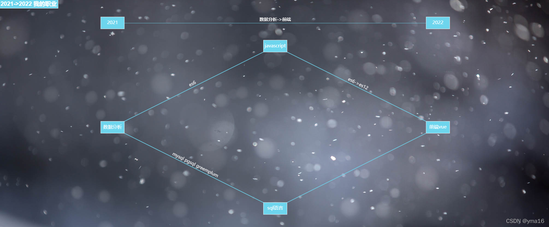
配置关键:
代码如下
{
        title: {
          text: "2021->2022 我的职业",
          color: "#fff",
          x: "left",
          width: 120,
          height: 80,
          backgroundColor: "#6dd5ed",
          borderColor: "#fff",
          borderWidth: 1,
          padding: 5,
          textStyle: {
            fontFamily: "Arial",
            fontSize: 20,
            fontStyle: "normal",
            fontWeight: "bold",
            color: "#fff",
          },
        },
        tooltip: {},
        animationDurationUpdate: 1500,
        animationEasingUpdate: "quinticInOut",
        series: [
          {
            type: "graph",
            layout: "none",
            symbolSize: 0,
            roam: true,
            edgeSymbol: ["circle", "arrow"],
            edgeSymbolSize: [4, 10],
            edgeLabel: {
              fontSize: 15,
            },
            label: {
              //
              show: true,
              formatter: function (params) {
                console.log(params, params);
                return params.name;
              },
              width: 80,
              fontSize: 16,
              height: 40,
              color: "#fff",
              backgroundColor: "#6dd5ed",
              borderColor: "#fff",
              borderWidth: 1,
            },
            data: [
              {
                name: "2021",
                x: 100,
                y: 50,
              },
              {
                name: "2022",
                x: 800,
                y: 50,
              },
              {
                name: "数据分析",
                x: 100,
                y: 275,
              },
              {
                name: "sql语言",
                x: 450,
                y: 450,
              },
              {
                name: "javascript",
                x: 450,
                y: 100,
              },
              {
                name: "前端vue",
                x: 800,
                y: 275,
              },
            ],
            // links: [],
            links: [
              {
                source: 0,
                target: 1,
                symbolSize: [10, 20],
                label: {
                  show: true,
                  fontWeight: "bold",
                  color: "#fff",
                  formatter: function () {
                    // console.log(params, params);
                    return "数据分析->前端";
                  },
                },
                lineStyle: {
                  width: 1,
                  color: "#6dd5ed",
                  curveness: 0,
                },
              },
              {
                source: 2,
                target: 3,
                label: {
                  show: true,
                  color: "#fff",
                  formatter: function () {
                    return "mysql pgsql greemplum";
                  },
                },
                lineStyle: {
                  color: "#6dd5ed",
                  curveness: 0,
                },
              },
              {
                source: 2,
                target: 4,
                label: {
                  show: true,
                  color: "#fff",
                  formatter: function () {
                    return "es6";
                  },
                },
                lineStyle: {
                  color: "#6dd5ed",
                  curveness: 0,
                },
              },
              {
                source: 3,
                target: 5,
                label: {
                  show: true,
                  formatter: function () {
                    return "";
                  },
                },
                lineStyle: {
                  color: " #6dd5ed",
                },
              },
              {
                source: 4,
                target: 5,
                label: {
                  show: true,
                  color: "#fff",
                  formatter: function () {
                    return "es6->es12";
                  },
                },
                lineStyle: {
                  color: " #6dd5ed",
                },
              },
            ],
            lineStyle: {
              opacity: 0.9,
              width: 2,
              curveness: 0,
            },
          },
        ],
      }
仓库
github的仓库
https://github.com/yongma16/emoji-search
浏览
预览地址,已部署
http://yongma16.xyz/emoji/index/

结束
本文分享到此结束,感谢你的阅读,如有不足或者错误欢迎指出!