@[toc]
一、自定义图例name
当我们在构绘制力图的时候,是无法通过 legend 进行配置的
热力图中的图例信息被默认显示,想要自定义图例内容,但是在 legend 配置中无法对图例进行自定义修改,在研究学习之后,因此,选择对 visualMap 的图例内容进行格式化,判断当前图例是在哪个范围从而return返回自定义指定的图例展示内容,在 formatter 的 function 中,可以拿到两个参数,即下图中的显示的
0-25,在 formatter 的 function 中叫做 value1 和 value2,那么就可以加判断从而让图例展示我们想要的效果
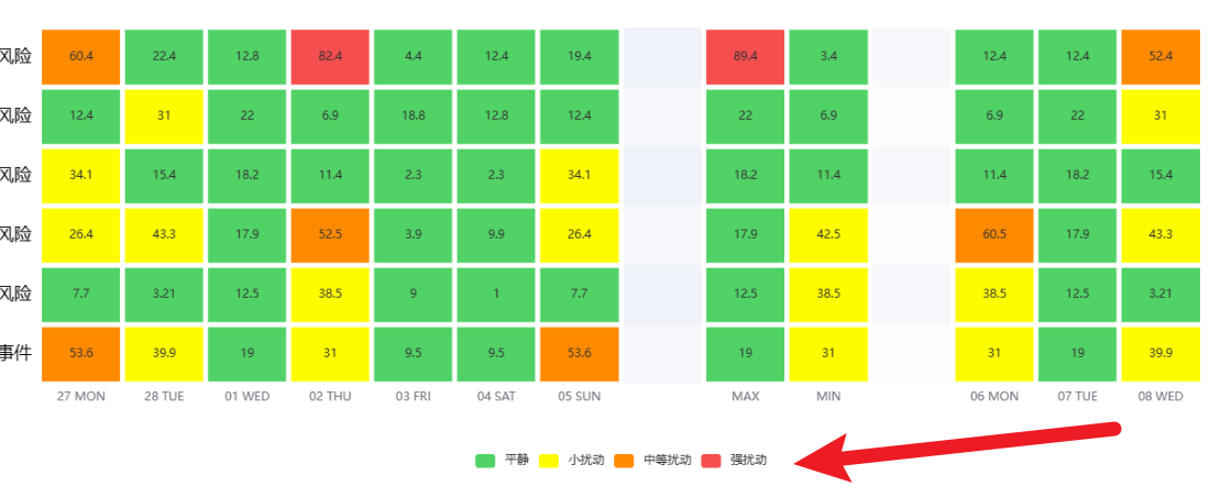
- 默认的图例内容如下
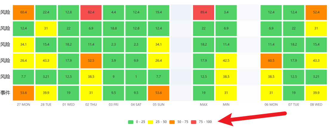
- 在经过自定义格式化后的图例如下
源码如下
visualMap: {
        // show: false, // 是否展示图例信息
        type: 'piecewise', // 定义为分段型 visualMap
        min: 0,
        max: 100,
        splitNumber: 4, // 平均分为4段,默认分为5段
        calculable: true,
        orient: 'horizontal',
        left: 'center',
        bottom: '15%',
        // 格式化对图例颜色进行自定义
        color: [
          '#f54e4e', '#ff8a00', '#fffc00', '#50d266'
        ],
        // 对图例进行自定义格式化展示的内容
        formatter: function (value, value2) {
        if (value + value2 === 25) {
            return '平静'; // 范围标签显示内容。
        } else if (value + value2 === 75) {
            return '小扰动'; // 范围标签显示内容。
        } else if (value + value2 === 125) {
            return '中等扰动'; // 范围标签显示内容。
        } else if (value + value2 === 175) {
            return '强扰动'; // 范围标签显示内容。
        }
        }
      },
二、升级:根据series中data传入每个item应该展示的级别颜色
1. 根据 max & min 判断
- 已知每个 item 元素所展示的等级 level 放在 series 中 data 传入,level 分为 1~3 ,想要根据这个等级 level ,判断当前 item 所展示的元素。
<template>
  <div ref="echartsRef" class="content" id="my-div"> </div>
</template>

<script setup lang="ts">
import {


  ref,
  reactive,
  watch,
  watchEffect,
  computed,
  getCurrentInstance,
  nextTick,
  defineComponent,
  toRefs,
  onMounted,
} from 'vue';
import * as echarts from 'echarts';
import html2canvas from 'html2canvas';

const props = defineProps({


    chartData:{


        type:Object,
        require:true,
        default:()=>{


            return {

   };
        },
    }.
    autoResize:{


        type:Boolean,
        default:true,
    }
})

// 指定显示纵坐标名字
const categoryName = [
    '第一项',
    '第二项',
    '第三项',
    '第四项',
    '第五项',
    '第六项',
]
const echartsData = reactive({


  option: {


    toolbox: {


      feature: {


        // 保存为图片
        saveAsImage: {


          show: true,
          pixelRatio: 2,
          title: '这是一种图片',// 鼠标悬浮所展示的 提示内容
          type: 'jpg',// 文件类型
        },
      }
    },
    tooltip:{


        position:'top',
        formatter(value,index){


            const {

    color, name, data } = value;
            return `${

   name} ,<br/>
            <span>此处可以自定义span的color</span>
            ${

   data}:${

   color}`;
        },
    },
    grid:{


        height:'70%',
        top:'13%',
        right:'80',
    },
    xAxis: {


      type: 'category',
      data: ['Mon', 'Tue', 'Wed', 'Thu', 'Fri', 'Sat', 'Sun']
    },
    yAxis: {


      type: 'category',
      data: categoryName,
      axisLabel:{


          color: 'black',
          fontSize: 16,
      }
    },
    visualMap: {


          // show: false, // 是否展示图例信息
          type: 'piecewise', // 定义为分段型 visualMap
          min: 0,
          max: 3,
          splitNumber: 3, // 平均分为4段,默认分为5段
          calculable: true,
          orient: 'horizontal',
          left: 'center',
          bottom: '15%',
          // 格式化对图例颜色进行自定义
          color: [
            '#f54e4e', '#ff8a00', '#50d266'
          ],
          // 对图例进行自定义格式化展示的内容
          formatter: function (value, value2) {


          if (value + value2 < 3) {


              return '平静'; // 范围标签显示内容。
          }
          if (value + value2 > 5) {


              return '强扰动'; // 范围标签显示内容。
          }
            return '小扰动'; // 范围标签显示内容。
          }
     },
    series: [
      {


          name: '',
        data: [],
        type: 'heatmap',
        smooth: true,
        itemStyle: {


            themeColors: 'light',
            borderWidth: 5,
            borderColor: '#fff',
        }
      }
    ]
  }
})
const {

    option } = toRefs(echartsData);
const echartsRef = ref<string>();
let echartInstance;
watch(
    chartData,
    (newValue)=>{


        if(newVlaue){


            option.value.xAxis.data = newValue.timeSet;
            option.value.series[0].data = newValue.dataSet;
        }
    },
    {

   deep:true,immediate:true}
)
watch(
    option,
    (newValue)=>{


        echartInstace.clear();
        echartInstance.setOption(newValue)
    },
    {

   deep:true}
)
onMounted(() => {


  echartInstance = echarts.init(echartsRef.value, 'macarons');
  echartInstance.setOption(option.value);
  window.addEventListener('resize'() = >{


      echartInstance.resize();
  })
});
onBeforeUnMounted(()=>{


    if(echartInstance && echartInstance.dispose){


        echartInstance = null;
    }
})

</script>

<style lang="less" scoped>
.content {


  width: 100%;
  height: 90vh;
}
</style>
2. 使用 itemStyle 属性来为每一个热力点设置自定义的颜色
在 heatmap 中,还可以使用 itemStyle 属性来为每一个热力点设置自定义的颜色。例如,下面是在 itemStyle 中为热力点设置颜色的例子:
series: [{


    type: 'heatmap',
    data: [...],
    itemStyle: {


       color: function (params) {


           var value = params.value;
           var colors = ['#FF0000', '#00FF00', '#0000FF']; // 自定义颜色范围
           if (value >= 90) {


               return colors[0]; // 返回第一种颜色
           } else if (value >= 70 && value < 90) {


               return colors[1]; // 返回第二种颜色
           } else {


               return colors[2]; // 返回第三种颜色
           }
       }
    }
}]
我们可以在 normal 的子属性中使用一个 function 来为每一个热力点返回自定义的颜色。在这个例子中,我们使用了一个自定义的颜色范围来为数据中的每一个值分配对应的颜色。要根据自己的需求进行调整,来找到一个适合您数据(以及视觉效果)的颜色。
三、点击事件自定义
对指定热力图中的块元素进行
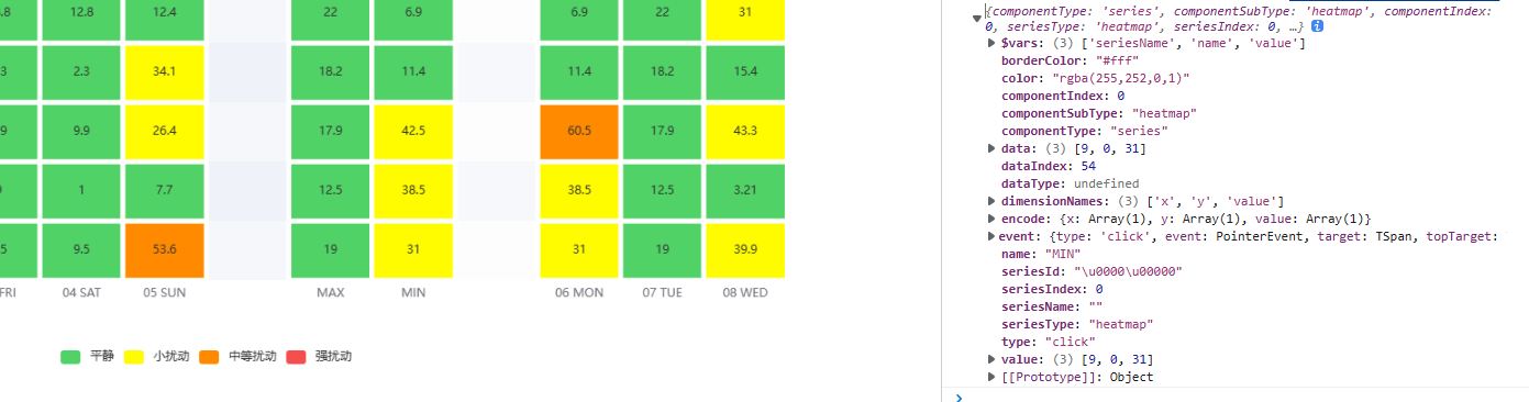
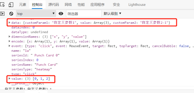
热力图点击事件实现如下
<!DOCTYPE html>
<html>
    <head>
        <meta charset="utf-8">
        <title>热力图</title>
    </head>
    <body>
        <div id="echarsID" style="height: 400px;"></div>
    </body>
    <script src="https://cdn.bootcdn.net/ajax/libs/jquery/3.5.1/jquery.js" type="text/javascript" charset="utf-8"></script>
    <!-- echars版本可以使用自己的 -->
    <script src="https://cdn.bootcdn.net/ajax/libs/echarts/5.0.1/echarts.js" type="text/javascript" charset="utf-8"></script>
    <script type="text/javascript">
        function showEchars() {


            var chartDom = document.getElementById('echarsID');
            var myChart = echarts.init(chartDom);
            var option;
            //横坐标name
            var hours = ['1a', '2a', '3a', '4a', '5a', '6a'];
            //纵坐标name
            var days = ['Saturday', 'Friday', 'Thursday', 'Wednesday', 'Tuesday', 'Monday', 'Sunday'];

            var data = [{


                    customParam1: "自定义参数1",
                    //[x坐标, y坐标, value值]
                    value: [0, 1, 2],
                    customParam2: "自定义参数2-1"
                },
                {


                    customParam1: "自定义参数2",
                    value: [0, 2, 5],
                    customParam2: "自定义参数2-2"
                },
                {


                    customParam1: "自定义参数3",
                    value: [1, 1, 0],
                    customParam2: "自定义参数2-3"
                },
                {


                    customParam1: "自定义参数4",
                    value: [1, 2, 7],
                    customParam2: "自定义参数2-4"
                },
                {


                    customParam1: "自定义参数5",
                    value: [2, 3, 8],
                    customParam2: "自定义参数2-5"
                },
                {


                    customParam1: "自定义参数6",
                    value: [2, 5, 2],
                    customParam2: "自定义参数2-6"
                },
                {


                    customParam1: "自定义参数7",
                    value: [3, 1, 1],
                    customParam2: "自定义参数2-7"
                },
                {


                    customParam1: "自定义参数8",
                    value: [3, 4, 1],
                    customParam2: "自定义参数2-8"
                },
                {


                    customParam1: "自定义参数9",
                    value: [4, 3, 1],
                    customParam2: "自定义参数2-9"
                },
                {


                    customParam1: "自定义参数10",
                    value: [5, 2, 1],
                    customParam2: "自定义参数2-10"
                }
            ];
            option = {


                title: {


                    text: "热力图点击事件带自定义参数",
                    left: 'center',
                    top:'2%'
                },
                tooltip: {


                    position: 'top'
                },
                grid: {


                    height: '50%',
                    top: '10%'
                },
                xAxis: {


                    type: 'category',
                    data: hours,
                    splitArea: {


                        show: true
                    }
                },
                yAxis: {


                    type: 'category',
                    data: days,
                    splitArea: {


                        show: true
                    }
                },
                visualMap: {


                    min: 0,
                    max: 10,
                    calculable: true,
                    orient: 'horizontal',
                    left: 'center',
                    bottom: '15%'
                },
                series: [{


                    name: 'Punch Card',
                    type: 'heatmap',
                    data: data,
                    label: {


                        show: true
                    },
                    emphasis: {


                        itemStyle: {


                            shadowBlur: 10,
                            shadowColor: 'rgba(0, 0, 0, 0.5)'
                        }
                    }
                }]
            };
            option && myChart.setOption(option);
            //热力图点击事件
            myChart.off('click');
            myChart.on('click', function(e) {


                console.log(e)
                console.log(e.data.customParam1,e.data.customParam2)
            });
        }
        //调用方法
        showEchars()
    </script>
</html>