原文:UWP Button添加圆角阴影(一)
众所周知,17763之前的UWP控件,大部分是没有圆角属性的;而阴影也只有17763中的ThemeShadow可以直接在xaml中使用,之前的版本只能用DropShadow,用法极其别扭。
本文就给出一个虽然很别扭,但是效果还不错的,比较通用的圆角+阴影的方案。
概念
我们先思考一下,用户感知到的圆角按钮,到底是个什么东西。
任何一个按钮,不外乎Background和Content两部分,用户可以从Content中获取到按钮的信息,而按钮的形状,在没有Border的情况下,用户对Button形状最直观的感受就是Background!
也就是说,我们只要让一个按钮的Background是一个圆角矩形,他在大多数情况下,就是一个圆角按钮!
按照这个思路,我们可以在17763之前的UWP,也就是大多数控件都没有CornerRadius这个属性的环境里,造出许多圆角的控件。
圆角
从Generic.xaml中,把Button的Style复制出一份,删除没有必要的东西,就成了下面的样子:
<Style TargetType="Button">
    <Setter Property="Background" Value="{ThemeResource ButtonBackground}" />
    <Setter Property="Foreground" Value="{ThemeResource ButtonForeground}" />
    <Setter Property="BorderBrush" Value="{ThemeResource ButtonBorderBrush}" />
    <Setter Property="BorderThickness" Value="{ThemeResource ButtonBorderThemeThickness}" />
    <Setter Property="Padding" Value="8,4,8,4" />
    <Setter Property="HorizontalAlignment" Value="Left" />
    <Setter Property="VerticalAlignment" Value="Center" />
    <Setter Property="FontFamily" Value="{ThemeResource ContentControlThemeFontFamily}" />
    <Setter Property="FontWeight" Value="Normal" />
    <Setter Property="FontSize" Value="{ThemeResource ControlContentThemeFontSize}" />
    <Setter Property="UseSystemFocusVisuals" Value="True" />
    <Setter Property="FocusVisualMargin" Value="-3" />
    <Setter Property="Template">
        <Setter.Value>
            <ControlTemplate TargetType="Button">
                <Grid x:Name="RootGrid" Background="{TemplateBinding Background}">
                    <VisualStateManager.VisualStateGroups>
                        <VisualStateGroup x:Name="CommonStates">
                            <VisualState x:Name="Normal" />
                            <VisualState x:Name="PointerOver">
                                <Storyboard>
                                    <ObjectAnimationUsingKeyFrames Storyboard.TargetName="RootGrid" Storyboard.TargetProperty="Background">
                                        <DiscreteObjectKeyFrame KeyTime="0" Value="{ThemeResource ButtonBackgroundPointerOver}" />
                                    </ObjectAnimationUsingKeyFrames>
                                    <ObjectAnimationUsingKeyFrames Storyboard.TargetName="ContentPresenter" Storyboard.TargetProperty="BorderBrush">
                                        <DiscreteObjectKeyFrame KeyTime="0" Value="{ThemeResource ButtonBorderBrushPointerOver}" />
                                    </ObjectAnimationUsingKeyFrames>
                                    <ObjectAnimationUsingKeyFrames Storyboard.TargetName="ContentPresenter" Storyboard.TargetProperty="Foreground">
                                        <DiscreteObjectKeyFrame KeyTime="0" Value="{ThemeResource ButtonForegroundPointerOver}" />
                                    </ObjectAnimationUsingKeyFrames>
                                </Storyboard>
                            </VisualState>
                            <VisualState x:Name="Pressed">
                                <Storyboard>
                                    <ObjectAnimationUsingKeyFrames Storyboard.TargetName="RootGrid" Storyboard.TargetProperty="Background">
                                        <DiscreteObjectKeyFrame KeyTime="0" Value="{ThemeResource ButtonBackgroundPressed}" />
                                    </ObjectAnimationUsingKeyFrames>
                                    <ObjectAnimationUsingKeyFrames Storyboard.TargetName="ContentPresenter" Storyboard.TargetProperty="BorderBrush">
                                        <DiscreteObjectKeyFrame KeyTime="0" Value="{ThemeResource ButtonBorderBrushPressed}" />
                                    </ObjectAnimationUsingKeyFrames>
                                    <ObjectAnimationUsingKeyFrames Storyboard.TargetName="ContentPresenter" Storyboard.TargetProperty="Foreground">
                                        <DiscreteObjectKeyFrame KeyTime="0" Value="{ThemeResource ButtonForegroundPressed}" />
                                    </ObjectAnimationUsingKeyFrames>
                                </Storyboard>
                            </VisualState>
                            <VisualState x:Name="Disabled">
                                <Storyboard>
                                    <ObjectAnimationUsingKeyFrames Storyboard.TargetName="RootGrid" Storyboard.TargetProperty="Background">
                                        <DiscreteObjectKeyFrame KeyTime="0" Value="{ThemeResource ButtonBackgroundDisabled}" />
                                    </ObjectAnimationUsingKeyFrames>
                                    <ObjectAnimationUsingKeyFrames Storyboard.TargetName="ContentPresenter" Storyboard.TargetProperty="BorderBrush">
                                        <DiscreteObjectKeyFrame KeyTime="0" Value="{ThemeResource ButtonBorderBrushDisabled}" />
                                    </ObjectAnimationUsingKeyFrames>
                                    <ObjectAnimationUsingKeyFrames Storyboard.TargetName="ContentPresenter" Storyboard.TargetProperty="Foreground">
                                        <DiscreteObjectKeyFrame KeyTime="0" Value="{ThemeResource ButtonForegroundDisabled}" />
                                    </ObjectAnimationUsingKeyFrames>
                                </Storyboard>
                            </VisualState>
                        </VisualStateGroup>
                    </VisualStateManager.VisualStateGroups>
                    <ContentPresenter x:Name="ContentPresenter"
                        BorderBrush="{TemplateBinding BorderBrush}"
                        BorderThickness="{TemplateBinding BorderThickness}"
                        Content="{TemplateBinding Content}"
                        ContentTransitions="{TemplateBinding ContentTransitions}"
                        ContentTemplate="{TemplateBinding ContentTemplate}"
                        Padding="{TemplateBinding Padding}"
                        HorizontalContentAlignment="{TemplateBinding HorizontalContentAlignment}"
                        VerticalContentAlignment="{TemplateBinding VerticalContentAlignment}"
                        AutomationProperties.AccessibilityView="Raw" />
                </Grid>
            </ControlTemplate>
        </Setter.Value>
    </Setter>
</Style>
其实大部分内容不重要,我们先来分析一下这个结构,删掉所有布局之外的属性,就剩下很单纯的Grid装着一个ContentPresenter,是这样的:
<Style TargetType="Button" x:Key="CornerRadiusShadowButtonStyle">
    <Setter Property="Template">
        <Setter.Value>
            <ControlTemplate TargetType="Button">
                <Grid x:Name="RootGrid">
                    <VisualStateManager.VisualStateGroups>
                        <VisualStateGroup x:Name="CommonStates">
                            <VisualState x:Name="Normal" />
                            <VisualState x:Name="PointerOver"/>
                            <VisualState x:Name="Pressed"/>
                            <VisualState x:Name="Disabled"/>
                        </VisualStateGroup>
                    </VisualStateManager.VisualStateGroups>
                    <ContentPresenter x:Name="ContentPresenter"/>
                </Grid>
            </ControlTemplate>
        </Setter.Value>
    </Setter>
</Style>
圆角的属性呢,只有在Border,Rectangle中有,当然你要是足够闲,也可以撸Path...
结果很明显了对吧,这就是圆角的两个实现方式,ContentPresenter外面套Border,或者后面放Rectangle当Background。
Border的方式呢,优缺点都很明显。
优点是Border的CornerRadius可以分别设置四个角的半径,而且可以设置给Button设置Border相关属性的时候,让Border的相关属性按照我们定义的Border的形状去绘制。
缺点呢,就是在PC端,Border设置CornerRadius后,会Clip掉内容超出Border的部分(由于17763之前的UWP没有GeometryClip,所以这个圆角Clip也算是个特性...),其实我们可以利用这个特性做圆形头像,圆形播放器啥的...
而Rectangle呢,虽然不能分别设置四个角的半径,但是可以分别设置X的半径和Y的半径...说起来感觉好诡异...
出个人喜好,还有我不喜欢画Border的风格,就选Rectangle的解决方案了。修改完成之后的Style结构应该是这个模样的:
<Style TargetType="Button" x:Key="CornerRadiusShadowButtonStyle">
    <Setter Property="Template">
        <Setter.Value>
            <ControlTemplate TargetType="Button">
                <Grid x:Name="RootGrid">
                    <VisualStateManager.VisualStateGroups>
                        <VisualStateGroup x:Name="CommonStates">
                            <VisualState x:Name="Normal" />
                            <VisualState x:Name="PointerOver"/>
                            <VisualState x:Name="Pressed"/>
                            <VisualState x:Name="Disabled"/>
                        </VisualStateGroup>
                    </VisualStateManager.VisualStateGroups>
                    <Rectangle x:Name="Background" />
                    <ContentPresenter x:Name="ContentPresenter"/>
                </Grid>
            </ControlTemplate>
        </Setter.Value>
    </Setter>
</Style>注意事项:VisualStateManager必须放到控件根元素内,比如Page的VisualStateManager就必须放到Page内第一个元素比如Grid或者StackPanel里,不然是不会生效的。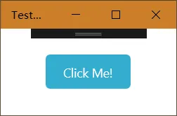
完整版是这样的,有改颜色的需求可以撸一下VisualState里的颜色:
<Style TargetType="Button" x:Key="CornerRadiusShadowButtonStyle">
    <Setter Property="Background" Value="{ThemeResource ButtonBackground}"/>
    <Setter Property="Foreground" Value="{ThemeResource ButtonForeground}"/>
    <Setter Property="BorderBrush" Value="Transparent" />
    <Setter Property="BorderThickness" Value="0" />
    <Setter Property="Padding" Value="20,10,20,10" />
    <Setter Property="HorizontalAlignment" Value="Left" />
    <Setter Property="VerticalAlignment" Value="Center" />
    <Setter Property="FontFamily" Value="{ThemeResource ContentControlThemeFontFamily}" />
    <Setter Property="FontWeight" Value="Normal" />
    <Setter Property="FontSize" Value="{ThemeResource ControlContentThemeFontSize}" />
    <Setter Property="UseSystemFocusVisuals" Value="True" />
    <Setter Property="FocusVisualMargin" Value="-3" />
    <Setter Property="Template">
        <Setter.Value>
            <ControlTemplate TargetType="Button">
                <Grid x:Name="RootGrid">
                    <VisualStateManager.VisualStateGroups>
                        <VisualStateGroup x:Name="CommonStates">
                            <VisualState x:Name="Normal" />
                            <VisualState x:Name="PointerOver">
                                <Storyboard>
                                    <ObjectAnimationUsingKeyFrames Storyboard.TargetName="Background" Storyboard.TargetProperty="Fill">
                                        <DiscreteObjectKeyFrame KeyTime="0" Value="{ThemeResource ButtonBackgroundPointerOver}" />
                                    </ObjectAnimationUsingKeyFrames>
                                </Storyboard>
                            </VisualState>
                            <VisualState x:Name="Pressed">
                                <Storyboard>
                                    <ObjectAnimationUsingKeyFrames Storyboard.TargetName="Background" Storyboard.TargetProperty="Fill">
                                        <DiscreteObjectKeyFrame KeyTime="0" Value="{ThemeResource ButtonBackgroundPressed}" />
                                    </ObjectAnimationUsingKeyFrames>
                                </Storyboard>
                            </VisualState>
                            <VisualState x:Name="Disabled">
                                <Storyboard>
                                    <ObjectAnimationUsingKeyFrames Storyboard.TargetName="Background" Storyboard.TargetProperty="Fill">
                                        <DiscreteObjectKeyFrame KeyTime="0" Value="{ThemeResource ButtonBackgroundDisabled}" />
                                    </ObjectAnimationUsingKeyFrames>
                                </Storyboard>
                            </VisualState>
                        </VisualStateGroup>
                    </VisualStateManager.VisualStateGroups>
                    <Rectangle x:Name="Background" Fill="{TemplateBinding Background}" HorizontalAlignment="Stretch" VerticalAlignment="Stretch" RadiusX="5" RadiusY="5" />
                    <ContentPresenter x:Name="ContentPresenter"
                        BorderBrush="{TemplateBinding BorderBrush}"
                        BorderThickness="{TemplateBinding BorderThickness}"
                        Content="{TemplateBinding Content}"
                        ContentTransitions="{TemplateBinding ContentTransitions}"
                        ContentTemplate="{TemplateBinding ContentTemplate}"
                        Padding="{TemplateBinding Padding}"
                        HorizontalContentAlignment="{TemplateBinding HorizontalContentAlignment}"
                        VerticalContentAlignment="{TemplateBinding VerticalContentAlignment}"
                        AutomationProperties.AccessibilityView="Raw" />
                </Grid>
            </ControlTemplate>
        </Setter.Value>
    </Setter>
</Style>