程序员Feri一名12年+的程序员,做过开发带过团队创过业,擅长Java相关开发、鸿蒙开发、人工智能等,专注于程序员搞钱那点儿事,希望在搞钱的路上有你相伴!君志所向,一往无前!
1.ArkUI中的布局
组件按照布局的要求依次排列,构成应用的页面。在声明式UI中,所有的页面都是由自定义组件构成,我们可以根据自己的需求,选择合适的布局进行页面开发。
布局指用特定的组件或者属性来管理用户页面所放置UI组件的大小和位置。在开发过程中,需要遵守以下流程保证整体的布局效果:
- 确定页面的布局结构。
- 分析页面中的元素构成。
- 选用适合的布局容器组件或属性控制页面中各个元素的位置和大小。
布局相关的容器组件可形成对应的布局效果
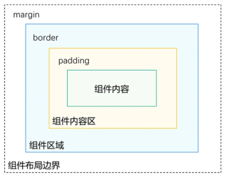
详解:
组件区域(蓝区方块):
组件区域表示组件的大小,width、height属性用于设置组件区域的大小。
组件内容区(黄色方块):
组件内容区大小为组件区域大小减去组件的border值,组件内容区大小会作为组件内容(或者子组件)进行大小测算时的布局测算限制。
组件内容(绿色方块):
组件内容本身占用的大小,比如文本内容占用的大小。组件内容和组件内容区不一定匹配,比如设置了固定的width和height,此时组件内容的大小就是设置的width和height减去padding和border值,但文本内容则是通过文本布局引擎测算后得到的大小,可能出现文本真实大小小于设置的组件内容区大小。当组件内容和组件内容区大小不一致时,align属性生效,定义组件内容在组件内容区的对齐方式,如居中对齐。
组件布局边界(虚线部分):
组件通过margin属性设置外边距时,组件布局边界就是组件区域加上margin的大小。
2.线性布局(Row/Column)
2.1 线性布局概述
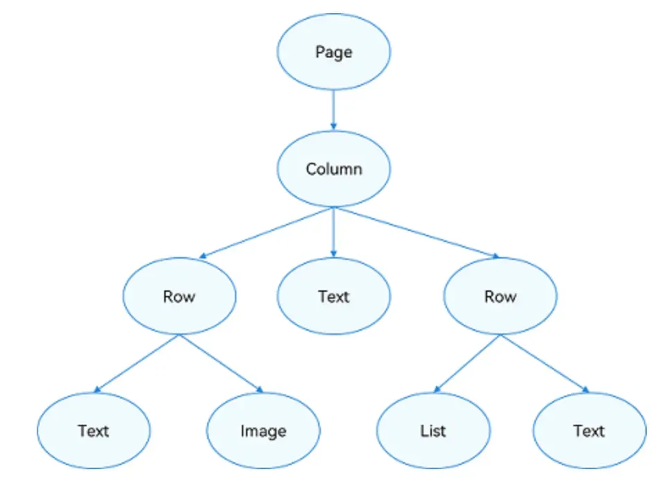
线性布局(LinearLayout)是开发中最常用的布局,通过线性容器 Row 和 Column 构建。
Column容器内子元素按照垂直方向排列
Row容器内子元素按照水平方向排列。
根据不同的排列方向,我们自己可选择使用Row或Column容器创建线性布局。
@Entry
@Component
struct MyStudy2{
  build() {
    Column(){
      //列方向
      Text().width("90%").height(50).backgroundColor(Color.Gray).borderWidth(1).margin(10)
      Text().width("90%").height(50).backgroundColor(Color.Gray).borderWidth(1).margin(10)
      Text().width("90%").height(50).backgroundColor(Color.Gray).borderWidth(1).margin(10)
      Text().width("90%").height(50).backgroundColor(Color.Gray).borderWidth(1).margin(10)

      //行方向
      Row(){
        Text().width("20%").height(200).backgroundColor(Color.Orange).borderWidth(1).margin(10)
        Text().width("20%").height(200).backgroundColor(Color.Orange).borderWidth(1).margin(10)
        Text().width("20%").height(200).backgroundColor(Color.Orange).borderWidth(1).margin(10)
        Text().width("20%").height(200).backgroundColor(Color.Orange).borderWidth(1).margin(10)
      }.width("100%").height(300).margin(10)

    }.width("100%")
  }
}
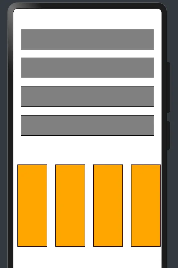
2.2 间距
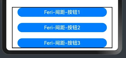
在布局容器内,可以通过 space 属性设置布局主方向方向上子元素的间距,使各子元素在布局主方向上有等间距效果。
属性:space:间距
示例如下:
//间距
      Column({space:20}){
        Button("Feri-间距-按钮1").width("90%").height(30)
        Button("Feri-间距-按钮2").width("90%").height(30)
        Button("Feri-间距-按钮3").width("90%").height(30)
      }.width("90%").borderWidth(2)
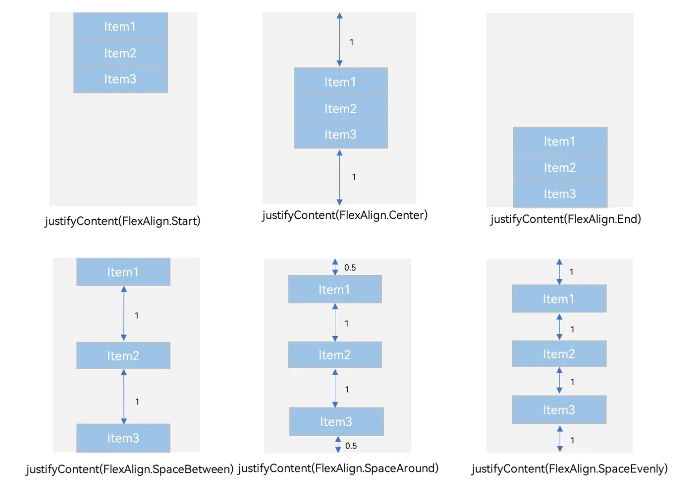
2.3 布局主方向对齐方式
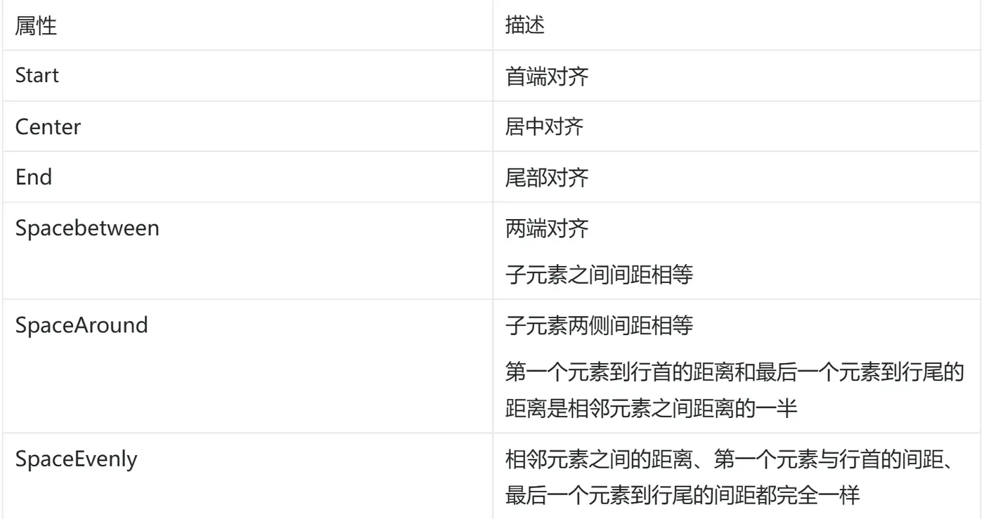
属性:justifyContent()
参数:枚举FlexAlign
具体取值如下所示:
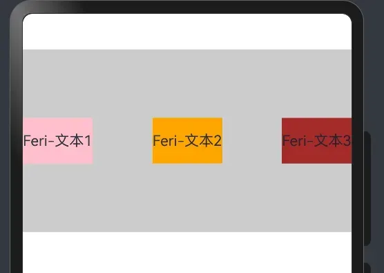
示例代码,如下所示:
  build() {
    Row() {
      Text('Feri-文本1')
        .height(50)
        .backgroundColor(Color.Pink)
      Text('Feri-文本2')
        .height(50)
        .backgroundColor(Color.Orange)
      Text('Feri-文本3')
        .height(50)
        .backgroundColor(Color.Brown)
    }
    .width('100%')
    .height(200)
    .backgroundColor('#ccc')
    // 主布局方向的对齐方式
    .justifyContent(FlexAlign.Center)
    // 两端对齐
    .justifyContent(FlexAlign.SpaceBetween)
  }
3 综合效果实现
@Entry
@Component
struct Index{
  build() {
    Column() {
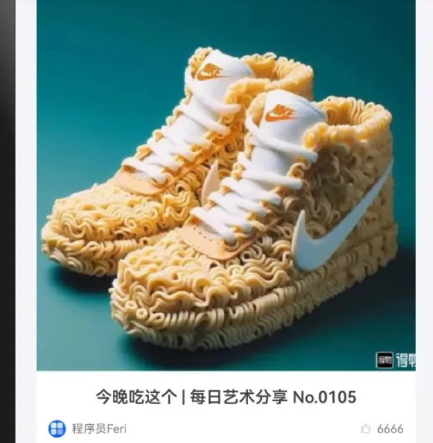
      // 产品卡片
      Column({space: 10}) {
        // 图片
        Image($r('app.media.xie'))
          .width('100%')
          .aspectRatio(1)
          .borderRadius({topLeft:5, topRight: 5})
        // 标题文字
        Text('今晚吃这个 | 每日艺术分享 No.0105')
          .fontSize(14)
          .fontWeight(600)
          .fontColor('#414141')
          .lineHeight(22)
          .padding({left: 10, right: 10})
        // 用户与点赞
        Row() {
          // 用户
          Row({space: 5}){
            Image($r('app.media.startIcon'))
              .width(15)
              .borderRadius(10)
            Text('程序员Feri')
              .fontSize(10)
              .fontColor('#787a7d')
          }
          // 点赞
          Row({ space: 5}){
            Image($r('app.media.xihuan'))
              .width(10)
              .aspectRatio(1)
              .fillColor('#c2c0ca')
            Text('6666')
              .fontSize(10)
              .fontColor('#787a7d')
          }
        }
        .width('100%')
        .padding({left: 10, right: 10})
        .justifyContent(FlexAlign.SpaceBetween)
      }
      .width("90%")
      .padding({bottom:10})
      .backgroundColor('#fff')
      .borderRadius(5)
    }
    .width('100%')
    .height('100%')
    .backgroundColor('#f5f4f9')
  }
}
好啦,就先说到这里,下一篇继续说线性布局,关注我,跟着搞harmony开发!