多行元素
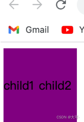
表格布局
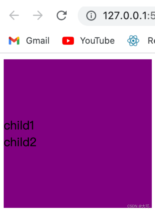
使用表格布局的 vertical-align: middle 可以实现子元素的垂直居中。
<!DOCTYPE html>
<html lang="en">
<head>
    <meta charset="UTF-8">
    <meta name="viewport" content="width=device-width, initial-scale=1.0">
    <title>Document</title>
    <style>
        .table-common {
            display: table;
            height: 100px;
            width: 100px;
            background: purple;
        }
        .table-child {
            display: table-cell;
            vertical-align: middle;
        }
    </style>
</head>
<body>
    <div class="table-common table-parent">
        <div class="table-child">child1</div>
        <div class="table-child">child2</div>
    </div>
</body>
</html>
弹性布局
利用弹性布局实现垂直居中,其中 flex-direction: column 定义主轴方向为纵向。
<!DOCTYPE html>
<html lang="en">
<head>
    <meta charset="UTF-8">
    <meta name="viewport" content="width=device-width, initial-scale=1.0">
    <title>Document</title>
    <style>
        .dad {
            width: 200px;
            height: 200px;
            background-color: purple;
            display: flex;
            flex-direction: column;
            justify-content: center;
        }
    </style>
</head>
<body>
    <div class="dad">
        <div>child1</div>
        <div>child2</div>
    </div>
</body>
</html>
块级元素
固定高度-定位-外边距偏移
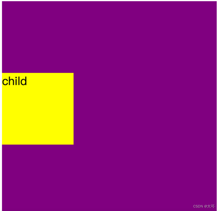
当居中元素的 高度和宽度 已知时,垂直居中问题就很简单。通过 绝对定位 元素距离顶部 50%,并设置 margin-top 向上偏移元素高度的一半,就可以实现垂直居中了。
<!DOCTYPE html>
<html lang="en">
<head>
    <meta charset="UTF-8">
    <meta name="viewport" content="width=device-width, initial-scale=1.0">
    <title>Document</title>
    <style>
        .dad {
            width: 300px;
            height: 300px;
            background-color: purple;
            position: relative;
        }
        .child {
            position: absolute;
            top: 50%;
            margin-top: -50px;
            width: 100px;
            height: 100px;
            background-color: yellow;
        }
    </style>
</head>
<body>
    <div class="dad">
        <div class="child">child</div>
    </div>
</body>
</html>
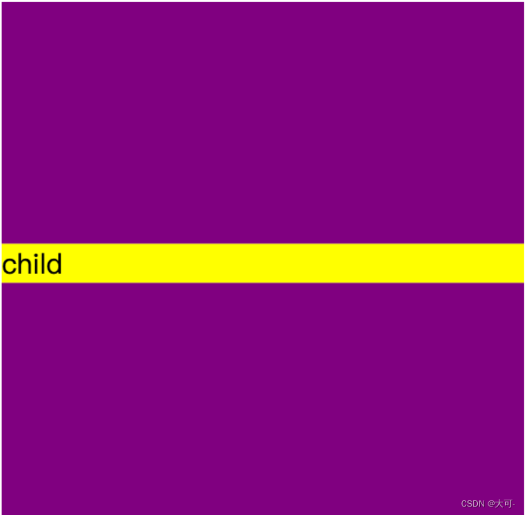
未知高度-外边距偏移
与 块级元素-有滚动条 实现效果类似,只是对定位元素自身的偏移使用 transform 实现
<!DOCTYPE html>
<html lang="en">
<head>
    <meta charset="UTF-8">
    <meta name="viewport" content="width=device-width, initial-scale=1.0">
    <title>Document</title>
    <style>
        .dad {
            width: 300px;
            height: 300px;
            background-color: purple;
            overflow: hidden;
        }
        .child {
            background-color: yellow;
            margin-top: 50%;
            transform: translateY(-50%);
        }
    </style>
</head>
<body>
    <div class="dad">
        <div class="child">
            child
        </div>
    </div>
</body>
</html>
水平垂直居中
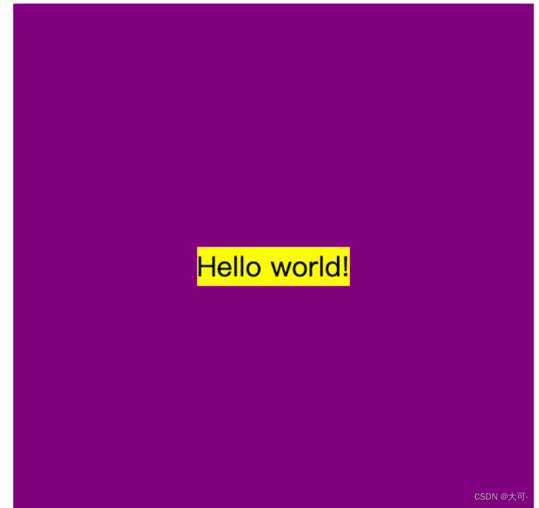
垂直居中文本
通过设置父元素容器 text-align 实现水平居中,设置一致的高度(height)和行高(line-height)实现对子元素的垂直居中,垂直居中元素设置 vertical-align 以及 line-height 为 initial 实现子元素内部的基准线垂直居中
<!DOCTYPE html>
<html lang="en">
<head>
    <meta charset="UTF-8">
    <meta name="viewport" content="width=device-width, initial-scale=1.0">
    <title>Document</title>
    <style>
        .dad {
            width: 300px;
            height: 300px;
            background-color: purple;
            text-align: center;
            line-height: 300px;
        }
        .child {
            display: inline-block;
            vertical-align: middle;
            line-height: initial;
            background-color: yellow;
        }
    </style>
</head>
<body>
    <div class="dad">
        <div class="child">Hello world!</div>
    </div>
</body>
</html>
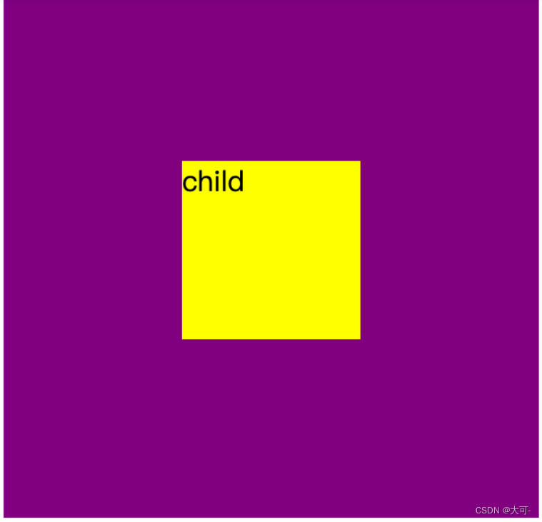
固定宽高元素
使用绝对定位向右向下定位至父元素宽度和高度的50%,再使用margin向上和想左偏移自身的50%
<!DOCTYPE html>
<html lang="en">
<head>
    <meta charset="UTF-8">
    <meta name="viewport" content="width=device-width, initial-scale=1.0">
    <title>Document</title>
    <style>
        .dad {
            width: 300px;
            height: 300px;
            background-color: purple;
            position: relative;
        }
        .child {
            width: 100px;
            height: 100px;
            background-color: yellow;
            position: absolute;
            left: 50%;
            top: 50%;
            margin-left: -50px;
            margin-top: -50px;
        }
    </style>
</head>
<body>
    <div class="dad">
        <div class="child">
            child
        </div>
    </div>
</body>
</html>
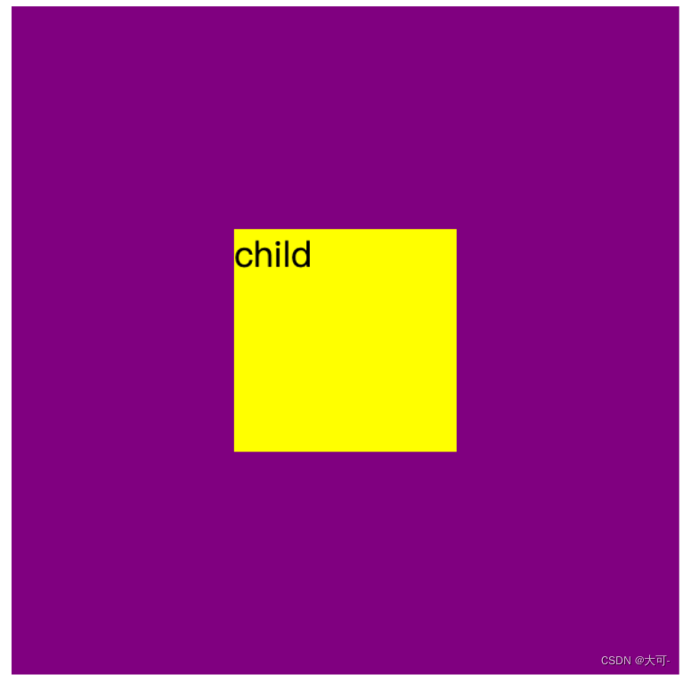
未知宽高元素
使用margin让自身向右向下偏移50%,使用 transform + translate 将垂直居中元素自身偏移负 50%
<!DOCTYPE html>
<html lang="en">
<head>
    <meta charset="UTF-8">
    <meta name="viewport" content="width=device-width, initial-scale=1.0">
    <title>Document</title>
    <style>
        .dad {
            width: 300px;
            height: 300px;
            background-color: purple;
            overflow: hidden;
        }
        .child {
            width: 100px;
            height: 100px;
            background-color: yellow;
            margin-top: 50%;
            margin-left: 50%;
            transform: translate(-50%, -50%);
        }
    </style>
</head>
<body>
    <div class="dad">
        <div class="child">
            child
        </div>
    </div>
</body>
</html>
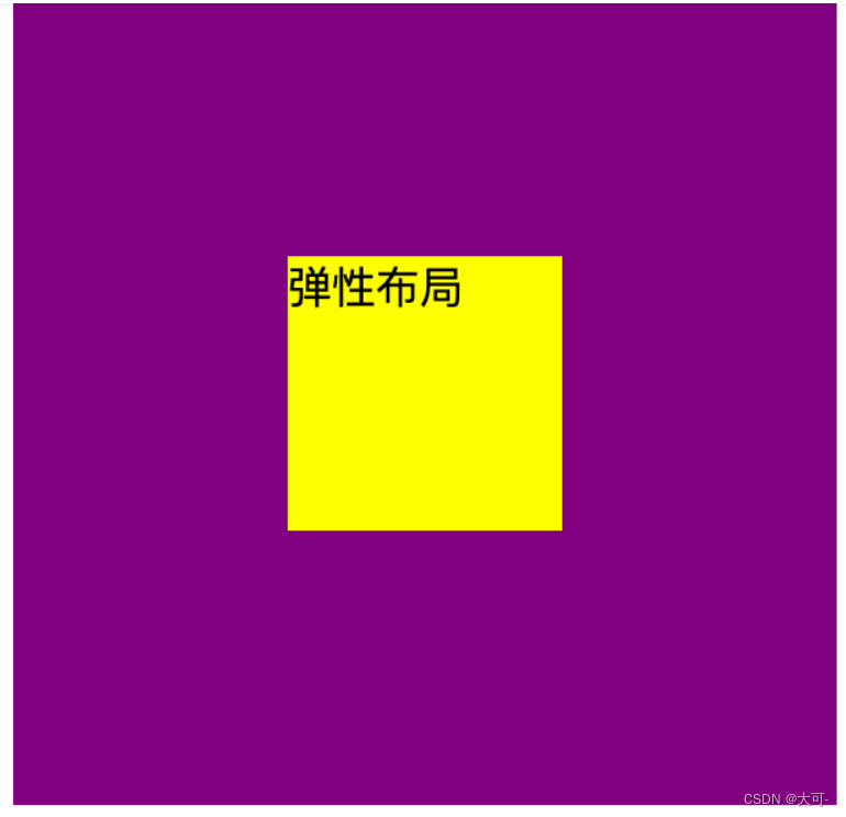
弹性布局
父元素设置为弹性布局容器,并将 justify-content 和 align-items 设置为 center 居中
<!DOCTYPE html>
<html lang="en">
<head>
    <meta charset="UTF-8">
    <meta name="viewport" content="width=device-width, initial-scale=1.0">
    <title>Document</title>
    <style>
        .dad {
            width: 300px;
            height: 300px;
            background-color: purple;
            display: flex;
            align-items: center;
            justify-content: center;
        }
        .child {
            width: 100px;
            height: 100px;
            background-color: yellow;
        }
    </style>
</head>
<body>
    <div class="dad">
        <div class="child">
            弹性布局
        </div>
    </div>
</body>
</html>
总结
本篇博客详细介绍了居中布局的多种实现方式,涵盖了水平居中、垂直居中以及水平垂直居中的场景,并提供了实用的示例代码。无论你是前端新手还是有一定经验的开发者,掌握这些居中布局的技巧都将对你在前端开发中有所裨益。希望通过本篇博客,你能够更好地理解和运用居中布局,提升自己的前端技能,构建更美观、专业的网页。