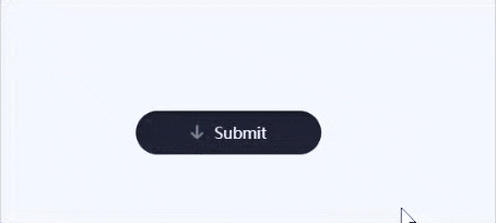
效果
完整代码
HTML部分
<button id="button" class="ready" onclick="clickButton();">

        <div class="message submitMessage">
          <svg xmlns="http://www.w3.org/2000/svg" viewBox="0 0 13 12.2">
            <polyline stroke="currentColor" points="2,7.1 6.5,11.1 11,7.1 "/>
            <line stroke="currentColor" x1="6.5" y1="1.2" x2="6.5" y2="10.3"/>
          </svg> <span class="button-text">Submit</span>
        </div>

        <div class="message loadingMessage">
          <svg xmlns="http://www.w3.org/2000/svg" viewBox="0 0 19 17">
            <circle class="loadingCircle" cx="2.2" cy="10" r="1.6"/>
            <circle class="loadingCircle" cx="9.5" cy="10" r="1.6"/>
            <circle class="loadingCircle" cx="16.8" cy="10" r="1.6"/>
          </svg>
        </div>

        <div class="message successMessage">
          <svg xmlns="http://www.w3.org/2000/svg" viewBox="0 0 13 11">
            <polyline stroke="currentColor" points="1.4,5.8 5.1,9.5 11.6,2.1 "/>
          </svg> <span class="button-text">Success</span>
        </div>
      </button>

      <canvas id="canvas"></canvas>
CSS部分
@keyframes loading {
  0% { transform: translateY(10px); }
  25% { transform: translateY(3px); }
  50% { transform: translateY(10px); }
}
body {
  -webkit-font-smoothing: antialiased;
  background-color: #f4f7ff;
}
canvas {
  height: 100vh;
  pointer-events: none;
  position: fixed;
  width: 100%;
  z-index: 2;
}
button {
  background: none;
  border: none;
  color: #f4f7ff;
  cursor: pointer;
  font-family: 'Quicksand', sans-serif;
  font-size: 14px;
  font-weight: 500;
  height: 40px;
  left: 50%;
  outline: none;
  overflow: hidden;
  padding: 0 10px;
  position: fixed;
  top: 50%;
  transform: translate(-50%, -50%);
  width: 190px;
  -webkit-tap-highlight-color: transparent;
  z-index: 1;
  &::before {
    background: #1f2335;
    border-radius: 50px;
    box-shadow: 0 2px 5px rgba(0, 0, 0, .4) inset;
    content: '';
    display: block;
    height: 100%;
    margin: 0 auto;
    position: relative;
    transition: width .2s cubic-bezier(.39,1.86,.64,1) .3s;
    width: 100%;
  }
}
/* READY STATE */
button.ready .submitMessage svg {
  opacity: 1;
  top: 1px;
  transition: top .4s ease 600ms, opacity .3s linear 600ms;
}
button.ready .submitMessage .button-text span {
  top: 0;
  opacity: 1;
  transition: all .2s ease 1.6s;
}
/* LOADING STATE */
button.loading::before {
  transition: width .3s ease;
  width: 80%;
}
button.loading .loadingMessage {
  opacity: 1;
}
button.loading .loadingCircle {
  animation-duration: 1s;
  animation-iteration-count: infinite;
  animation-name: loading;
}
/* COMPLETE STATE */
button.complete .submitMessage svg {
  top: -30px;
  transition: none;
}
button.complete .submitMessage .button-text span {
  top: -8px;
  transition: none;
}
button.complete .loadingMessage {
  top: 80px;
}
button.complete .successMessage .button-text span {
  left: 0;
  opacity: 1;
  transition: all .2s ease 2.4s;
}
button.complete .successMessage svg {
  stroke-dashoffset: 0;
  transition: stroke-dashoffset .3s ease-in-out 2.4s;
}
.button-text span {
  opacity: 0;
  position: relative;
}
.message {
  left: 50%;
  position: absolute;
  top: 50%;
  transform: translate(-50%, -50%);
  width: 100%;
}
.message svg {
  display: inline-block;
  fill: none;
  margin-right: 5px;
  stroke-linecap: round;
  stroke-linejoin: round;
  stroke-width: 2;
}
.submitMessage .button-text span {
  top: 8px;
  transition: all .2s ease var(--d, 0s);
}
.submitMessage svg {
  color: #5c86ff;
  margin-left: -1px;
  opacity: 0;
  position: relative;
  top: 30px;
  transition: top .4s ease, opacity .3s linear;
  width: 14px;
}
.loadingMessage {
  opacity: 0;
  transition: opacity .3s linear .3s, top .4s cubic-bezier(.22,0,.41,-0.57);
  svg {
    fill: #5c86ff;
    margin: 0;
    width: 22px;
  }
}
.successMessage .button-text span {
  left: 5px;
  transition: all .2s ease var(--dr, 0s);
}

.successMessage svg {
  color: #5cffa1;
  stroke-dasharray: 20;
  stroke-dashoffset: 20;
  transition: stroke-dashoffset .3s ease-in-out;
  width: 14px;
}
.loadingCircle:nth-child(2) { animation-delay: .1s }
.loadingCircle:nth-child(3) { animation-delay: .2s }
JS
// ammount to add on each button press
const confettiCount = 20
const sequinCount = 10
// "physics" variables
const gravityConfetti = 0.3
const gravitySequins = 0.55
const dragConfetti = 0.075
const dragSequins = 0.02
const terminalVelocity = 3
// init other global elements
const button = document.getElementById('button')
var disabled = false
const canvas = document.getElementById('canvas')
const ctx = canvas.getContext('2d')
canvas.width = window.innerWidth
canvas.height = window.innerHeight
let cx = ctx.canvas.width / 2
let cy = ctx.canvas.height / 2
// add Confetto/Sequin objects to arrays to draw them
let confetti = []
let sequins = []
// colors, back side is darker for confetti flipping
const colors = [
  { front : '#7b5cff', back: '#6245e0' }, // Purple
  { front : '#b3c7ff', back: '#8fa5e5' }, // Light Blue
  { front : '#5c86ff', back: '#345dd1' } // Darker Blue
]
// helper function to pick a random number within a range
randomRange = (min, max) => Math.random() * (max - min) + min
// helper function to get initial velocities for confetti
// this weighted spread helps the confetti look more realistic
initConfettoVelocity = (xRange, yRange) => {
  const x = randomRange(xRange[0], xRange[1])
  const range = yRange[1] - yRange[0] + 1
  let y = yRange[1] - Math.abs(randomRange(0, range) + randomRange(0, range) - range)
  if (y >= yRange[1] - 1) {
    // Occasional confetto goes higher than the max
    y += (Math.random() < .25) ? randomRange(1, 3) : 0
  }
  return {x: x, y: -y}
}
// Confetto Class
function Confetto() {
  this.randomModifier = randomRange(0, 99)
  this.color = colors[Math.floor(randomRange(0, colors.length))]
  this.dimensions = {
    x: randomRange(5, 9),
    y: randomRange(8, 15),
  }
  this.position = {
    x: randomRange(canvas.width/2 - button.offsetWidth/4, canvas.width/2 + button.offsetWidth/4),
    y: randomRange(canvas.height/2 + button.offsetHeight/2 + 8, canvas.height/2 + (1.5 * button.offsetHeight) - 8),
  }
  this.rotation = randomRange(0, 2 * Math.PI)
  this.scale = {
    x: 1,
    y: 1,
  }
  this.velocity = initConfettoVelocity([-9, 9], [6, 11])
}
Confetto.prototype.update = function() {
  // apply forces to velocity
  this.velocity.x -= this.velocity.x * dragConfetti
  this.velocity.y = Math.min(this.velocity.y + gravityConfetti, terminalVelocity)
  this.velocity.x += Math.random() > 0.5 ? Math.random() : -Math.random()

  // set position
  this.position.x += this.velocity.x
  this.position.y += this.velocity.y
  // spin confetto by scaling y and set the color, .09 just slows cosine frequency
  this.scale.y = Math.cos((this.position.y + this.randomModifier) * 0.09)
}
// Sequin Class
function Sequin() {
  this.color = colors[Math.floor(randomRange(0, colors.length))].back,
  this.radius = randomRange(1, 2),
  this.position = {
    x: randomRange(canvas.width/2 - button.offsetWidth/3, canvas.width/2 + button.offsetWidth/3),
    y: randomRange(canvas.height/2 + button.offsetHeight/2 + 8, canvas.height/2 + (1.5 * button.offsetHeight) - 8),
  },
  this.velocity = {
    x: randomRange(-6, 6),
    y: randomRange(-8, -12)
  }
}
Sequin.prototype.update = function() {
  // apply forces to velocity
  this.velocity.x -= this.velocity.x * dragSequins
  this.velocity.y = this.velocity.y + gravitySequins

  // set position
  this.position.x += this.velocity.x
  this.position.y += this.velocity.y
}
// add elements to arrays to be drawn
initBurst = () => {
  for (let i = 0; i < confettiCount; i++) {
    confetti.push(new Confetto())
  }
  for (let i = 0; i < sequinCount; i++) {
    sequins.push(new Sequin())
  }
}
// draws the elements on the canvas
render = () => {
  ctx.clearRect(0, 0, canvas.width, canvas.height)

  confetti.forEach((confetto, index) => {
    let width = (confetto.dimensions.x * confetto.scale.x)
    let height = (confetto.dimensions.y * confetto.scale.y)

    // move canvas to position and rotate
    ctx.translate(confetto.position.x, confetto.position.y)
    ctx.rotate(confetto.rotation)
    // update confetto "physics" values
    confetto.update()

    // get front or back fill color
    ctx.fillStyle = confetto.scale.y > 0 ? confetto.color.front : confetto.color.back

    // draw confetto
    ctx.fillRect(-width / 2, -height / 2, width, height)

    // reset transform matrix
    ctx.setTransform(1, 0, 0, 1, 0, 0)
    // clear rectangle where button cuts off
    if (confetto.velocity.y < 0) {
      ctx.clearRect(canvas.width/2 - button.offsetWidth/2, canvas.height/2 + button.offsetHeight/2, button.offsetWidth, button.offsetHeight)
    }
  })
  sequins.forEach((sequin, index) => {
    // move canvas to position
    ctx.translate(sequin.position.x, sequin.position.y)

    // update sequin "physics" values
    sequin.update()

    // set the color
    ctx.fillStyle = sequin.color

    // draw sequin
    ctx.beginPath()
    ctx.arc(0, 0, sequin.radius, 0, 2 * Math.PI)
    ctx.fill()
    // reset transform matrix
    ctx.setTransform(1, 0, 0, 1, 0, 0)
    // clear rectangle where button cuts off
    if (sequin.velocity.y < 0) {
      ctx.clearRect(canvas.width/2 - button.offsetWidth/2, canvas.height/2 + button.offsetHeight/2, button.offsetWidth, button.offsetHeight)
    }
  })
  // remove confetti and sequins that fall off the screen
  // must be done in seperate loops to avoid noticeable flickering
  confetti.forEach((confetto, index) => {
    if (confetto.position.y >= canvas.height) confetti.splice(index, 1)
  })
  sequins.forEach((sequin, index) => {
    if (sequin.position.y >= canvas.height) sequins.splice(index, 1)
  })
  window.requestAnimationFrame(render)
}
// cycle through button states when clicked
clickButton = () => {
  if (!disabled) {
    disabled = true
    // Loading stage
    button.classList.add('loading')
    button.classList.remove('ready')
    setTimeout(() => {
      // Completed stage
      button.classList.add('complete')
      button.classList.remove('loading')
      setTimeout(() => {
        window.initBurst()
        setTimeout(() => {
          // Reset button so user can select it again
          disabled = false
          button.classList.add('ready')
          button.classList.remove('complete')
        }, 4000)
      }, 320)
    }, 1800)
  }
}
// re-init canvas if the window size changes
resizeCanvas = () => {
  canvas.width = window.innerWidth
  canvas.height = window.innerHeight
  cx = ctx.canvas.width / 2
  cy = ctx.canvas.height / 2
}
// resize listenter
window.addEventListener('resize', () => {
  resizeCanvas()
})
// click button on spacebar or return keypress
document.body.onkeyup = (e) => {
  if (e.keyCode == 13 || e.keyCode == 32) {
    clickButton()
  }
}
// Set up button text transition timings on page load
textElements = button.querySelectorAll('.button-text')
textElements.forEach((element) => {
  characters = element.innerText.split('')
  let characterHTML = ''
  characters.forEach((letter, index) => {
    characterHTML += `<span class="char${index}" style="--d:${index * 30}ms; --dr:${(characters.length - index - 1) * 30}ms;">${letter}</span>`
  })
  element.innerHTML = characterHTML
})
// kick off the render loop
window.initBurst()
render()
