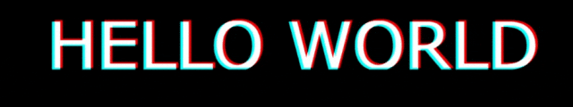
先上效果
🌟 在视觉传达的艺术中,logo作为品牌的第一印象,其设计至关重要。随着网页设计趋势的发展,动态元素的加入使得logo不再局限于静态图像,而是能够通过动画效果与用户产生更深层次的互动。本文将探讨如何利用CSS为logo添加阴影动画效果,让品牌标志在网页上生动起来,增强品牌的吸引力和记忆度。
完整代码
以下是完整代码:
HTML:
<div class="textItem" data-word="HELLO WORLD">

    </div>
CSS代码:
body {background:#000}
    .textItem {
    position: absolute;
    top: 50%;
    left: 50%;
    transform: translate(-50%, -50%) scale(3);
    width: 300px;
    font-size: 36px;
    font-family: Raleway, Verdana, Arial;
    color: transparent;
}
.textItem::before {
    content: attr(data-word);
    position: absolute;
    top: 0;
    left: 0;
    height: 36px;
    color: red;
    overflow: hidden;
    z-index: 2;
    filter: contrast(200%);
    text-shadow: 1px 0 0 red;
    animation: move 0.95s infinite;
}
.textItem::after {
    content: attr(data-word);
    position: absolute;
    top: 0;
    left: -1px;
    height: 36px;
    color: rgba(255, 255, 255, 0.8);
    overflow: hidden;
    z-index: 3;
    color: cyan;
    filter: contrast(200%);
    text-shadow: -1px 0 0 cyan;
    mix-blend-mode: lighten;
    animation: move 1.1s infinite 0.2s;
}
@keyframes move {
    10% {
        top: -0.4px;
        left: -1.1px;
    }
    20% {
        top: 0.4px;
        left: -0.2px;
    }
    30% {
        left: .5px;
    }
    40% {
        top: -0.3px;
        left: -0.7px;
    }
    50% {
        left: 0.2px;
    }
    60% {
        top: 1.8px;
        left: -1.2px;
    }
    70% {
        top: -1px;
        left: 0.1px;
    }
    80% {
        top: -0.4px;
        left: -0.9px;
    }
    90% {
        left: 1.2px;
    }
    100% {
        left: -1.2px;
    }
}
🌟 关键技术点如下:
- 变换(Transform):
.textItem使用了transform: translate(-50%, -50%) scale(3);来将元素的位置偏移并缩放。 - 伪元素(Pseudo-elements):
.textItem::before和.textItem::after使用伪元素来在元素的前后添加额外的内容,这些内容可以被定位和动画化。 - 过渡(Transitions):动画效果是通过过渡(
transition)属性实现的,它可以平滑地改变元素的状态。 - 动画(Animations):
.textItem::before和.textItem::after的动画是通过@keyframes规则定义的,这些规则定义了动画的不同状态和它们之间的转换。 - CSS变量(Custom Properties):尽管在您提供的代码中没有直接使用CSS变量,但CSS变量可以用来定义和复用颜色和尺寸等值,以提高代码的可维护性。
