三、核心组件详解
Naive UI提供了超过90个高质量组件,以下是中后台开发中最常用的核心组件及其详细用法。
3.1 按钮组件 NButton
按钮是用户交互中最基础的组件,Naive UI的按钮组件设计简洁但功能完整。
<template>
  <!-- 按钮类型 -->
  <n-space>
    <n-button>默认按钮</n-button>
    <n-button type="primary">主要按钮</n-button>
    <n-button type="success">成功按钮</n-button>
    <n-button type="info">信息按钮</n-button>
    <n-button type="warning">警告按钮</n-button>
    <n-button type="error">错误按钮</n-button>
  </n-space>

  <!-- 按钮状态 -->
  <n-space>
    <n-button loading>加载中</n-button>
    <n-button disabled>禁用状态</n-button>
    <n-button strong secondary>次要强调</n-button>
    <n-button text>文本按钮</n-button>
  </n-space>

  <!-- 按钮尺寸 -->
  <n-space>
    <n-button size="tiny">超小</n-button>
    <n-button size="small">小型</n-button>
    <n-button size="medium">中型(默认)</n-button>
    <n-button size="large">大型</n-button>
  </n-space>

  <!-- 图标按钮 -->
  <n-space>
    <n-button circle>
      <template #icon>
        <n-icon><search-outline /></n-icon>
      </template>
    </n-button>
    <n-button round>
      <template #icon>
        <n-icon><add-outline /></n-icon>
      </template>
      新增
    </n-button>
  </n-space>
</template>

<script setup>
import { NButton, NSpace, NIcon } from 'naive-ui'
import { SearchOutline, AddOutline } from '@vicons/ionicons5'
</script>
3.2 数据表格 NDataTable
数据表格是中后台系统的核心组件。Naive UI的表格组件默认启用虚拟列表,即使渲染数万行数据也能保持流畅。
<template>
  <n-data-table
    :columns="columns"
    :data="data"
    :pagination="pagination"
    :bordered="true"
    :loading="loading"
    :scroll-x="1200"
    :max-height="500"
    @update:page="handlePageChange"
  />
</template>

<script setup>
import { ref } from 'vue'
import { NDataTable, NTag, NButton, NSpace } from 'naive-ui'

const loading = ref(false)

// 表格列定义
const columns = [
  {
    title: 'ID',
    key: 'id',
    width: 80,
    fixed: 'left'  // 固定列
  },
  {
    title: '姓名',
    key: 'name',
    width: 120,
    sorter: (a, b) => a.name.localeCompare(b.name)  // 本地排序
  },
  {
    title: '状态',
    key: 'status',
    width: 100,
    render(row) {
      return h(NTag, {
        type: row.status === 'active' ? 'success' : 'error',
        bordered: false
      }, { default: () => row.status === 'active' ? '启用' : '禁用' })
    }
  },
  {
    title: '操作',
    key: 'actions',
    width: 150,
    fixed: 'right',
    render(row) {
      return h(NSpace, {}, [
        h(NButton, { size: 'small', onClick: () => handleEdit(row) }, { default: () => '编辑' }),
        h(NButton, { size: 'small', type: 'error', onClick: () => handleDelete(row) }, { default: () => '删除' })
      ])
    }
  }
]

// 分页配置
const pagination = ref({
  page: 1,
  pageSize: 20,
  pageCount: 10,
  showSizePicker: true,
  pageSizes: [10, 20, 50, 100]
})

const handlePageChange = (page) => {
  pagination.value.page = page
  fetchData()
}
</script>
表格组件的关键特性:默认虚拟列表处理大数据量,内置排序、筛选、分页功能,支持固定列和可伸缩列。
3.3 表单组件 NForm
Naive UI的表单组件提供了完善的验证机制和优雅的错误提示。
<template>
  <n-form
    ref="formRef"
    :model="formValue"
    :rules="rules"
    :label-width="100"
    label-placement="left"
    size="medium"
  >
    <n-form-item label="用户名" path="username">
      <n-input v-model:value="formValue.username" placeholder="请输入用户名" />
    </n-form-item>

    <n-form-item label="邮箱" path="email">
      <n-input v-model:value="formValue.email" placeholder="请输入邮箱" />
    </n-form-item>

    <n-form-item label="角色" path="role">
      <n-select
        v-model:value="formValue.role"
        :options="roleOptions"
        placeholder="请选择角色"
        label-field="label"
        value-field="value"
      />
    </n-form-item>

    <n-form-item label="状态" path="status">
      <n-switch v-model:value="formValue.status" />
    </n-form-item>

    <n-form-item>
      <n-space>
        <n-button type="primary" @click="handleSubmit">提交</n-button>
        <n-button @click="handleReset">重置</n-button>
      </n-space>
    </n-form-item>
  </n-form>
</template>

<script setup>
import { ref } from 'vue'
import { NForm, NFormItem, NInput, NSelect, NSwitch, NButton, NSpace } from 'naive-ui'

const formRef = ref(null)

const formValue = ref({
  username: '',
  email: '',
  role: null,
  status: false
})

// 表单验证规则
const rules = {
  username: [
    { required: true, message: '请输入用户名', trigger: 'blur' },
    { min: 3, max: 20, message: '长度在3-20个字符', trigger: 'blur' }
  ],
  email: [
    { required: true, message: '请输入邮箱', trigger: 'blur' },
    { type: 'email', message: '请输入正确的邮箱格式', trigger: 'blur' }
  ],
  role: [
    { required: true, message: '请选择角色', trigger: 'change' }
  ]
}

const roleOptions = [
  { label: '管理员', value: 'admin' },
  { label: '普通用户', value: 'user' }
]

const handleSubmit = () => {
  formRef.value?.validate((errors) => {
    if (!errors) {
      console.log('表单数据:', formValue.value)
    }
  })
}

const handleReset = () => {
  formRef.value?.restoreValidation()
  formValue.value = { username: '', email: '', role: null, status: false }
}
</script>
Naive UI表单的优势:验证规则清晰、错误提示友好、与组件库其他组件无缝集成。根据实战经验,其校验体验优于同类产品。
3.4 消息组件
Naive UI提供了四种消息组件,用于不同场景的用户反馈。
3.4.1 Message消息提示
<script setup>
import { useMessage } from 'naive-ui'

const message = useMessage()

const showMessage = () => {
  message.success('操作成功')
  message.warning('警告信息')
  message.error('错误信息')
  message.info('提示信息')
  message.loading('加载中...')
}
</script>
3.4.2 Dialog对话框
<script setup>
import { useDialog } from 'naive-ui'

const dialog = useDialog()

const confirmDelete = () => {
  dialog.warning({
    title: '确认删除',
    content: '确定要删除这条数据吗?此操作不可恢复。',
    positiveText: '确定',
    negativeText: '取消',
    onPositiveClick: () => {
      message.success('删除成功')
    }
  })
}
</script>
3.4.3 Notification通知
<script setup>
import { useNotification } from 'naive-ui'

const notification = useNotification()

const showNotification = () => {
  notification.success({
    title: '操作成功',
    content: '您的数据已成功保存',
    duration: 3000,
    placement: 'top-right'
  })
}
</script>
3.5 布局组件
3.5.1 栅格布局 NGrid
Naive UI的栅格系统基于24列设计,支持响应式布局。
<template>
  <n-grid :cols="24" :x-gap="16" :y-gap="24">
    <n-grid-item :span="24" :xs="24" :sm="12" :md="8" :lg="6">
      响应式卡片1
    </n-grid-item>
    <n-grid-item :span="24" :xs="24" :sm="12" :md="8" :lg="6">
      响应式卡片2
    </n-grid-item>
    <n-grid-item :span="24" :xs="24" :sm="12" :md="8" :lg="6">
      响应式卡片3
    </n-grid-item>
    <n-grid-item :span="24" :xs="24" :sm="12" :md="8" :lg="6">
      响应式卡片4
    </n-grid-item>
  </n-grid>
</template>

<script setup>
import { NGrid, NGridItem } from 'naive-ui'
</script>
3.5.2 布局与间距 NSpace
是Naive UI中最常用的布局辅助组件,用于管理子元素之间的间距。
<template>
  <!-- 水平间距 -->
  <n-space>
    <n-button>按钮1</n-button>
    <n-button>按钮2</n-button>
    <n-button>按钮3</n-button>
  </n-space>

  <!-- 垂直间距 -->
  <n-space vertical>
    <n-card>卡片1</n-card>
    <n-card>卡片2</n-card>
  </n-space>

  <!-- 自定义间距大小 -->
  <n-space :size="20" wrap>
    <n-tag v-for="i in 10" :key="i">标签{
  { i }}</n-tag>
  </n-space>
</template>
3.6 其他常用组件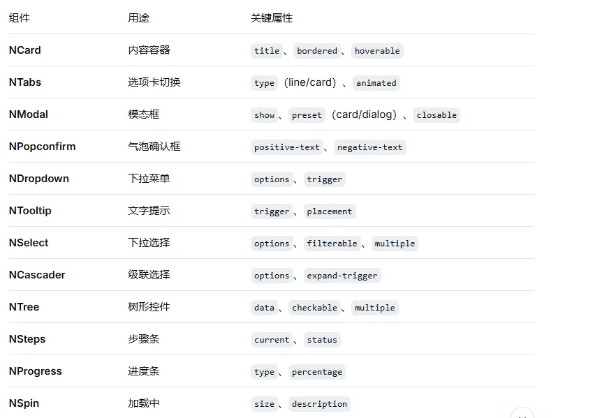
四、主题定制
4.1 主题系统架构
Naive UI的主题系统是其最独特的设计之一,完全基于TypeScript构建,提供类型安全的主题定制体验。核心主题功能由src/themes/index.ts文件导出,包含了默认的明暗主题和主题创建工具。
主题系统的文件结构:
themes/default:默认亮色主题
themes/dark:暗色主题
themes/interface.ts:主题类型定义和接口
4.2 自定义主题
基础主题扩展
扩展现有主题是最常见的需求,只需覆盖需要修改的变量即可:
<template>
  <n-config-provider :theme-overrides="themeOverrides">
    <app />
  </n-config-provider>
</template>

<script setup>
const themeOverrides = {
  common: {
    primaryColor: '#7c3aed',      // 紫色主色调
    primaryColorHover: '#6d28d9',  // 悬停色
    primaryColorPressed: '#5b21b6', // 按下色
    successColor: '#10b981',
    warningColor: '#f59e0b',
    errorColor: '#ef4444',
    infoColor: '#3b82f6',
    borderRadius: '8px',
    fontSize: '14px'
  },
  Button: {
    borderRadius: '6px',
    heightLarge: '44px'
  },
  DataTable: {
    borderRadius: '8px'
  }
}
</script>
4.3 暗黑模式支持
Naive UI内置了暗黑主题,可以一键切换:
<template>
  <n-config-provider :theme="darkTheme ? darkTheme : null">
    <app />
  </n-config-provider>
</template>

<script setup>
import { darkTheme } from 'naive-ui'
import { useOsTheme } from 'naive-ui'

const osTheme = useOsTheme()
const darkTheme = computed(() => osTheme.value === 'dark')
</script>
Naive UI的暗黑模式会自动适配操作系统的主题设置,也可以通过darkTheme变量手动控制。
4.4 多端适配时的主题覆盖
在实际项目中发现,Naive UI默认的间距(spacing)和字体大小在移动端偏大,需要手动覆盖:
<script setup>
const themeOverrides = {
  common: {
    fontSizeSmall: '12px',
    fontSizeMedium: '14px',
    fontSizeLarge: '16px',
    heightSmall: '28px',
    heightMedium: '32px',
    heightLarge: '40px'
  }
}
</script>