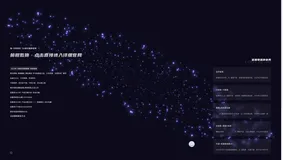
效果

部分HTML:
<canvas id="c" style="position: absolute;z-index: -1;text-align: center;height:100vh;top:0;left:0;width:100%"></canvas>
<div onclick=star() style="position: absolute;top: 200px;width: 100%;cursor: pointer;text-align:center;font-size:20px;font-weight:bold;z-index:9990"><h1 class="svoiceIcon">你知道吗,等待是最长情的告白♥</h1></div>
<div class="wrap">
</div>
<div style="position:absolute;width:100%;left:0;bottom:0">
</div>
<div class="star"><div class="heart animated"></div></div>
CSS部分
body,html{
margin:0;padding:0;
overflow:hidden
}
.svoiceIcon{
  animation-name:colorswitchs;
  animation-duration: 3s; /*动画时间*/
  animation-fill-mode: both; /*播放后的状态*/
  animation-iteration-count: infinite; /*动作循环的次数:infinite 无限循环*/
}
@keyframes colorswitchs {
  0% {
    color: #0087C9
  }

  20% {
    color: #EF4A53
  }
  40% {
    color: #804cfa
  }
  60% {
    color: #FFB463
  }

  80% {
    color: #33D5D4
  }
  100% {
    color: #0087C9
  }
}
.star{
  width: 100%;
  position: fixed;
  left: 0;
  top: 40vh;
  display:none;
  z-index:9991
}
/*心跳开始 */
.heart{
   width: 200px;
   height: 200px;
   background: #f00;
   position: relative;
   filter:drop-shadow(0px 0px 20px rgb(255,20,20));
   transform: rotate(45deg);
   margin: 20px auto;
}
.heart{
  animation-name:heartbeat;
  animation-duration: 1s; /*动画时间*/
  animation-fill-mode: both; /*播放后的状态*/
  animation-iteration-count: infinite; /*动作循环的次数:infinite 无限循环*/
}
.heart:before, .heart:after{
    content: "";
    position: absolute;
    width: 200px;
    height: 200px;
    background: #f00;
    border-radius: 100px;
}
.heart:before{
   left: -100px;
}
.heart:after{
   left: 0;
   top: -100px;
}
@keyframes heartbeat{
    0%{transform: rotate(45deg) scale(0.8,0.8); opacity: 1;}
    25%{transform: rotate(45deg) scale(1,1); opacity: 0.8;}
    100%{transform: rotate(45deg) scale(0.8,0.8); opacity: 1;}
}
/* 心跳结束 */
.music{
  position: fixed;
  right: 4%;
  top: 2%;
  width: 120px;
  height: 120px;
  z-index: 999999;
  opacity:0.5
}
.musicRotate{
  animation-name:musicrotate;
  animation-duration: 4s; /*动画时间*/
  animation-timing-function:linear;
  -webkit-animation-timing-function:linear; /* Safari 和 Chrome */
  animation-fill-mode: both; /*播放后的状态*/
  animation-iteration-count: infinite; /*动作循环的次数:infinite 无限循环*/
}
@keyframes musicrotate{
  0%{-webkit-transform:rotate(0deg);}

    25%{-webkit-transform:rotate(90deg);}

    50%{-webkit-transform:rotate(180deg);}

    75%{-webkit-transform:rotate(270deg);}

    100%{-webkit-transform:rotate(360deg);}
}