
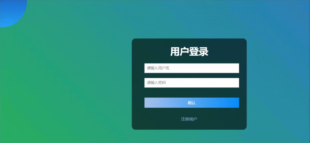
先上效果
🌟登录页面作为用户进入网站或应用的门户,其设计直接影响着用户的第一印象。结合CSS动画的背景效果,可以显著提升登录页的吸引力和用户体验。本文将深入探讨如何利用CSS代码为登录页添加引人入胜的背景动画效果,让登录过程变得更加生动和愉悦。
完整代码
以下是完整代码:
HTML:
<div class="container">
      <div class="shape"></div>
      <div class="login-wrapper">


        <div class="header">用户登录</div>
        <div class="form-wrapper">
          <input
            type="text"
            name="用户名"
            placeholder="请输入用户名"
            class="input-item"
          />
          <input
            type="password"
            name="密码"
            placeholder="请输入密码"
            class="input-item"
          />
          <div class="btn">确认</div>
        </div>
        <div class="msg">
          <a href="#">注册用户</a>
        </div>
      </div>
    </div>
CSS代码:
* {
        margin: 0;
        padding: 0;
      }
      html {
        height: 100%;
      }
      body {
        height: 100%;
      }
      .shape:first-child{
        background: linear-gradient(
            #1845ad,
            #23a2f6
        );
        position: absolute;
        left: -80px;
        top: -80px;
    }
    .shape{
    height: 200px;
    width: 200px;
    position: absolute;
    border-radius: 50%;z-index:1
}
    .shape:last-child{
      position: absolute;
        background: linear-gradient(
            to right,
            #ff512f,
            #f09819
        );
        right: -30px;
        bottom: -80px;
    }
      .container {
        height: 100%;
        background-image: linear-gradient(45deg,#2c3e50,#27ae60,#2980b9,#e74c3c,#8e44ad);
            background-size: 400%;
            animation: bganimation 15s infinite;
      }
      .login-wrapper {
        background-color: rgb(0, 0, 0,0.6);
        width: 358px;
        /* height: 588px; */
        border-radius: 15px;
        padding: 0 50px;
        position: relative;
        left: 50%;
        z-index:2;
        top: 50%;
        transform: translate(-50%, -50%);
      }
      .header {
        font-size: 38px;
        color:#fff;
        font-weight: bold;
        text-align: center;
        line-height: 100px;
      }
      .input-item {
        display: block;
        width: 100%;
        margin-bottom: 20px;
        border: 0;
        padding: 10px;
        border-bottom: 1px solid rgb(128, 125, 125);
        font-size: 15px;
        outline: none;
      }
      .input-item:placeholder {
        text-transform: uppercase;
      }
      .btn {
        text-align: center;
        padding: 10px;
        width: 100%;
        margin-top: 40px;
        background-image: linear-gradient(to right, #a6c1ee, #038bf9);
        color: #fff;
      }
      .msg {
        text-align: center;
        line-height: 88px;
      }
      a {
        text-decoration-line: none;
        color: #abc1ee;
      }
      @keyframes bganimation {
            0%{
                background-position: 0% 50%;
            }
            50%{
                background-position: 100% 50%;
            }
            100%{
                background-position: 0% 50%;
            }
        }
🌟 关键技术点如下:
- 形状和背景:
.shape类使用了border-radius: 50%;来创建圆形形状。linear-gradient用于创建形状的渐变背景。position: absolute;用于定位形状元素。
- 动画背景:
.container类使用了background-image和linear-gradient来创建一个多色渐变背景。background-size: 400%;使得背景图片大小扩展到原始尺寸的400%,为动画效果提供更多的空间。animation: bganimation 15s infinite;应用了一个名为bganimation的动画,该动画在15秒内无限循环。
- 登录表单样式:
.login-wrapper类使用了background-color和rgba值来设置半透明的背景。position: relative; left: 50%; top: 50%; transform: translate(-50%, -50%);用于垂直和水平居中登录表单。z-index: 2;确保登录表单位于其他元素之上。
- 文本和输入样式:
.header类定义了标题的样式,包括字体大小、颜色和居中。.input-item类定义了输入字段的样式,包括宽度、边距、边框和字体大小。:placeholder伪元素用于修改输入字段的占位文本样式。
- 按钮和链接样式:
.btn类定义了按钮的样式,包括背景渐变、颜色和边距。a标签的样式移除了下划线并设置了链接颜色。
- 动画关键帧:
@keyframes bganimation定义了背景动画的关键帧,使得背景在水平方向上从左到右移动。
