
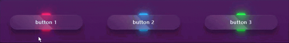
先上效果
🌟在网页设计中,按钮不仅仅是用户界面的一个简单组成部分,它还能够通过视觉效果增强用户体验和美感。CSS动画酷炫毛玻璃按钮展开效果是一种创新的交互设计,它结合了流行的毛玻璃美学和动态动画,为按钮添加了深度和动感。
完整代码
以下是完整代码:
HTML:
<div class="container">
        <div class="btn"><a href="#">button 1</a></div>
        <div class="btn"><a href="#">button 2</a></div>
        <div class="btn"><a href="#">button 3</a></div>
    </div>
CSS代码:
body {
  position: relative;
  display: flex;
  justify-content: center;
  align-items: center;
  height: 100vh;
  background: linear-gradient(to bottom, #5d326c, #350048); /*fiolet*/
}
.container {
  width: 1000px;
  display: flex;
  flex-wrap: wrap;
  justify-content: space-around;
}
.container .btn {
  position: relative;
  top: 0;
  left: 0;
  width: 250px;
  height: 50px;
  margin: 0;
  display: flex;
  justify-content: center;
  align-items: center;
}
.container .btn a {
  position: absolute;
  top: 0;
  left: 0;
  width: 100%;
  height: 100%;
  display: flex;
  justify-content: center;
  align-items: center;
  background: rgba(255, 255, 255, 0.05);
  box-shadow: 0 15px 15px rgba(0, 0, 0, 0.3);
  border-bottom: 1px solid rgba(255, 255, 255, 0.1);
  border-top: 1px solid rgba(255, 255, 255, 0.1);
  border-radius: 30px;
  padding: 10px;
  box-sizing: border-box;
  letter-spacing: 1px;
  text-decoration: none;
  overflow: hidden;
  color: #fff;
  font-weight: 400px;
  z-index: 1;
  transition: 0.5s;
  backdrop-filter: blur(15px);
}
.container .btn:hover a {
  letter-spacing: 3px;
}
.container .btn a::before {
  content: "";
  position: absolute;
  top: 0;
  left: 0;
  width: 50%;
  height: 100%;
  background: linear-gradient(to left, rgba(255, 255, 255, 0.15), transparent);
  transform: skewX(45deg) translate(0);
  transition: 0.5s;
  filter: blur(0px);
}
.container .btn:hover a::before {
  transform: skewX(45deg) translate(200px);
}
.container .btn::before {
  content: "";
  position: absolute;
  left: 50%;
  transform: translatex(-50%);
  bottom: -5px;
  width: 30px;
  height: 10px;
  background: #f00;
  border-radius: 10px;
  transition: 0.5s;
  transition-delay: 0.5;
}
.container .btn:hover::before /*lightup button*/ {
  bottom: 0;
  height: 50%;
  width: 80%;
  border-radius: 30px;
}
.container .btn::after {
  content: "";
  position: absolute;
  left: 50%;
  transform: translatex(-50%);
  top: -5px;
  width: 30px;
  height: 10px;
  background: #f00;
  border-radius: 10px;
  transition: 0.5s;
  transition-delay: 0.5;
}
.container .btn:hover::after /*lightup button*/ {
  top: 0;
  height: 50%;
  width: 80%;
  border-radius: 30px;
}
.container .btn:nth-child(1)::before, /*chnage 1*/
.container .btn:nth-child(1)::after {
  background: #ff1f71;
  box-shadow: 0 0 5px #ff1f71, 0 0 15px #ff1f71, 0 0 30px #ff1f71, 0 0 60px #ff1f71;
}
.container .btn:nth-child(2)::before, /* 2*/
.container .btn:nth-child(2)::after {
  background: #2db2ff;
  box-shadow: 0 0 5px #2db2ff, 0 0 15px #2db2ff, 0 0 30px #2db2ff, 0 0 60px #2db2ff;
}
.container .btn:nth-child(3)::before, /* 3*/
.container .btn:nth-child(3)::after {
  background: #1eff45;
  box-shadow: 0 0 5px #1eff45, 0 0 15px #1eff45, 0 0 30px #1eff45, 0 0 60px #1eff45;
}
🌟 关键技术点如下:
- 过渡(Transitions):您使用了
transition属性来添加平滑的动画效果,如按钮在悬停和点击时的位置变化。 - 动画(Animations):您使用了
@keyframes规则来定义动画,并通过animation属性应用到元素上,实现按钮的动态效果。 - 伪元素(Pseudo-elements):您使用了
::before和::after伪元素来添加额外的内容或效果,如阴影、边框和背景图案。 - 渐变(Gradients):您使用了颜色渐变来设置按钮的背景颜色,这增加了视觉吸引力。
- 滤镜(Filters):您使用了
backdrop-filter和box-shadow属性来添加模糊效果和阴影,增强视觉效果。 - 定位(Positioning):您使用了
position属性来设置按钮的位置和布局,使其可以相对于父元素定位。 - 过渡延迟(Transition Delay):您使用了
transition-delay属性来控制动画的延迟时间,使按钮的动画更加流畅。
