
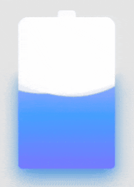
先上效果
代码如下:
HTML:
<div class="container">
    <div class="header"></div>
    <div class="battery">
    </div>
    <div class="battery-copy">
        <div class="g-wave"></div>
        <div class="g-wave"></div>
        <div class="g-wave"></div>
    </div>
</div>
CSS:
.container {
    position: relative;
    width: 140px;
    margin: auto;
}
.header {
    position: absolute;
    width: 26px;
    height: 10px;
    left: 50%;
    top: 0;
    transform: translate(-50%, -10px);
    border-radius: 5px 5px 0 0;
    background: rgba(255, 255, 255, .88);
}
.battery-copy {
    position: absolute;
    top: 0;
    left: 0;
    height: 220px;
    width: 140px;
    border-radius: 15px 15px 5px 5px;
    overflow: hidden;
}
.battery {
    position: relative;
    height: 220px;
    box-sizing: border-box;
    border-radius: 15px 15px 5px 5px;
    box-shadow: 0 0 5px 2px rgba(255, 255, 255, 0.22);
    background: #fff;
    z-index: 1;

    &::after {
        content: "";
        position: absolute;
        left: 0;
        right: 0;
        bottom: 0;
        top: 80%;
        background: linear-gradient(to bottom, #7abcff 0%, #00BCD4 44%, #2196F3 100%);
        border-radius: 0px 0px 5px 5px;
        box-shadow: 0 14px 28px rgba(33, 150, 243, 0), 0 10px 10px rgba(9, 188, 215, 0.08);
        animation: charging 10s linear infinite;
        filter: hue-rotate(90deg);
    }
}
.g-wave {
    position: absolute;
    width: 300px;
    height: 300px;
    background: rgba(255, 255, 255, .8);
    border-radius: 45% 47% 44% 42%;
    bottom: 25px;
    left: 50%;
    transform: translate(-50%, 0);
    z-index: 1;
    animation: move 10s linear infinite;
}
.g-wave:nth-child(2) {
    border-radius: 38% 46% 43% 47%;
    transform: translate(-50%, 0) rotate(-135deg);
}
.g-wave:nth-child(3) {
    border-radius: 42% 46% 37% 40%;
    transform: translate(-50%, 0) rotate(135deg);
}
@keyframes charging {
    50% {
        box-shadow: 0 14px 28px rgba(0, 150, 136, 0.83), 0px 4px 10px rgba(9, 188, 215, 0.4);
    }

    95% {
        top: 5%;
        filter: hue-rotate(0deg);
        border-radius: 0 0 5px 5px;
        box-shadow: 0 14px 28px rgba(4, 188, 213, .2), 0 10px 10px rgba(9, 188, 215, 0.08);
    }
    100% {
        top: 0%;
        filter: hue-rotate(0deg);
        border-radius: 15px 15px 5px 5px;
        box-shadow: 0 14px 28px rgba(4, 188, 213, 0), 0 10px 10px rgba(9, 188, 215, 0.4);
    }
}
@keyframes move {
    100% {
        transform: translate(-50%, -160px) rotate(720deg);
    }
}
