
空间数据建模
In real world datasets, particularly in climate and environmental problems, we often have measurements at a specified number of locations (in space and/or time), and will often need to make predictions of the output at unmeasured locations (for example, at the next several time steps, or for a spatial region).
We can approach the spatial problem by constructing a fine grid over the area in question and then predicting at each point on the grid, interpolating between the observed data points. If we have a set of explanatory/predictor variables at the locations of the measurements and for each point of the grid, then we could use a regression model to produce predictions. Our model should also provide a measure of uncertainty around any predictions, as we don’t observe the desired output at all possible locations.
In this course, we’ll be learning and applying methods for handling spatial and temporal measurement data. In this practical, we’ll consider a spatial dataset, and start by using methods that we already know, attempting to fit linear models to this spatial data, potentially identifying any issues with this approach and motivating the need to go beyond such models, as we will later in this course.
在现实世界的数据集中,特别是在气候和环境问题中,我们经常在指定数量的位置(空间或时间)进行测量,并且通常需要对未测量位置的输出进行预测。
我们可以通过在相关区域上构建精细网格,然后在网格上的每个点进行预测,在观察到的数据点之间进行插值来解决空间问题。如果我们在测量位置和网格的每个点都有一组解释或预测变量,那么我们可以使用回归模型来生成预测。我们的模型还应该提供任何预测的不确定性度量,因为我们没有在所有可能的位置观察到所需的输出。
在这个实践中,我们将考虑一个空间数据集,并从使用我们已知的方法开始,尝试将线性模型拟合到这个空间数据,识别这种方法的任何问题并激发超越这些模型的需要。
The Meuse dataset
We’re going to look at the meuse dataset, contained in the sp package. From its description (in ?meuse): “This data set gives locations and topsoil heavy metal concentrations, along with a number of soil and landscape variables at the observation locations, collected in a flood plain of the river Meuse, near the village of Stein (NL). Heavy metal concentrations are from composite samples of an area of approximately 15m x 15m.”
Let’s load in the data, and do some initial data analysis:
我们将使用sp包中包含的meuse数据集。在R中市容?meuse查看它的描述:“该数据集提供了位置和表土重金属浓度,以及观察地点的许多土壤和景观变量,收集在Stein村附近的默兹河洪泛区(荷兰)。 重金属浓度来自面积约为 15m x 15m 的复合样品。”让我们加载数据,并进行一些初步的数据分析:
# 加载包和数据
library(sp)
library(ggplot2)
data(meuse)
head(meuse)

meuse$x<- meuse$x/ 1000 # 整理坐标
meuse$y<- meuse$y/ 1000
summary(meuse)

We have (x, y) locations (in some non-standard coordinate system, we won’t worry about this), and want to model the soil concentration of various metals (cadmium, copper, lead, zinc) in $mg.kg^{-1}$. The dataset also contains some other variables which may be useful for prediction, such as elevation, and two measures of distance to the river (dist, dist.m). We’ll use the normalized version, dist, as this choice will come in useful later on. In all that follows, we’ll be attempting to model zinc concentration.
A sensible place to start is plotting the spatial locations of the points, to see the domain we’re working with (we’ll generally be using ggplot2, but everything here could be done similarly with base graphics):
我们有(x,y)位置,并且想要以$mg.kg^{-1}$为单位模拟各种金属(镉、铜、铅、锌)在土壤中的浓度.该数据集还包含一些可能对预测有用的其他变量,例如海拔和到河流的两个距离度量(dist、dist.m)。我们将使用规范化版本dist,因为这个选择稍后会派上用场。 在接下来的内容中,我们将尝试模拟锌浓度。
一个明智的开始是绘制空间点位置,以查看我们正在处理的域(我们通常使用 ggplot2,但这里的所有内容都可以使用基本图形来完成):
ggplot(data= meuse, aes(x= x, y= y))+
    geom_point()

This isn’t that exciting, so let’s plot the points with their size corresponding to distance from the river and zinc concentration:
这不是那么令人兴奋,所以接下来我们让点大小与与河流的距离和锌浓度相对应:
ggplot(data= meuse, aes(x= x, y= y, size= dist))+
    geom_point()

ggplot(data= meuse, aes(x= x, y= y, size= zinc))+
    geom_point()


From these plots, we see that the river is running from bottom left to top right, along our cloud of points (and we’re probably lying in a meander, as suggested by the 3 points away from the rest, with a low distance). There also seems to be a correlation between the zinc concentration and the distance from the river, with higher concentrations generally along the river. We can combine the above two plots using something like:
从这些图中,我们看到河流从左下角流向右上角,云锌浓度与河流距离之间似乎也存在相关性,通常沿河浓度较高。 我们可以使用以下内容组合上述两个图:
ggplot(data= meuse, aes(x= x, y= y))+
    geom_point(aes(size= dist, color= zinc))+
    scale_colour_viridis_c()

So, our data appears to have some correlation spatially, but there is also a clear inverse relationship between the distance from the river and the zinc concentration. We see that if we apply transformations (taking the square root of dist, and the logarithm of zinc) we have a reasonably strong negative correlation. Plotting these transformations:
因此,我们的数据在空间上似乎有一些相关性,但与河流的距离与锌浓度之间也存在明显的反比关系。我们看到,如果我们应用变换(取dist的平方根和锌的对数),我们会得到相当强的负相关。 绘制这些变换:
ggplot(data= meuse, aes(x= dist, y= zinc))+
    geom_point()
ggplot(data= meuse, aes(x= sqrt(dist), y= log(zinc)))+
    geom_point()


Fitting a model for zinc concentration-拟合锌浓度模型
Our initial data analysis has highlighted the relatively strong relationship between distance from the river and zinc concentration, given appropriate transformations. Let’s fit a linear regression using this relationship, with the aim of using this model to predict zinc concentration on a grid of points around the river:
经过适当的转换后,我们的初始数据分析显示了了到河流的距离与锌浓度之间相对较强的关系。 让我们使用此关系拟合线性回归,目的是使用此模型来预测河流周围点网格上的锌浓度:
$$log(zinc_i) = \beta_0 + \beta_1\sqrt{dist_i} + \epsilon_i$$
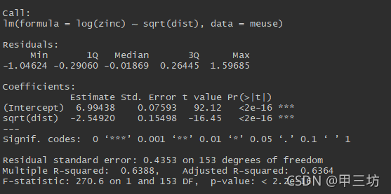
linear_model<- lm(log(zinc)~ sqrt(dist), data= meuse)
summary(linear_model)
For linear regression models, recall that we are assuming that the residuals $\epsilon_i$ are independent and identically distributed with mean $\theta$ and variance $\sigma^2$:
对于线性回归模型,回想一下,我们假设残差$\epsilon_i$是独立且同分布的,均值 $\theta$ 和方差 $\sigma^2$:
$$\epsilon \sim N(0,\sigma^2)$$
To assess whether this assumption is valid, we can consider the usual diagnostic plots:
为了评估这个假设是否有效,我们可以考虑通常的 diagnostic plots:
```{r}
par(mfrow= c(2, 2))
plot(linear_model)

We see some potential problems here: the QQ plot shows some deviation from Normality, particularly in the upper tail. In the residuals vs fitted plot, the mean of the residuals should be zero regardless of the fitted value, and the spread of these points should be constant, both of which are violated to some extent, particulary for lower values of (log) concentration.
我们在这里看到了一些潜在的问题:QQ图显示了一些与正态性的偏差,特别是在upper-tail。在residuals vs fittedplot中 ,无论拟合值如何,残差的平均值都应为零,并且这些点的分布应该是恒定的,这两者都在一定程度上被违反,特别是对于较低的 (log) 浓度值。
(At this point, we may want to consider adding extra covariates, or using different transformations, to try to improve the linear model fit, but we assume that this model is ‘good enough’ for now.)
We can also consider how the residuals change with distance from the river, and with x and y coordinates, again expecting no patterns if our assumptions hold:
(此时,我们可能要考虑添加额外的协变量,或使用不同的变换,以尝试改进线性模型拟合,但我们假设该模型目前“足够好”。)
我们还可以考虑残差如何随与河流的距离以及x和y坐标的变化而变化,如果我们的假设成立,则再次期望没有其他模式:
ggplot(data= meuse, aes(x= sqrt(dist), y= resid(linear_model)))+
    geom_point()+
    geom_smooth(se= FALSE)
ggplot(data= meuse, aes(x= x, y= resid(linear_model)))+
    geom_point()+
    geom_smooth(se= FALSE)
ggplot(data= meuse, aes(x= y, y= resid(linear_model)))+
    geom_point()+
    geom_smooth(se= FALSE)


And clearly here we have an issue, with the spread of residuals much narrower for high values of the distance,and a systematic pattern in terms of the x coordinate.
The problem becomes even clearer if we plot the residuals on our original spatial map, with green and redindicating whether the zinc measurements are higher or lower than the modelled values, with the size of the points scaled by the size of the residual:
很明显,这里我们有一个问题,相对于较远距离,残差的分布要窄得多,并且在残差个X坐标值存在一定的关系。
如果我们在原始空间地图上绘制残差,则问题变得更加清晰,用绿色和重新指示锌测量值是高于还是低于建模值,点的大小按残差的大小进行缩放:
ggplot(data= meuse, aes(x= x, y= y))+
    geom_point(size= 5*abs(resid(linear_model)),
               col= ifelse(resid(linear_model)> 0, 'green', 'red'))

This plot shows that the errors are correlated when considered spatially, with the model systematically over and underestimating the measurements in different regions, rather than the errors being distributed randomly. However, we set out to produce a map of zinc concentration, so despite the inadequacies of this particular model, let’s use it to interpolate and predict on a grid. The sp package also contains a dataset called meuse.grid, which gives a grid containing x and y coordinates, along with the distance to the river for every point. Using this in combination with the linear model, we can colour in our map with predictions:
该图显示,当从空间角度考虑时,误差是相关的,模型系统地高估和低估了不同区域的测量值,而不是随机分布的误差。然而,我们开始制作锌浓度图,所以尽管这个特定模型有不足之处,让我们用它在网格上进行插值和预测。sp包还包含一个名为meuse.grid的数据集,它给出了一个包含x和y坐标的网格,以及每个点到河流的距离。将此与线性模型结合使用,我们可以在地图中进行预测着色:
data(meuse.grid)
meuse.grid$x<- meuse.grid$x/ 1000
meuse.grid$y<- meuse.grid$y/ 1000
meuse.grid$linear_preds<- predict(linear_model, meuse.grid)
ggplot(data= meuse.grid, aes(x= x, y= y, fill= linear_preds))+
    geom_tile()+
    scale_fill_viridis_c(limits= c(4.4, 7.6))+
    labs(fill= "log conc")

Unsurprisingly, given the form of the model, the zinc concentration is highest next to the river, and decreases as the distance from the river increases.
So we’ve attempted to handle the spatial component of this data set by only considering distance to the river, which is strongly related to the zinc concentration. But whilst the residuals are reasonably Normal overall, there are clear systematic biases spatially:
不出所料,在该模型下,靠近河流的锌浓度最高,并随着与河流距离的增加而降低。
因此,我们试图通过仅考虑到河流的距离来处理此数据集的空间分量,这与锌浓度密切相关。 但是,虽然残差总体上是合理的,但在空间上存在明显的系统偏差:
Looking ahead
We saw above that assuming uncorrelated residuals was a problem, so the following code implements a model where we assume that the residuals at close points are related. Then, we could understand how to use the geoR package and what the functions below are actually doing, but for now it doesn’t matter:
我们在上面看到假设不相关的残差是一个问题,所以下面的代码实现了一个模型,我们假设近点的残差是相关的。然后,我们可以了解如何使用geoR包以及下面的函数实际上在做什么,但现在没关系:
library(geoR)
meuse_new<- as.geodata(meuse, data.col= which(colnames(meuse)== "zinc"))
str(meuse_new)

meuse_new
meuse_new[2]$data<- log(meuse_new[2]$data)
## likfit 参数:
## geodata: a list containing elements coords and data
## ini: initial values
## fix.nug: logical, indicating whether tau^2 should be regard as fixed
## lik.met: frmely method, ML for maximum likelihood, REML for restricted maximum likelihood
ml<- likfit(meuse_new, ini= c(10, 1), fix.nug= FALSE, lik.met= "REML")

## krige.conv参数:
## geodata:
## coords:
## loc: 2-D coordiantes
## krige: can take a call to krige.control(Auxiliary function辅助函数)
preds<- krige.conv(meuse_new, loc= meuse.grid[,1:2], krige = krige.control(obj.model = ml))

meuse.grid$preds <- preds$predict
ggplot(data = meuse.grid, aes(x = x, y = y, fill = preds)) +
    geom_tile() +
    scale_fill_viridis_c(limits = c(4.4,7.6)) +
    labs(fill = 'log conc')

So now we have an alternative set of predictions of zinc concentration spatially. There’s clearly a lot more going on here - there isn’t just a linear relationship as distance from the river increases, and we’re clearly able to model the data with much greater flexibility, picking up more local variability in the zinc concentration. There is a reasonably strong correlation between the predictions from the two models overall, but particularly
where the linear model predicts high concentrations (i.e. close to the river), the new model can return a much wider range of values, suggesting that distance from the river is not the only important factor:
所以现在我们有一组替代的锌浓度的空间预测。显然这里还有很多事情要做—,锌浓度与河流距离不仅仅是线性关系,,而且我们显然能够以更大的灵活性对数据进行建模,获取更多局部锌浓度变化。总体而言,两个模型的预测之间存在相当强的相关性,但特别是在线性模型预测高浓度(即靠近河流)的情况下,新模型可以返回更广泛的值,这表明与河流的距离并不是唯一的重要因素:
ggplot(data= meuse.grid, aes(x= linear_preds, y= preds))+
    geom_point()+
    labs(x= "Linear model", "Spatial model")

We can also look at the uncertainty on these predictions, and plot this spatially:
我们还可以查看这些预测的不确定性,并在空间上进行绘制:
meuse.grid$unc<- preds$krige.var
ggplot(data= meuse.grid, aes(x= x, y= y, fill= unc))+
    geom_tile()


